The network for creativity
Join 1.25M professional creatives like you
Connect with clients, get discovered, and run your business 100% commission-free
Creatives on Contra have earned over $150M and we are just getting started
Back to feedPost
Trying to explain a whole vibe in one hero section. Take a look at the landing page and tell us, too much info or just right?
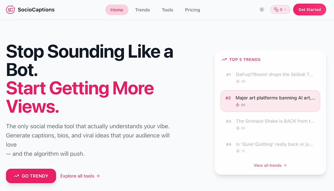
strong and clear.
The headline is strong and clear.
The only thing that might compete for attention is the trends card — it slightly splits focus from the primary CTA. Maybe simplifying the hero to one dominant action could increase conversions.
That’s a great point. The trends card and the primary CTA both lead to the same action, the goal was to visually demonstrate the live trending feature while reinforcing the main conversion path. But I agree that simplifying the hero to one dominant action could potentially...
That makes sense — showing live trends builds credibility. Testing a cleaner hero vs. proof-heavy hero is a smart move. You could even try collapsing the trends card behind a subtle “See live trends” trigger to reduce initial cognitive load.
That’s actually a great idea. Collapsing it behind a subtle trigger could keep the hero clean while still showcasing proof for curious users. I’ll test a cleaner hero vs. proof-heavy hero and compare interaction rates. Appreciate the thoughtful input.
The network for creativity
Join 1.25M professional creatives like you
Connect with clients, get discovered, and run your business 100% commission-free
Creatives on Contra have earned over $150M and we are just getting started
Related posts
MONAM© • One of the purest Framer templates, inspired by the minimal aesthetic of art exhibition and gallery websites. It maintains a clean, consistent rhythm throughout the portfolio.
Available to try
monam.preview
nice work.
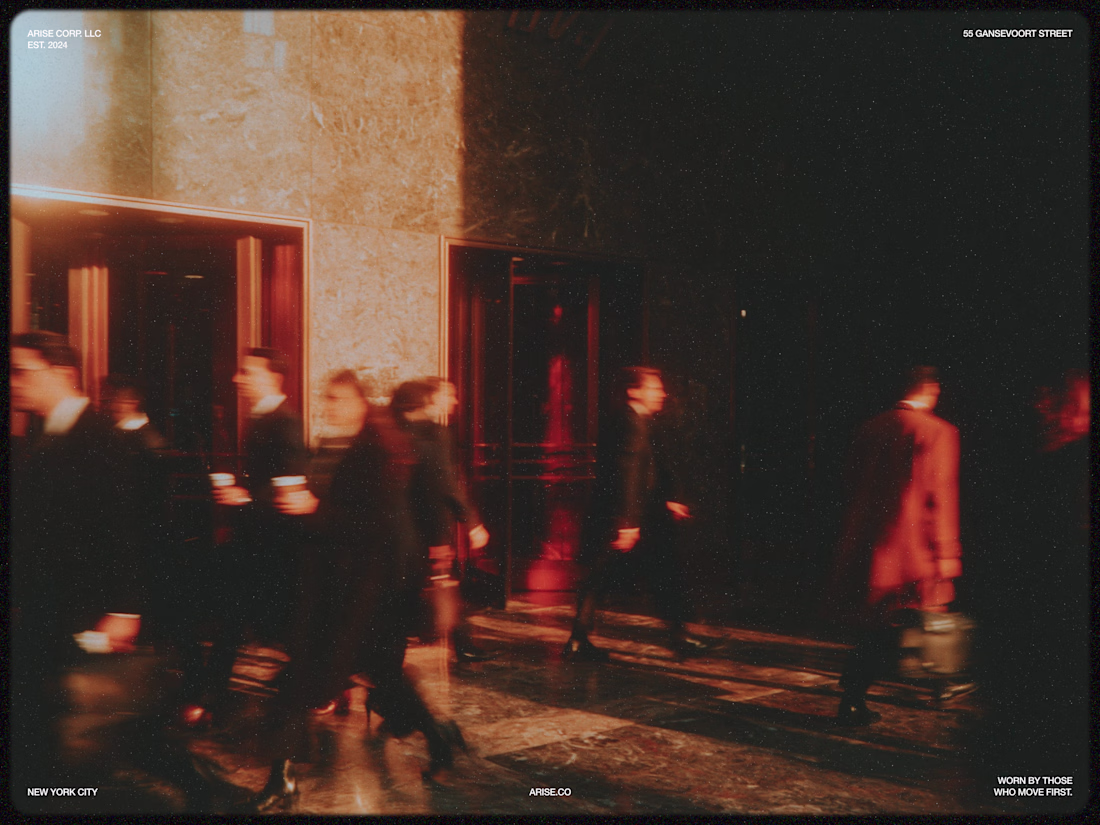
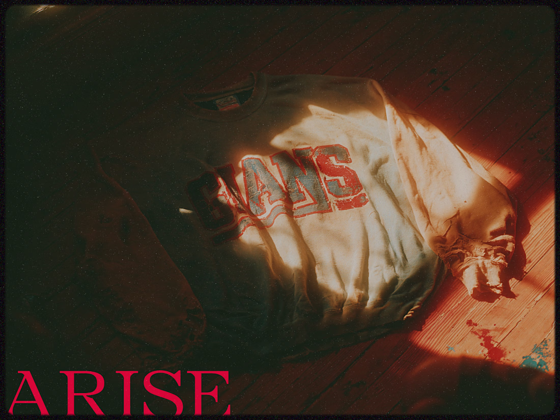
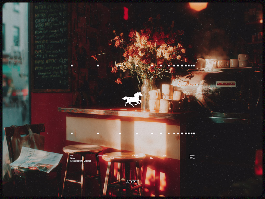
ARISE -- Imagery
Images were generated in Midjourney V8.1
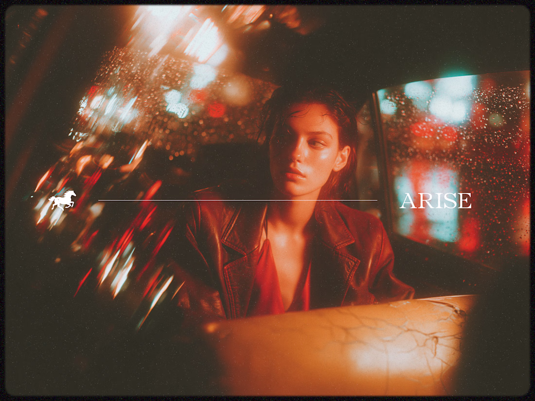
Love the vibe!
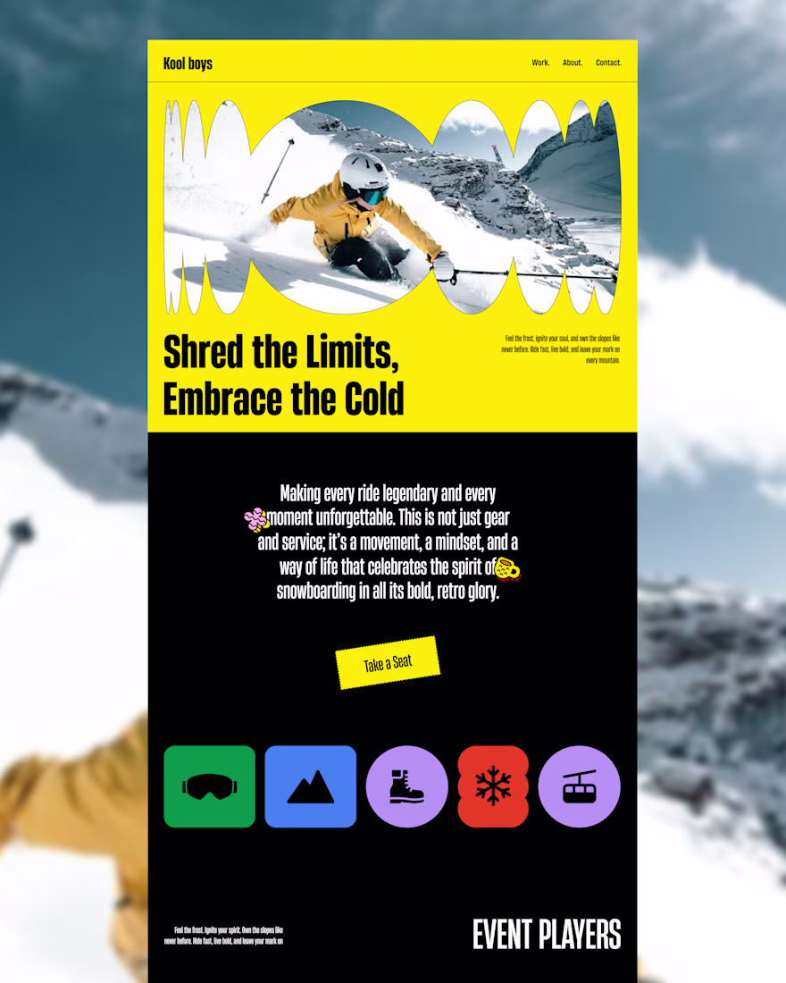
Most event websites play it safe.
Kool Boys doesn’t.
This homepage is designed to feel loud, energetic, and impossible to ignore.
Instead of relying on minimal trends, we focused on:
• Bold color contrast
• Oversized typography
• Raw, expressive visuals
• Clear but playful structure
The goal wasn’t just usability, it was memorability.
Because attention is earned in seconds.
If you're building a brand that needs to stand out in a crowded space - we design experiences that get noticed and remembered.
👉Open for projects - let’s build something that actually stands out.
Great design
Trending
Claude
Claude has entered the design space. How are you using Claude Design?
Contra University
Learn from expert creatives how to earn more using next-gen AI tools.
creativeaiflow
Creative AI workflows are evolving. What tools do you use, and what are their strengths and weaknesses?
portfolioreview
The best portfolios tell a story, not just show a grid. Share yours for feedback.
freelancerlife
Freelancer life is wins, pivots, and everything in between. What’s yours right now?