The network for creativity
Join 1.25M professional creatives like you
Connect with clients, get discovered, and run your business 100% commission-free
Creatives on Contra have earned over $150M and we are just getting started
Back to feedPost

Introducing Moneta, a digital banking brand concept for modern businesses, built around clarity, confidence, and simplicity through a refined visual identity designed for digital experiences and business touchpoints.
👉🏼 Check it out

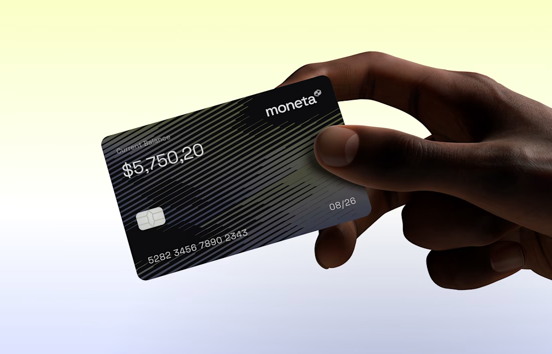
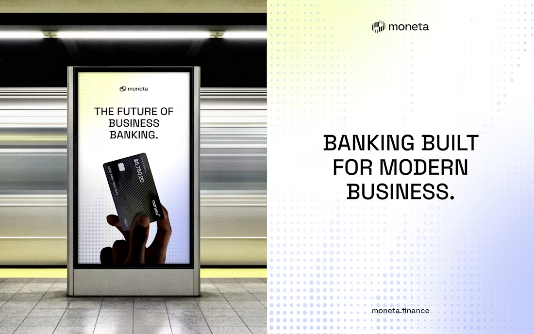

T O P!!
The network for creativity
Join 1.25M professional creatives like you
Connect with clients, get discovered, and run your business 100% commission-free
Creatives on Contra have earned over $150M and we are just getting started











Related posts


One letter. Eight personalities. 🔤
I explored the letter S in 8 different directions: soft and rounded, sharp and angular, bold and blocky, and fast like a bolt.
Same letter, same white-on-black treatment. The only thing that changes is the character.
Each mark could suit a different kind of brand, from tech and sports to fintech and lifestyle.
Which S would you pick, and what kind of brand would it belong to? Drop the number below. 👇
Looking for a logo mark or a full brand identity? My services are on my profile.


S letter designs is the best ❤️
Great job Shahwaiz🔥🔥

POLIDO — Brand Identity & Visual System
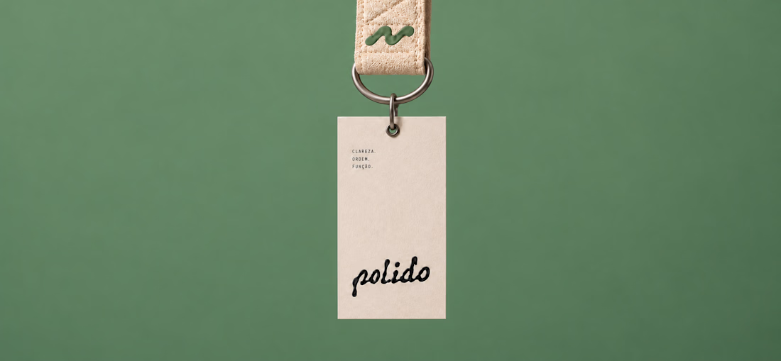
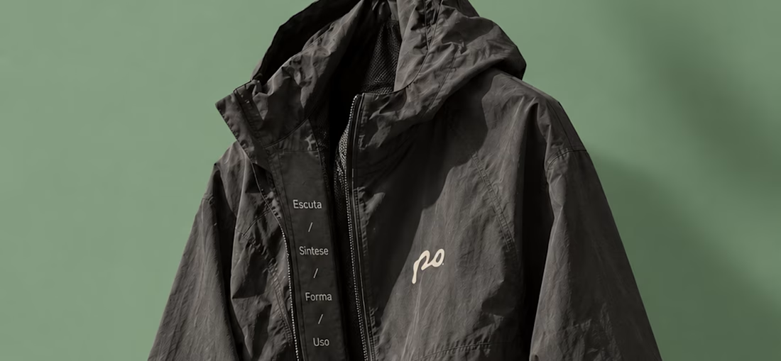
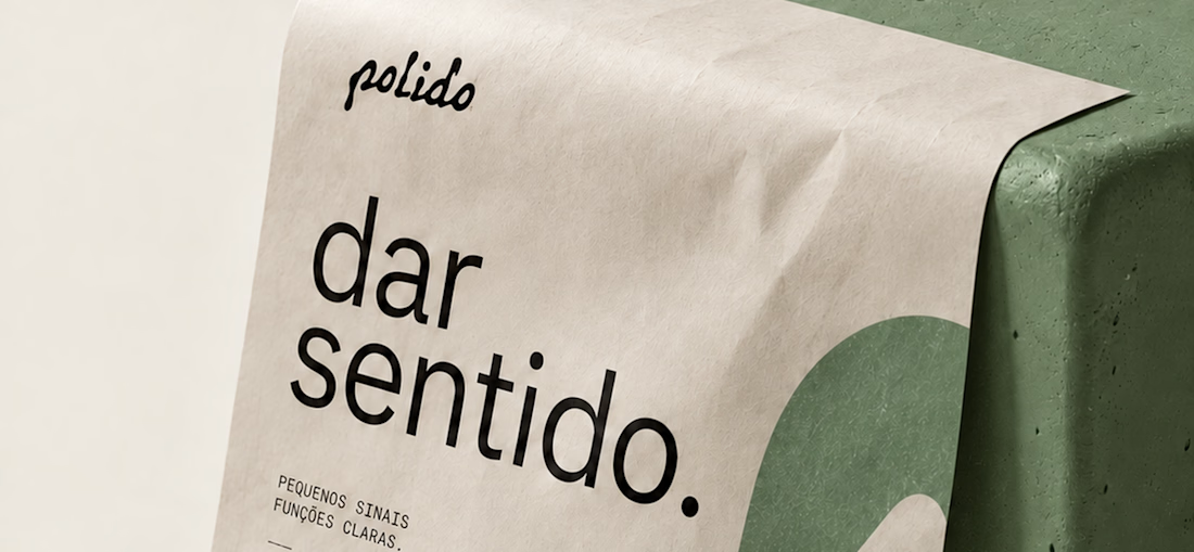
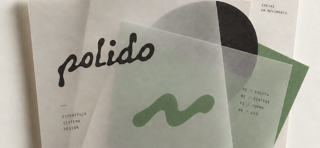
POLIDO is the visual identity of my independent brand design practice, shaped by a process of listening, synthesis, form, and use.
The identity brings together a hand-drawn signature, restrained typography, tactile materials, and a palette of warm paper, graphite, and Basil green.
From printed matter to apparel and physical applications, the project explores how a consistent visual language can adapt to different materials and contexts while maintaining its character.
Scope: Brand Strategy, Visual Identity, Art Direction, and Mockup Design.



High end branding

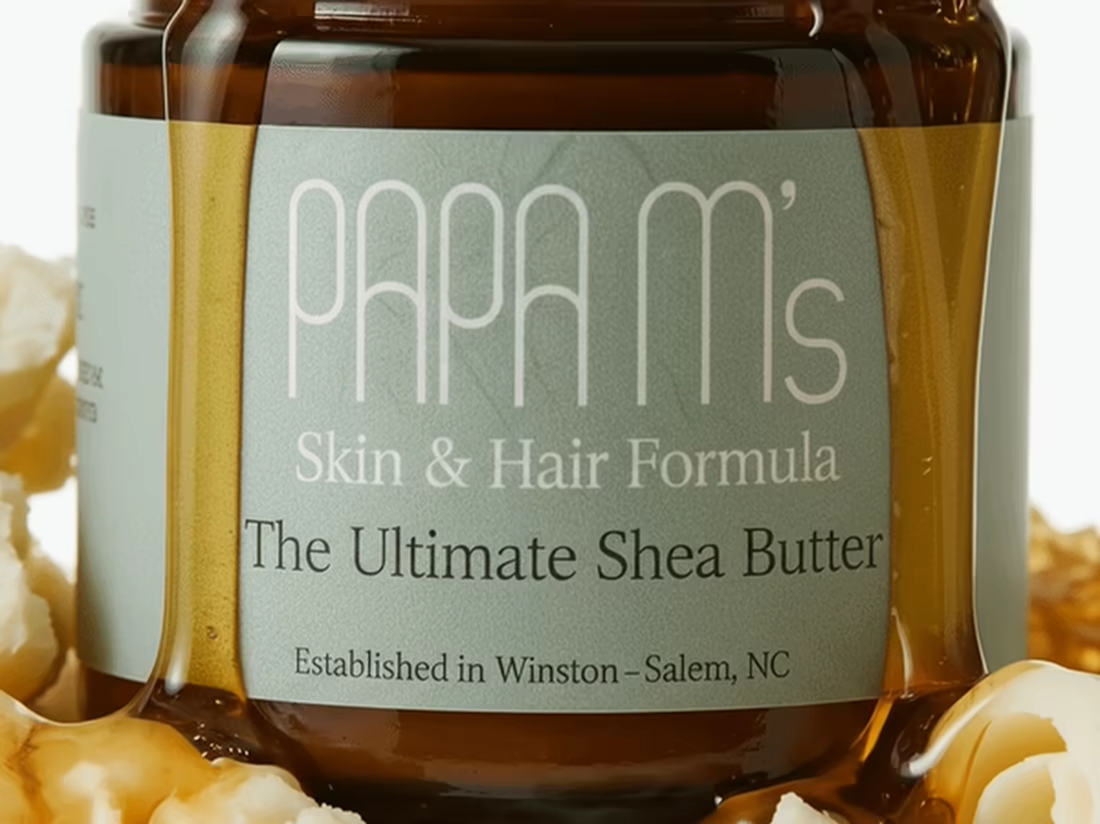
Being a Challenge winner was unexpected yet beyond rewarding.
I had goosebumps while creating this product launch and was well worth the long nights.
This was my first introduction to language prompting with Kittl's AI workflow so I'd figure I'll build out a full portfolio piece instead of pushing productivity today.
A lot of pieces came together for the final buildout and worth sharing.
I had a lot of fun bringing this one to life and I hope it feels like the kind of video that makes you want to stop and click buy immediately. 😊


Huge congratulations on the Kittl challenge win, Anjyla. Turning a first language-prompting experiment into a full portfolio piece is a smart move. The Papa M's launch looks like it was worth every long night.