The network for creativity
Join 1.25M professional creatives like you
Connect with clients, get discovered, and run your business 100% commission-free
Creatives on Contra have earned over $150M and we are just getting started
Back to feedPost

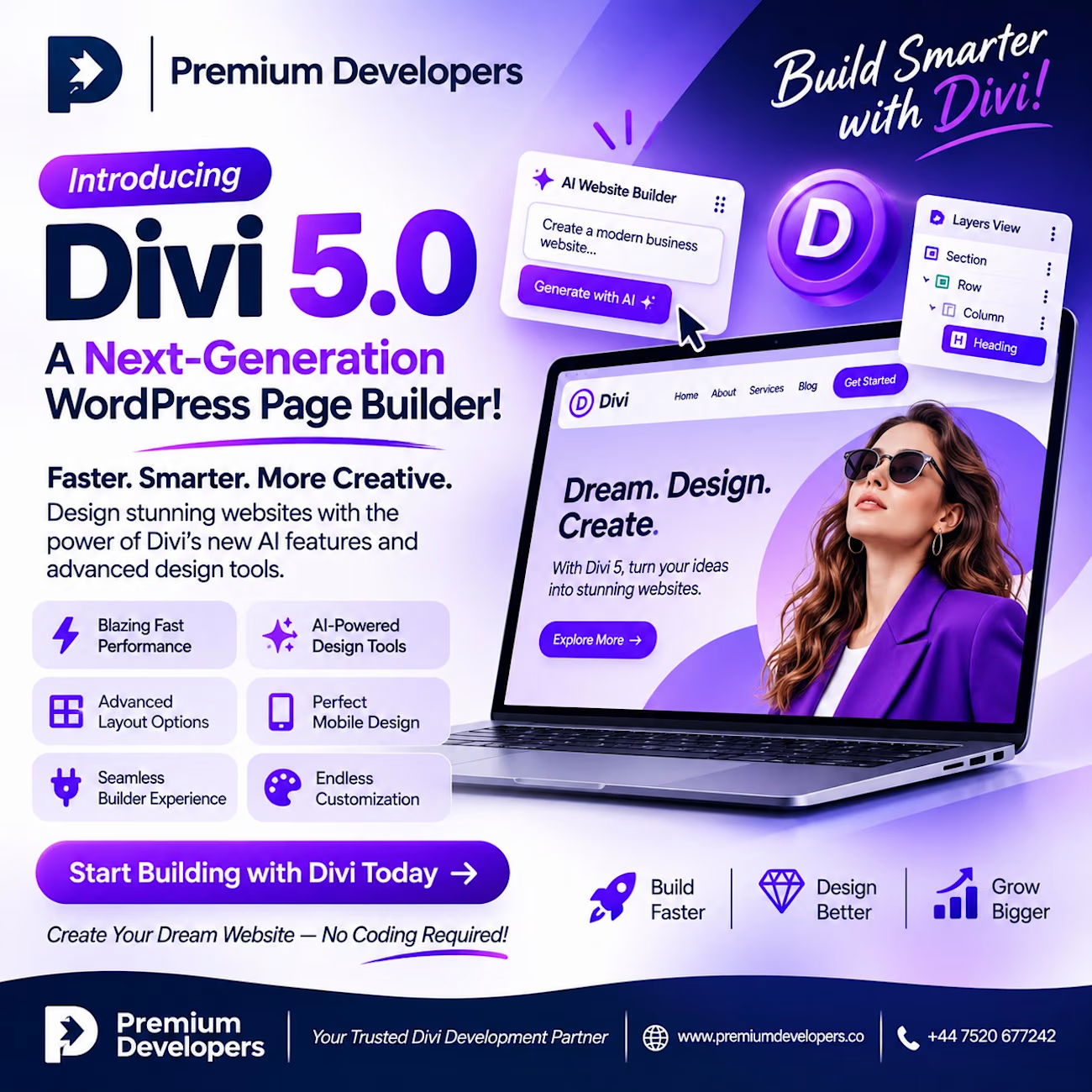
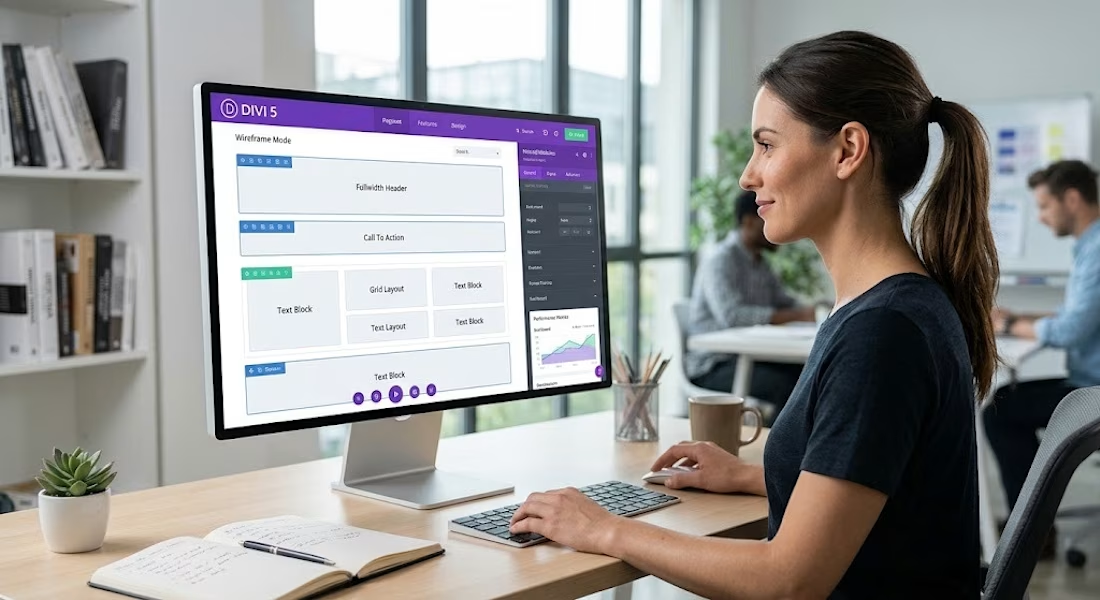
Future of WordPress Design: Divi 5 is Here!
If you thought building websites with Divi couldn’t get any better, think again. Divi 5 isn't just an update it’s a complete, ground-up rebuild focused on raw performance, ultimate stability, and seamless scalability.
Here is why everyone is talking about the shift to Divi 5:
⚡ Lightning-Fast Performance: Completely rewritten code and a modular architecture mean cleaner outputs, no more heavy shortcode dependencies, and lightning-fast load times.
📐 Advanced Layout Control: Say goodbye to workarounds! Enjoy native Flexbox and CSS Grid integration for precise alignment and responsive layouts.
🔄 The Loop Builder: Create custom blog feeds, dynamic product grids, and advanced templates directly from your site’s database with total visual freedom.
🧩 Nested Modules & Group Carousels: Nest rows, tabs, and buttons as deeply as you need, and turn any group into a fully customizable slider or carousel.
🎨 Option Group Presets & Breakpoints: Manage your design system effortlessly with reusable styles and custom breakpoints for every screen size.
The builder feels snappier, your pages load faster, and the creative possibilities are endless.
Have you upgraded your workflow to Divi 5 yet? Let us know your favorite feature in the comments below! 👇
#Divi #Divi5 #WordPress #WebDesign #WebDevelopment #ElegantThemes #UXDesign


The network for creativity
Join 1.25M professional creatives like you
Connect with clients, get discovered, and run your business 100% commission-free
Creatives on Contra have earned over $150M and we are just getting started



Related posts


We are testing two ways to browse a large template library.
Load More
Users initially see 9 cards. After clicking the button, 9 more are added while the previous results remain visible. Browsing feels continuous, but the page gradually becomes longer.
Pagination
The catalog is divided into numbered groups. When users select the next page, the current 9 cards are replaced with a new set. They can jump to a specific part of the catalog and easily return to where they were.
Load More creates a smoother browsing experience, while pagination offers greater control.
Which option would you choose for a template library?

17 voted
68%
8 voted
32%
25 votes
Closed

Load more


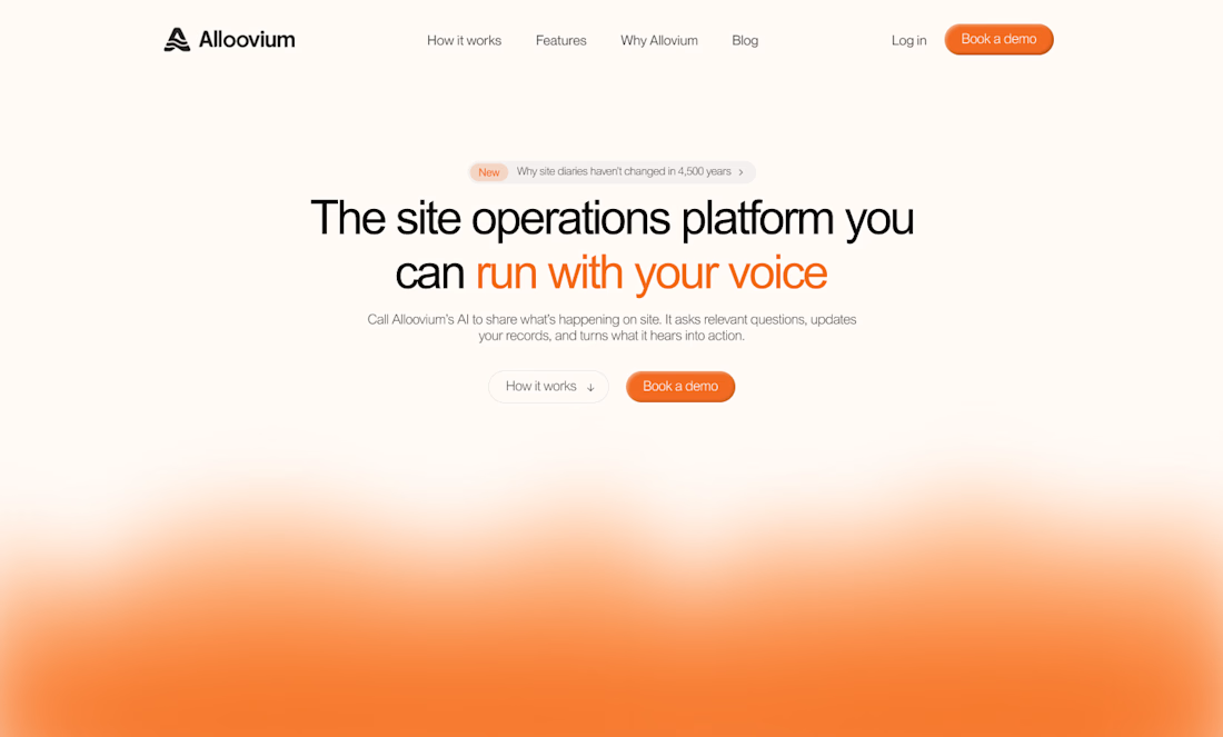
've reviewed 50+ startup websites, and I noticed a pattern.
Their hero sections are often simple. They tell you who the product is for and what it does.
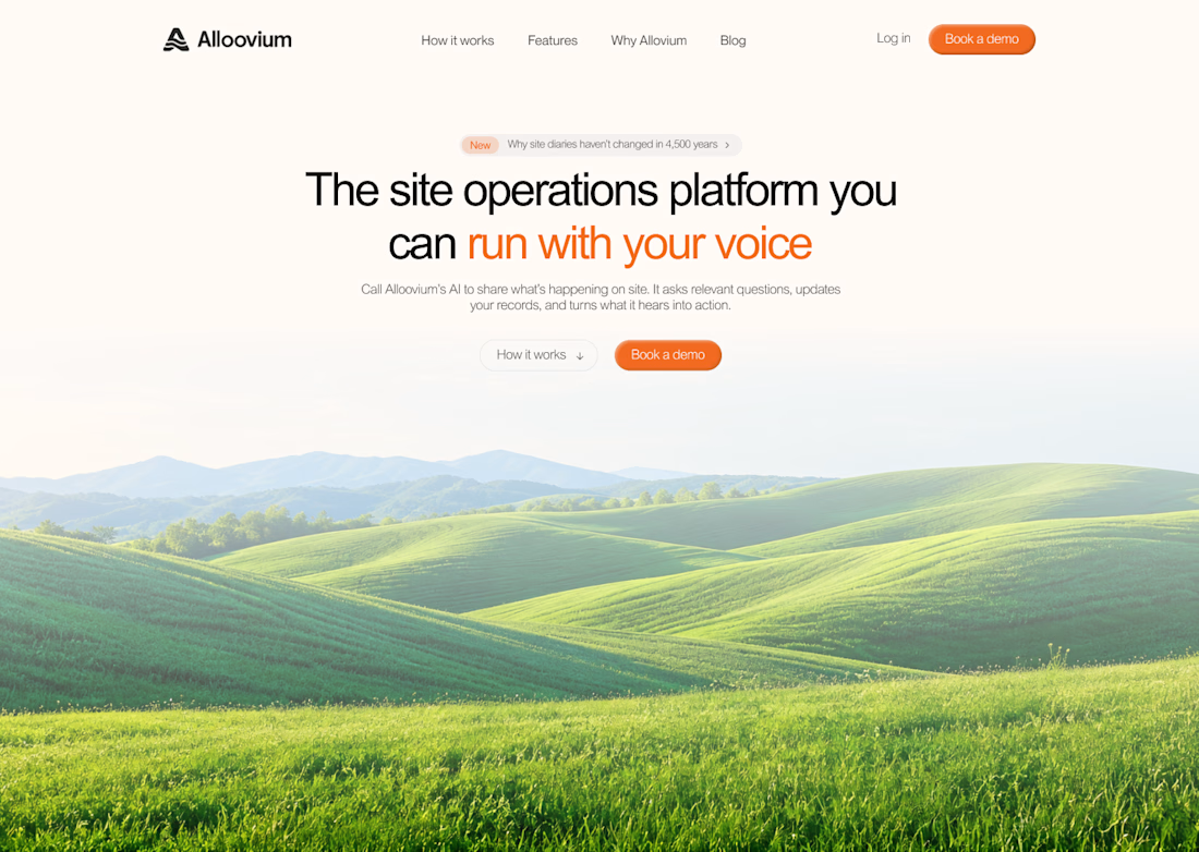
While working on this redesign concept for
@Alloovium, I wanted to explore a different direction.
Their original website already explained the product and its audience.
But what if the hero also used visuals that reflected the world their customers work in?
People often scan websites before deciding what to pay attention to.
Relevant visuals can catch their attention and create a connection with the audience before they start reading.
So I explored a few visual directions inspired by the construction industry.
Building a startup? I'd love to help you explore a new direction for your website.

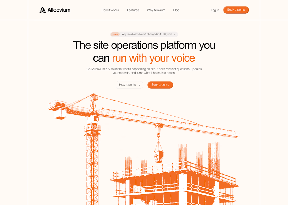

The construction visuals work well.