The network for creativity
Join 1.25M professional creatives like you
Connect with clients, get discovered, and run your business 100% commission-free
Creatives on Contra have earned over $150M and we are just getting started



The network for creativity
Join 1.25M professional creatives like you
Connect with clients, get discovered, and run your business 100% commission-free
Creatives on Contra have earned over $150M and we are just getting started







Related posts

Designed a clean, modern, and responsive business website concept to showcase services, build trust, and help businesses attract potential customers.
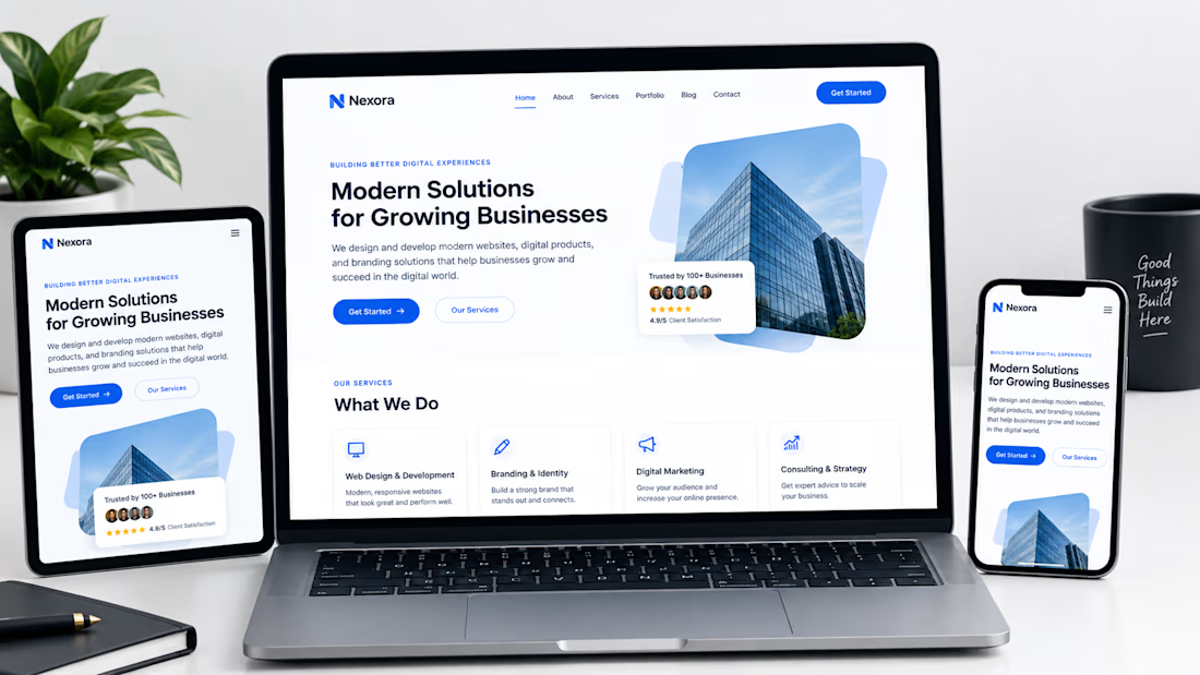

Not only is the design clean, but you also did a great job making sure it works well across different devices with a responsive design.

GIANT — Move Different.
Built around a bold gorilla mark, oversized typography, and an electric purple + neon-lime palette.
A streetwear identity designed to feel bold, rebellious, and instantly recognizable — from hoodies and caps to packaging, tags, and everyday brand details.
Concept branding project | Open for custom projects


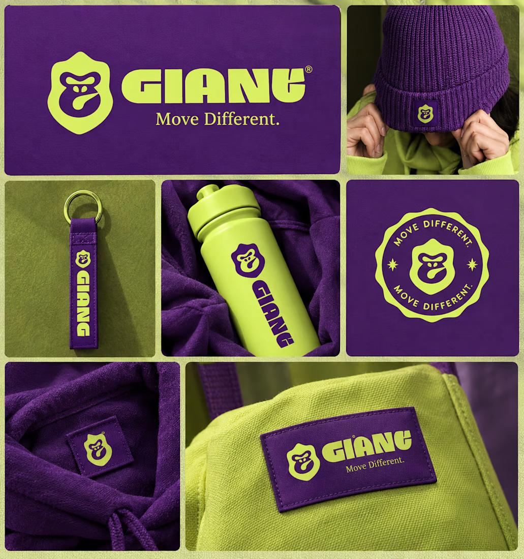
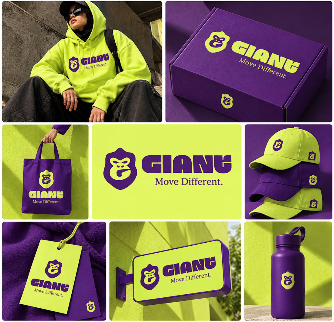

Using electric purple paired with neon lime is a high risk color choice that demands exceptional contrast management. Getting that balance right across different fabrics and lighting conditions is often where streetwear brand identities actually fail.

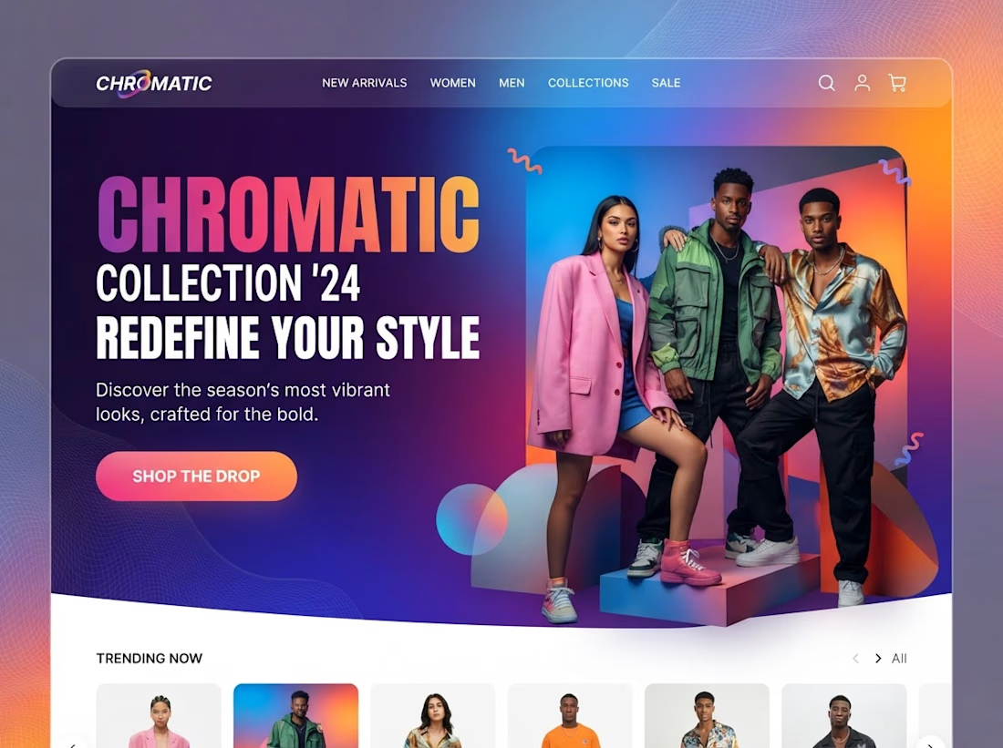
Modern Slick hero page design figma+Tailwind+Gemini ;)