The network for creativity
Join 1.25M professional creatives like you
Connect with clients, get discovered, and run your business 100% commission-free
Creatives on Contra have earned over $150M and we are just getting started
Back to feedPost

GB Lettermark Logo – Layered Wave, Motion Concept.
A modern GB lettermark logo built from layered wave lines, creating a dynamic sense of motion, flow, and continuous movement. The abstract G and B forms create a distinctive geometric symbol suitable for technology companies, digital platforms, creative studios, sports brands, engineering businesses, and modern startups.


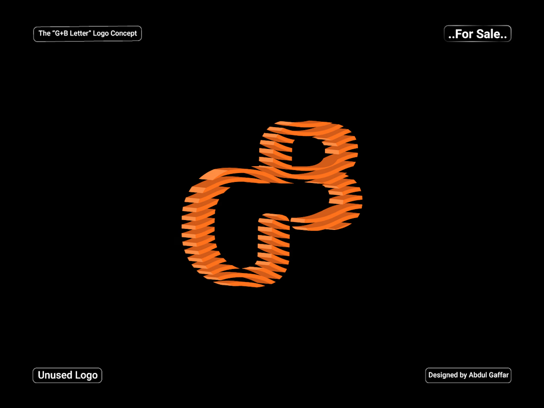

The layered wave geometry makes the GB lettermark feel continuously active.

Curious where the ripple count landed for you. Layered line marks seem to have a point where one more stroke stops reading as motion and starts reading as texture, and this one sits right on the edge of it. Did you settle the number by eye or by checking it small first?
The network for creativity
Join 1.25M professional creatives like you
Connect with clients, get discovered, and run your business 100% commission-free
Creatives on Contra have earned over $150M and we are just getting started







Related posts

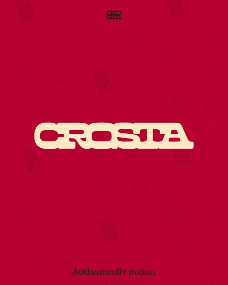
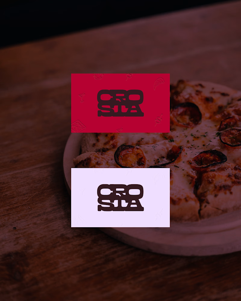
Do you prefer the main logo or the mark? Choose your pick.
The full project is coming soon, or check it out here on Instagram if you don't wanna wait.
11 voted
69%
5 voted
31%
16 votes
Closed
The mark, but for a reason that has nothing to do with which one looks better here: this brand lives on a pizza box, a napkin and a sticker on a takeaway bag, mostly around 20mm and often one ink on brown board. The full logo introduces the place once; the mark is what someone...

Love at first grid!
A short 2D motion study taking the Amorado logo from its construction grid to the final mark. Animated entirely in Spline.
A fictional identity concept for Amorado.


typography animation for the word "WALK" with dynamic motion and vibrant neon gradient lighting (teal/purple). Subtle motion blur emphasizes the speed of the letter reveal.
