The network for creativity
Join 1.25M professional creatives like you
Connect with clients, get discovered, and run your business 100% commission-free
Creatives on Contra have earned over $150M and we are just getting started
Back to feedPost
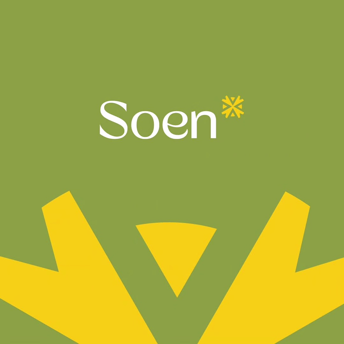
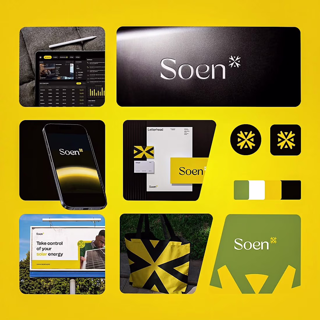
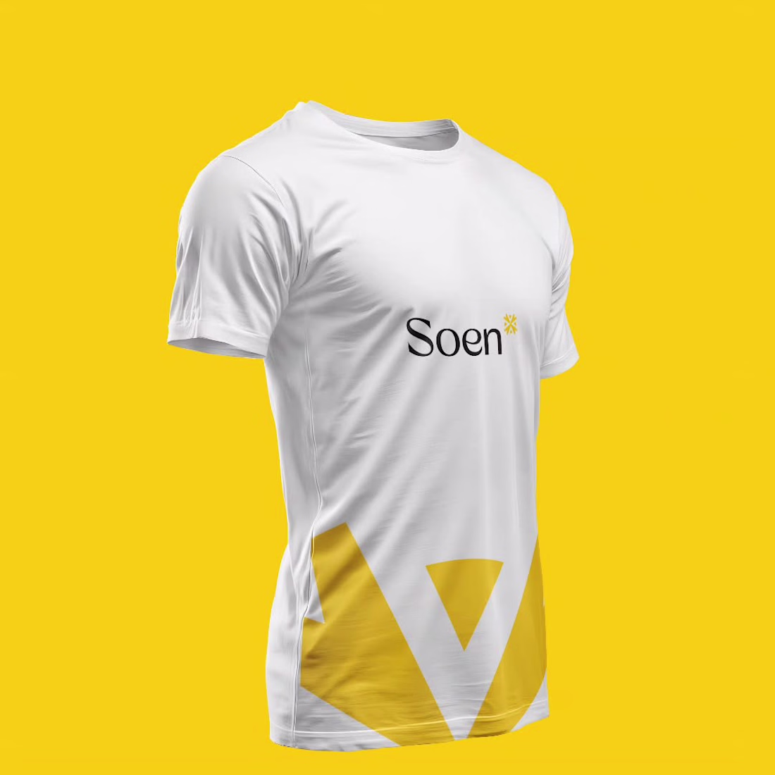
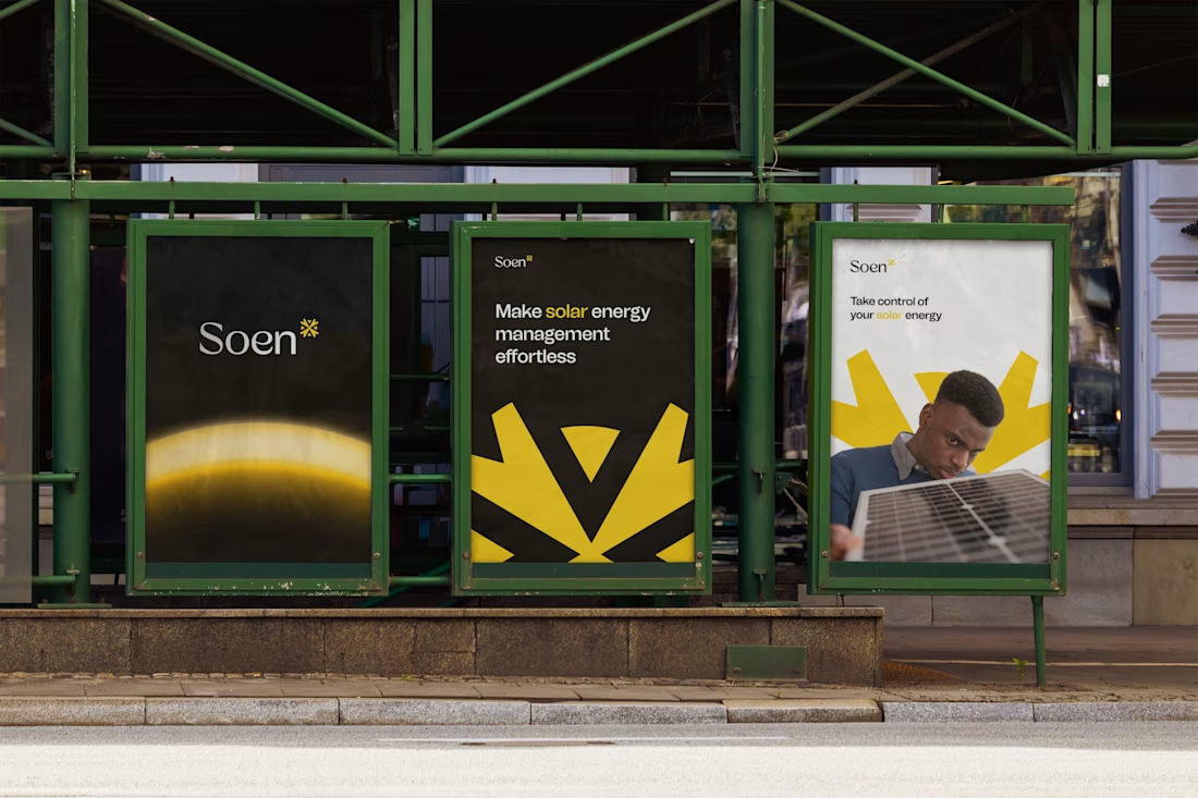
A solar energy company needed an identity that reimagined what solar could feel like. Not a distant, complex solution, but something easy, effortless, and within reach.
The four-pointed sun icon was designed to represent clarity and power, with a circle anchoring it in innovation and growth, while a bold palette of metallic yellow, palm leaf green, and vampire black challenged every convention of the category.
The result is a brand that makes clean energy feel as modern and accessible as the technology behind it.
The network for creativity
Join 1.25M professional creatives like you
Connect with clients, get discovered, and run your business 100% commission-free
Creatives on Contra have earned over $150M and we are just getting started
Trending
Claude
Claude has entered the design space. How are you using Claude Design?
Contra University
Learn from expert creatives how to earn more using next-gen AI tools.
creativeaiflow
Creative AI workflows are evolving. What tools do you use, and what are their strengths and weaknesses?
freelancerlife
Freelancer life is wins, pivots, and everything in between. What’s yours right now?
Related posts
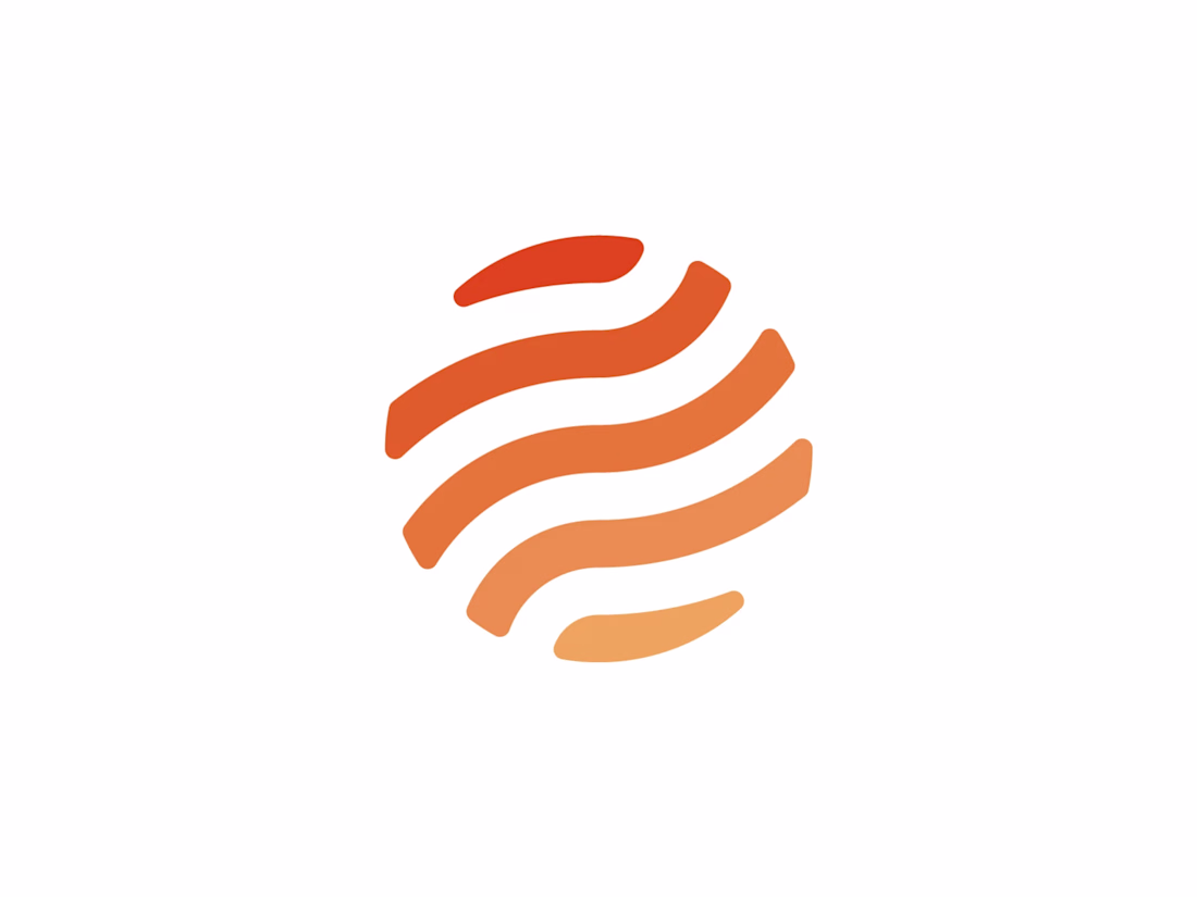
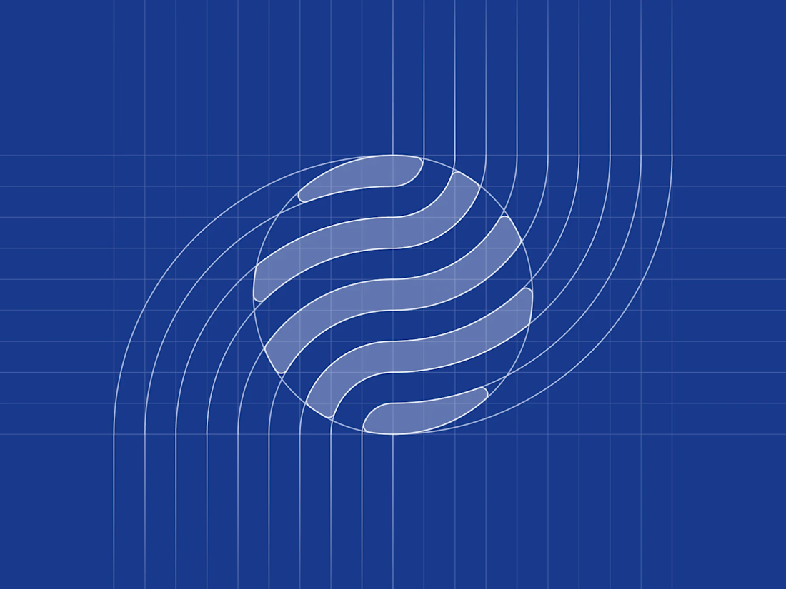
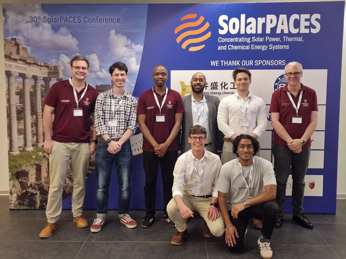
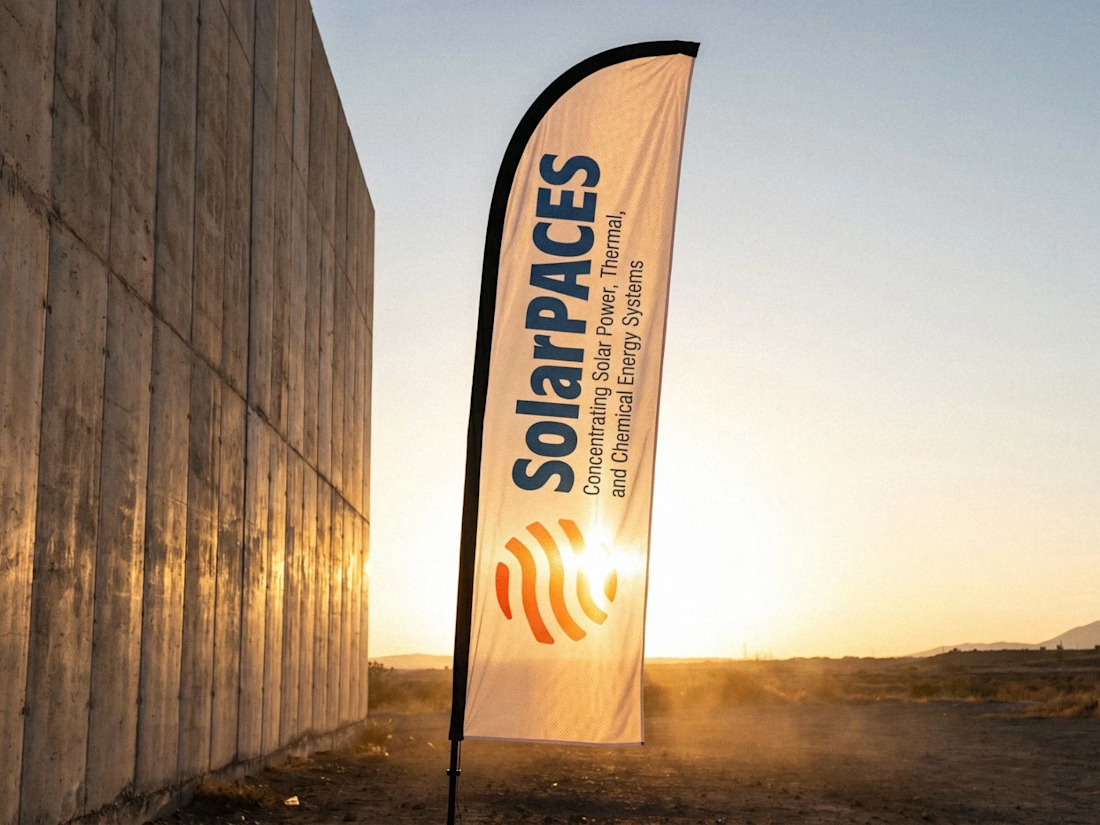
SolarPACES — brand identity for the international IEA research network advancing concentrating solar power.
An orange gradient globe built from flowing solar bands, developed as a full identity system: deep blue and orange palette, monochrome and reversed lockups, plus a vertical version for wayfinding. Applied across conference branding, merch, and industrial equipment.
Available for logo & brand identity projects: https://brandforma.com/work/solarpaces
Design by Bohdan Harbaruk // Brandforma Studio
Another concept from our archives that we're still proud of.
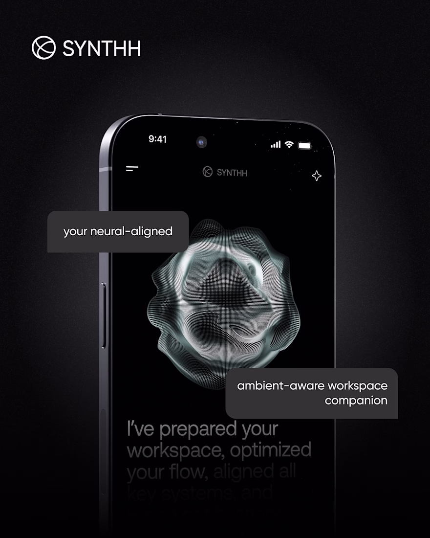
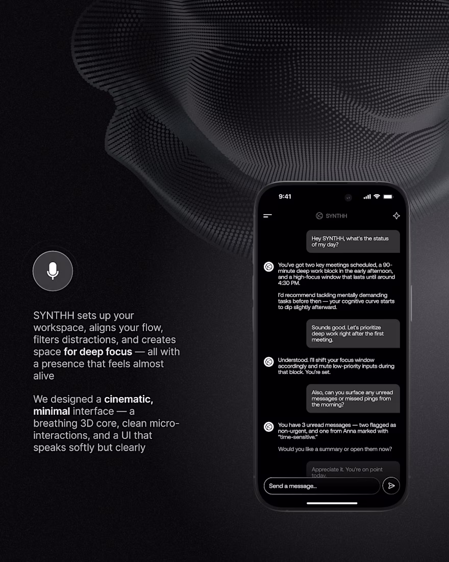
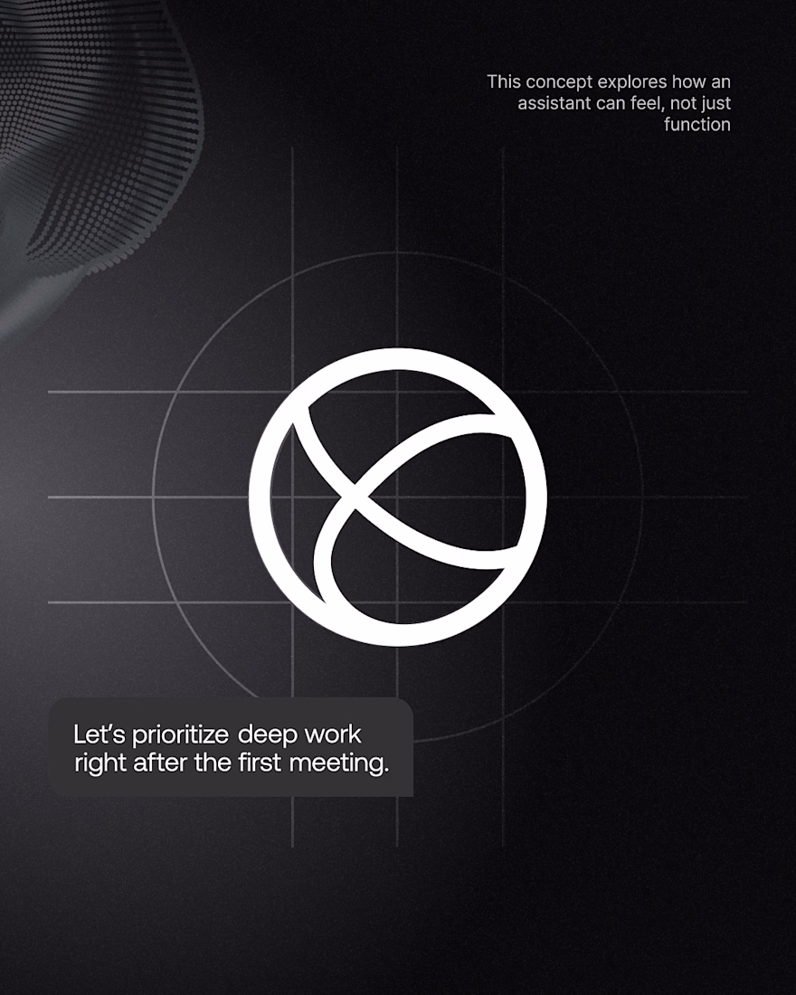
SYNTHH was our take on what an AI workspace assistant could feel like if it was designed around focus instead of constant notifications.
Instead of another chat interface, we explored a calmer experience with cinematic visuals, subtle motion, and an interface that fades into the background while helping you stay in flow.
We wanted every interaction to feel intentional, from the ambient UI to the conversational experience and the overall visual language.
It's always fun looking back at concepts like this and seeing ideas that are becoming more relevant today than when we first designed them.
Amazing work!
Hey, Guys! 👋Just published a new Solar Energy Template — Sunara.
12 responsive pages, 2 CMS collections (blog + services with dynamic detail pages), a working contact form, and a design system built on 6 color tokens and Switzer + Instrument Serif.
The fun part is the motion: Lottie animations, animated number counters, immersive scroll reveals, infinite tickers, and parallax — plus a 404 page with a headline that animates in letter by letter.
Everything's tokenized and semantically named, so it's genuinely fast to rebrand.Grab it here 👇
https://sunara.framer.website/
A four-primitive motion vocabulary across twelve pages is a great way to keep the system coherent. The shared timing probably does as much brand work as the individual effects.