The network for creativity
Join 1.25M professional creatives like you
Connect with clients, get discovered, and run your business 100% commission-free
Creatives on Contra have earned over $150M and we are just getting started
Back to feedPost

A quick raw-to-edited breakdown of my own branded content workflow.
The goal was to take a simple talking-head clip and turn it into a more polished, recognizable, and trust-building piece using consistent visual direction, branded layout, clean pacing, and motion graphics.
Good editing doesn’t just improve how content looks.
It helps the message feel more professional, memorable, and aligned with the brand.
Motion DesignsocialmediastrategistvideoeditormotiondesignerSocial Media StrategyVideo EditingAdobe After EffectsAdobe Premiere ProHeyGen


The network for creativity
Join 1.25M professional creatives like you
Connect with clients, get discovered, and run your business 100% commission-free
Creatives on Contra have earned over $150M and we are just getting started

Challenges
View all


Related posts

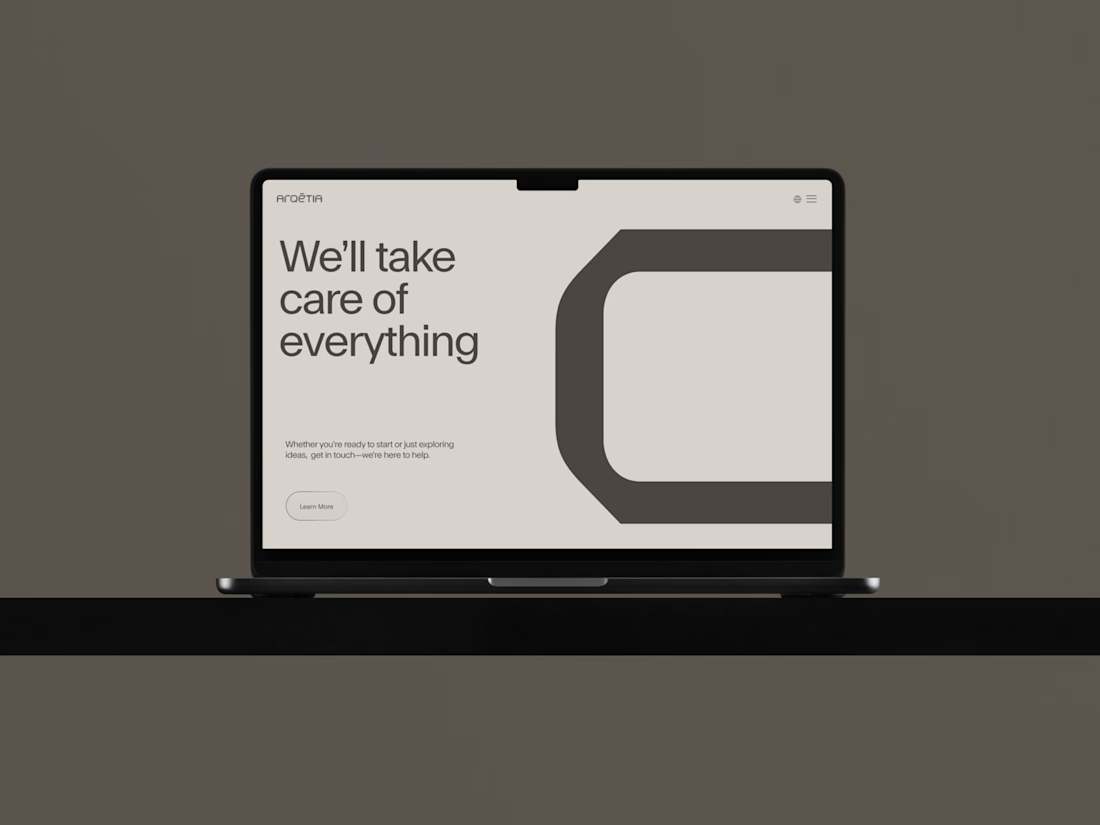
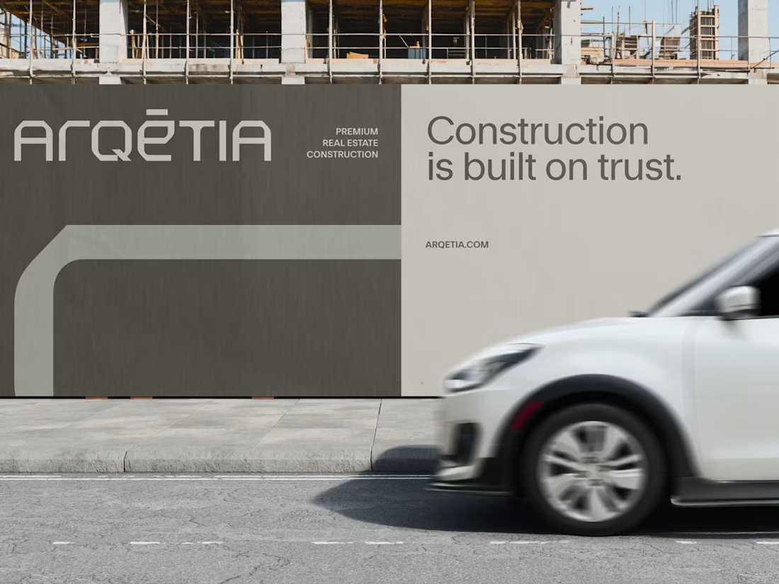
What if construction felt as clear as the space it creates?
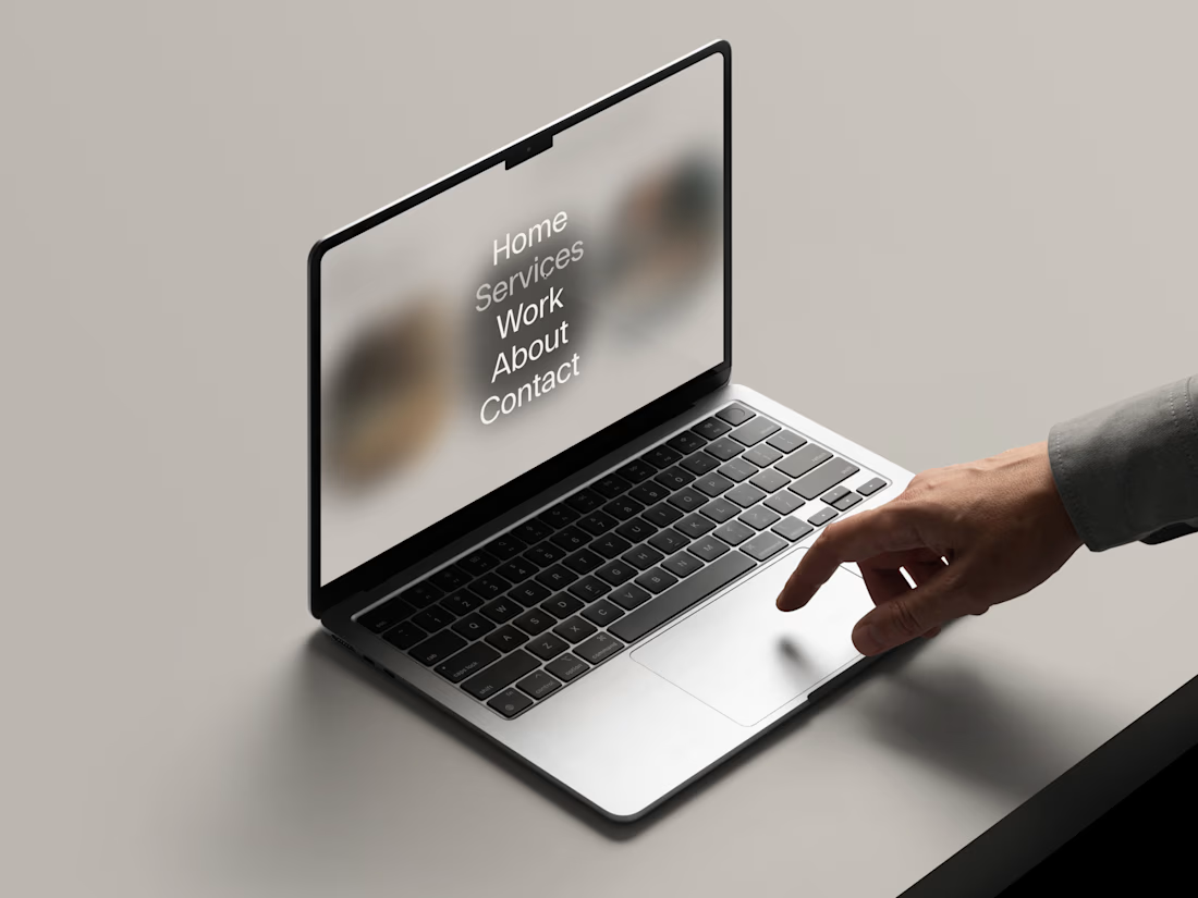
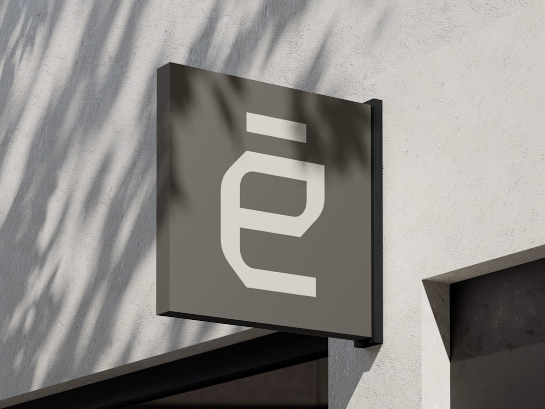
For Arqētia, we built a visual identity around one of the industry's most important client needs: transparency. A direct response to the uncertainty often associated with construction, from unclear processes and budgets to timelines and decision-making.
The concept makes transparency tangible, translating it into a visual system that feels open, structured and precise.
check it out

Very clean identity work

Hi :) This is a journey through asteroids into the heart of a star. Built with Three.js, React Three Fiber, and custom GLSL shaders. Liquid images, interactive particle typography, and a core that opens under your cursor.


Man... this is cool. 😍

SinkFlower.-Submerged beauty in motion.
The work contains immersive animation and fine details I’ve always wanted to try.
Sound ON
I used the sound of tearing fresh bread for one of the visual actions here.
Guess which part it is.👀

I really like the motion.