The network for creativity
Join 1.25M professional creatives like you
Connect with clients, get discovered, and run your business 100% commission-free
Creatives on Contra have earned over $150M and we are just getting started
Back to feedPost

I was handed a logo and a color palette. The client needed everything else — the system that turns a few brand decisions into a working enterprise product.
The project: a from-scratch redesign of an eIDAS-compliant B2B signature platform. Legally binding document workflows, enterprise customers, zero room for ambiguity.
I built the system in a deliberate order: icons → tokens → components → screens. Each layer constrained the one above it. That order is the whole method — by the time the first screen was designed, the system underneath was already stable. Screens demonstrated the system instead of driving it.
The token architecture had three layers: global primitives, alias tokens that describe intent (surface.primary, border.subtle), and component tokens that bind intent to elements. Sounds academic — until the team grew and other designers started building on top of my foundation. Some of my decisions held. Others got changed.
The token architecture absorbed both without breaking. That's the only test that matters.
A system that can't be changed isn't a system — it's a style guide.
Full case study — the setup, the build order, and three surfaces where the system did real work: bozenabulat.com/projects/b2b-signature-platform-redesign
bozenabulat.com
B2B Signature Platform Redesign
A token-based design system for a B2B signature platform built on an enterprise CRM. Turned inherited brand foundations into a scalable architecture.
The network for creativity
Join 1.25M professional creatives like you
Connect with clients, get discovered, and run your business 100% commission-free
Creatives on Contra have earned over $150M and we are just getting started








Related posts


Three weeks into building the Pasted website, after the design was approved, an 11-page document arrived with a whole new vision.
It was beautiful work, and it described a different project at the agreed price.
I asked them to decide: keep the approved scope, or pause and price the new idea separately. On day six, they chose the original. We shipped two weeks later.
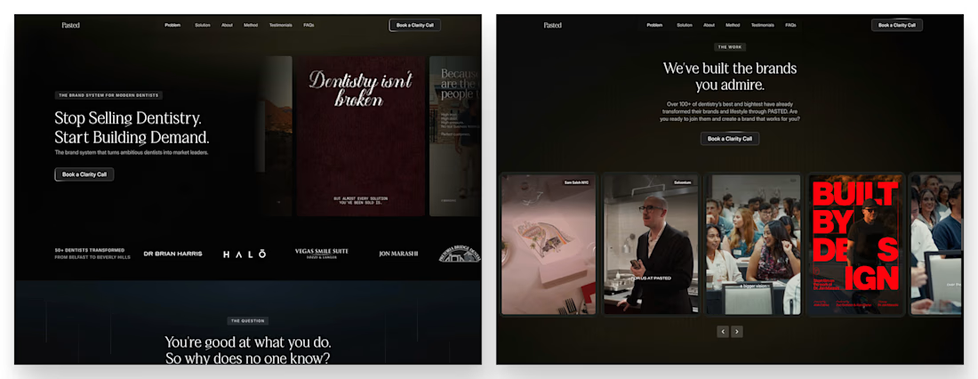

Offering to price the new vision as its own phase also lets the client see what the idea costs without it feeling like a no. Was a change-order process already written into your contract, or did you build that path on the spot?

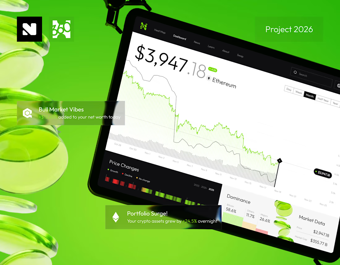
Product design for a crypto platform, including branding, logo, and a complete UX/UI system. The project focuses on simplifying complex financial interactions.


Designed a tech stack and toolkit section for a web design and development agency.
The goal was to present the technologies and creative tools behind the agency's work in a clean, structured, and easy-to-explore layout.
A clear visual hierarchy, grid-based layout, subtle dividers, and teal accents keep everything consistent with the overall brand identity.
For agencies and SaaS founders, a website should do more than look good. It should communicate expertise, build trust, and make it easy for potential clients to understand what you offer.
That's the thinking I bring to every design.
Designed in Figma.
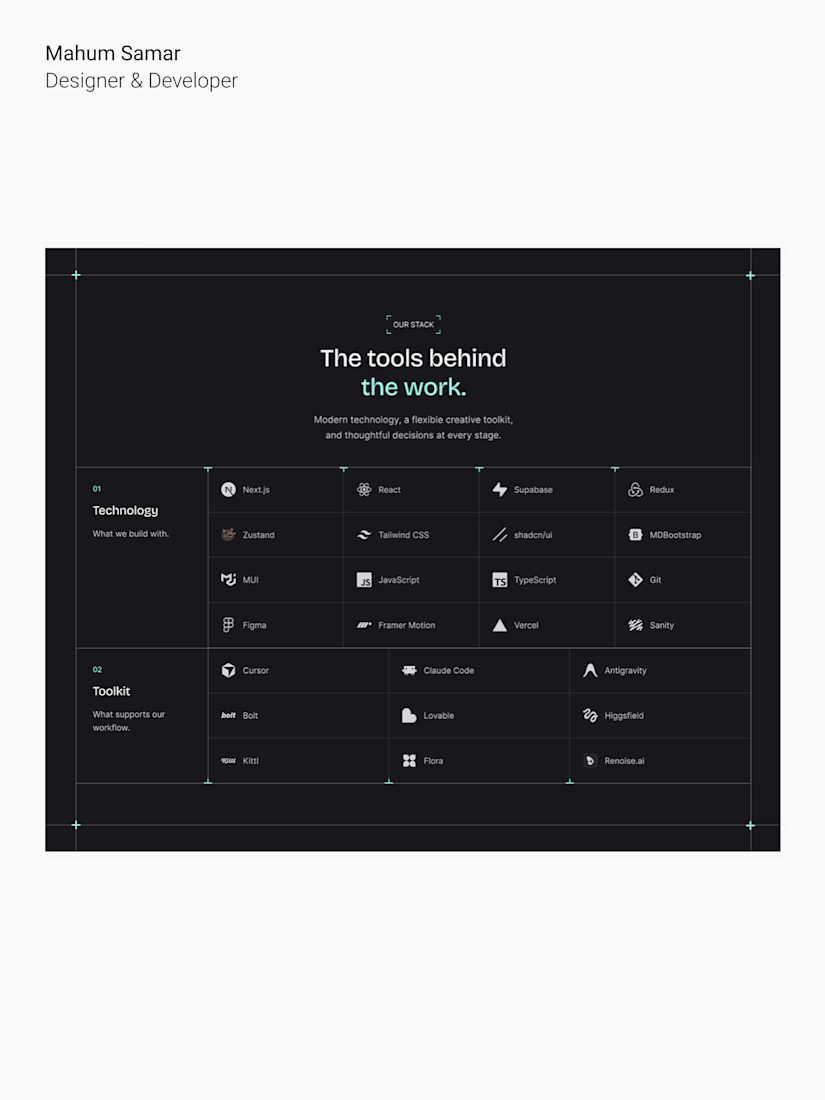

A tech stack section is where most agency sites get cluttered, Mahum. The grid-based layout with those subtle dividers keeps every tool readable, and the teal accents tie it all back to the brand. Sharp work.