The network for creativity
Join 1.25M professional creatives like you
Connect with clients, get discovered, and run your business 100% commission-free
Creatives on Contra have earned over $150M and we are just getting started
Back to feedPost

Creators, which page in your Kajabi funnel are you least confident in right now?
Your sales page, checkout, or member portal?
It’s easy to focus on getting the offer, content, and traffic right while overlooking the actual experience people have once they land on your site.
A sales page might have great copy but feel confusing.
A checkout might work perfectly but create unnecessary friction.
And a member portal might have all the content but still feel difficult to navigate.
These small UX issues can quietly affect conversions, trust, and how people experience your brand.
So which one needs the most attention in your Kajabi funnel?
Sales page, checkout, or member portal?


The network for creativity
Join 1.25M professional creatives like you
Connect with clients, get discovered, and run your business 100% commission-free
Creatives on Contra have earned over $150M and we are just getting started
Trending
retrofuturism
Share your favorite designs from the past exploring the distant future. Or your own take on the aesthetic 🚀
halftone
Dots. Texture. Grain. Let's see your designs using the halftone technique.

Midjourney
Creatives are showing off what they're making with Midjourney.
colorgrade
Video editors sound off: How do you enhance the mood of your video in color grading?



Related posts

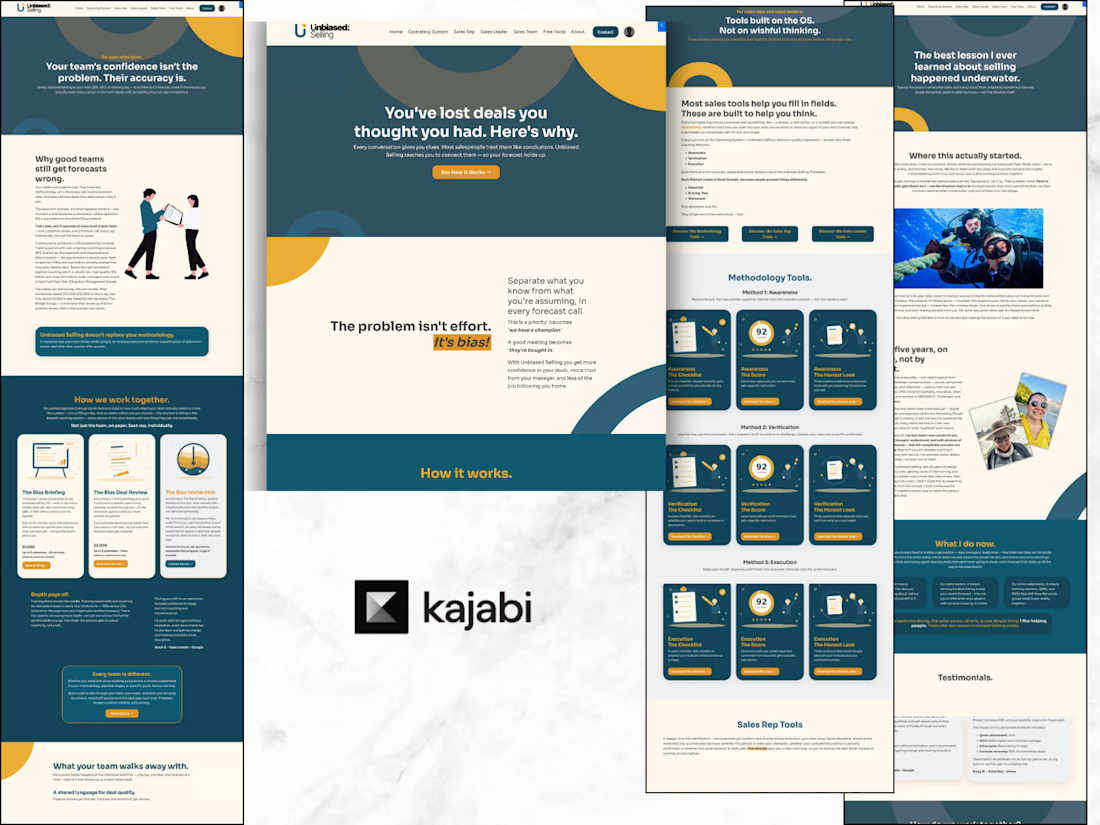
Just completed and documented a verified Kajabi build for DVA Brand Communications.
I migrated 6–8 pages from Wix to Kajabi, built separate corporate and individual funnels, created a branded client portal, and connected segmentation with nurture automation.
The project was completed and paid through Contra, and the live platform continues to run on Kajabi.
If you’re moving to Kajabi or consolidating a fragmented website, funnel, and client experience, this is the kind of system I build.
A quick visual look at the verified Kajabi delivery: website, funnel, and client portal in one connected system.

Building a website with a corporate touch — it had been a while since I’d worked on a project like this, and I absolutely loved it!
The client came prepared with a clear branding guide, strong copy, and a clear vision of what they wanted. And honestly, that makes such a difference.
Within just 3 weeks, I had the entire website and platform fully set up and ready to sell.
Front end? Done.
Back end? Done.
Full customer journey? Done.
This was such a lovely project to work on, and everything came together so smoothly. Not because building a complete website and platform is always “easy,” but because the client gave me everything I needed from the start.
Clear direction. Clear branding. Clear copy. Quick feedback.
It meant I could focus on what I do best: taking all those pieces and turning them into a polished, functional platform that’s ready for business.
And when the review rounds are a breeze? Even better.
What I did for this project:
- Built and designed the 10-page website
- Set up the Kajabi Coaching Products
- Created and customized the checkout pages
- Set up and branded all essential system pages
- Connected the front-end website with the back-end systems
Made sure the entire platform was fully functional and ready to sell


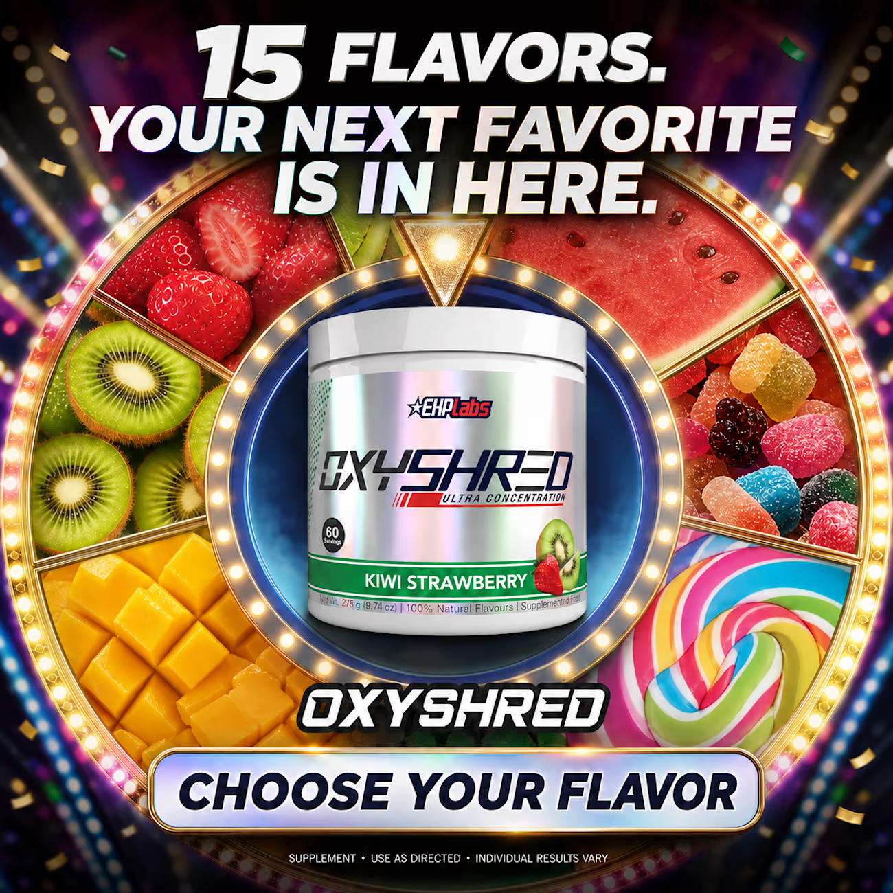
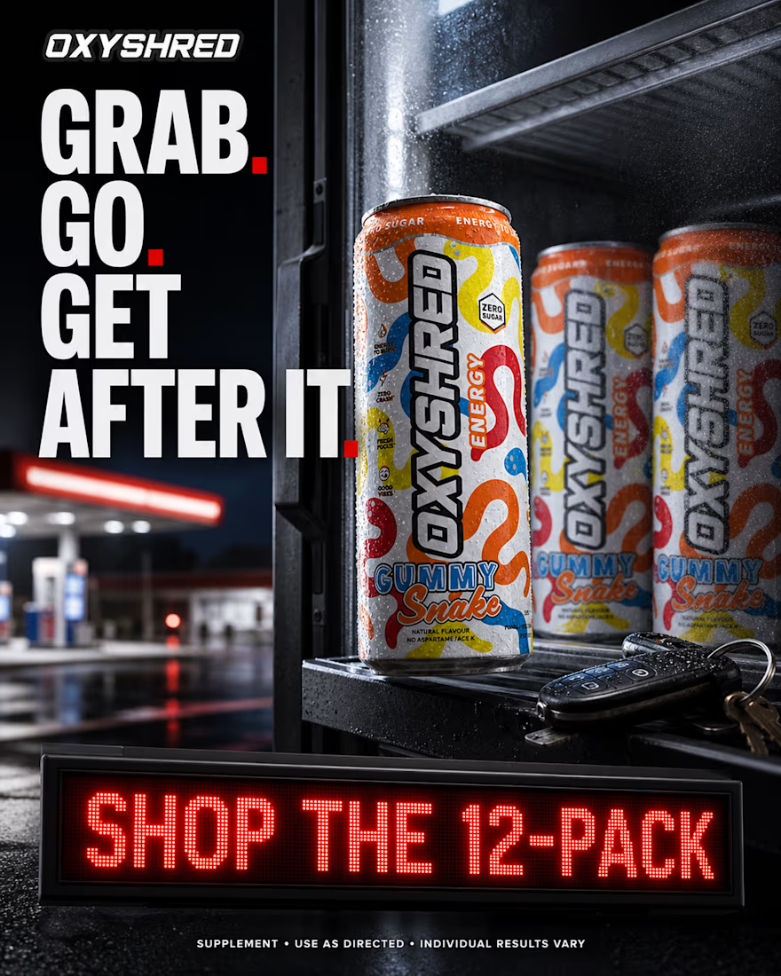
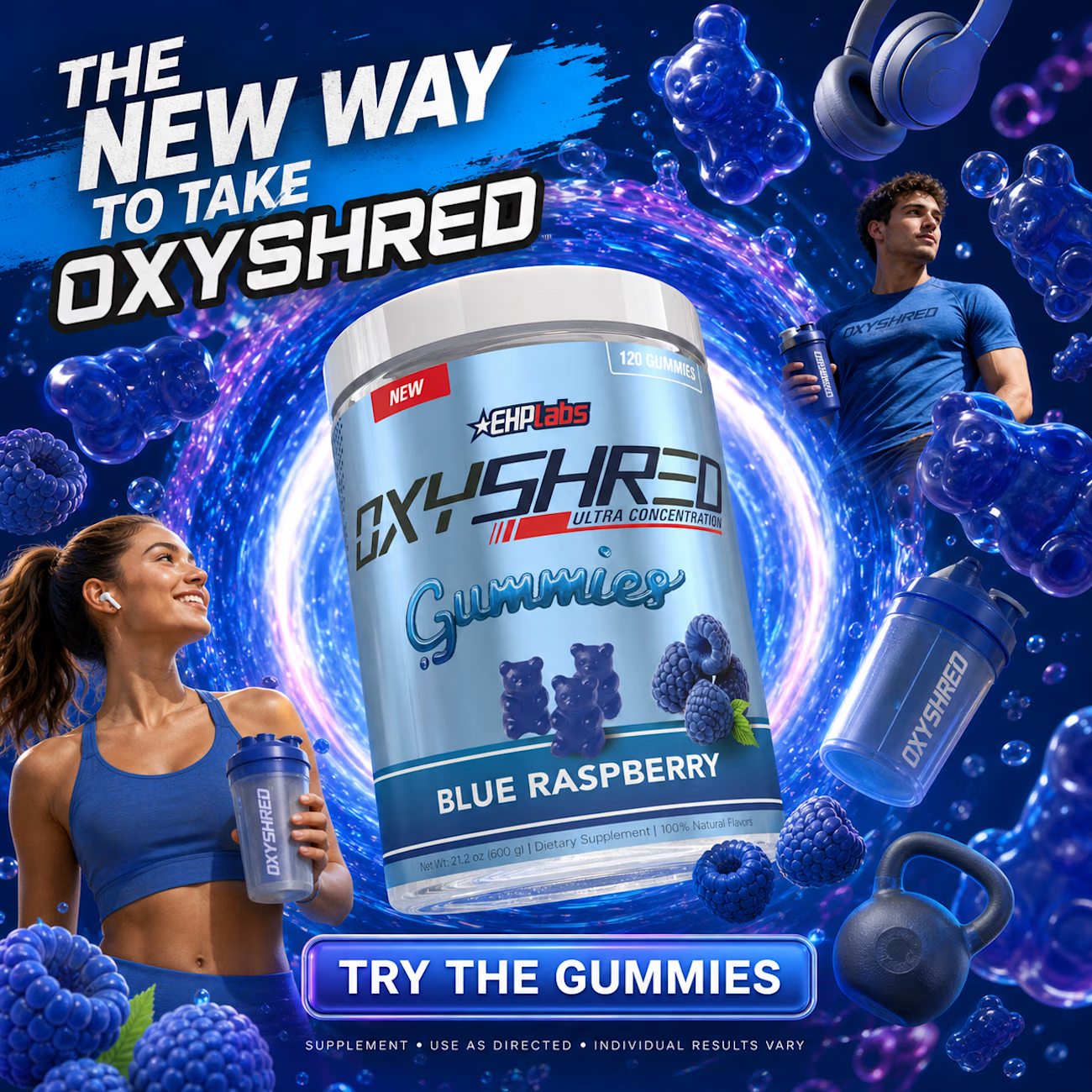
Top-of-funnel concept statics I created for Oxyshred. One idea that many advertisers are unaware of is that static / image ads do not have to be stuck in the bottom of the funnel. Largely, they are due to the way they are used, but educating new consumers about a product/launch/feature is not exclusive to video advertising. You can educate consumers in any format you like if your creative communicates the ad concept well enough.



Solid work