The network for creativity
Join 1.25M professional creatives like you
Connect with clients, get discovered, and run your business 100% commission-free
Creatives on Contra have earned over $150M and we are just getting started
Back to feedPost

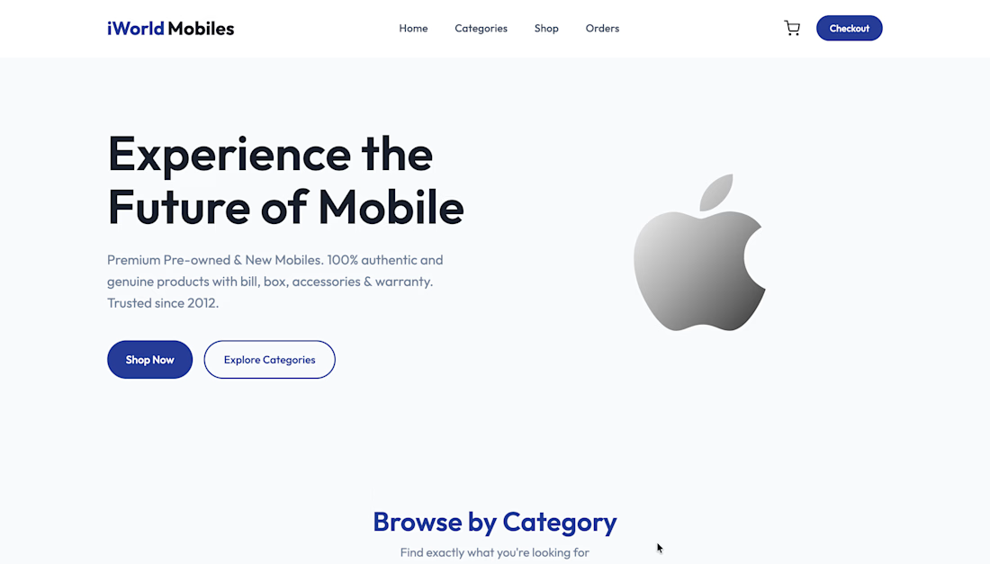
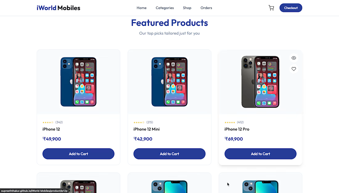
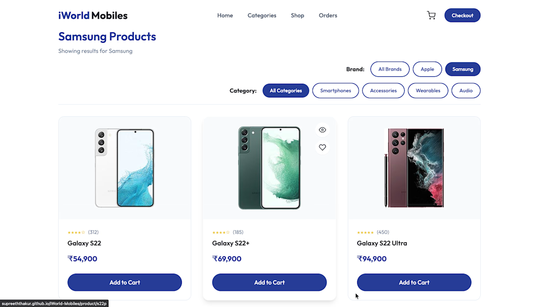
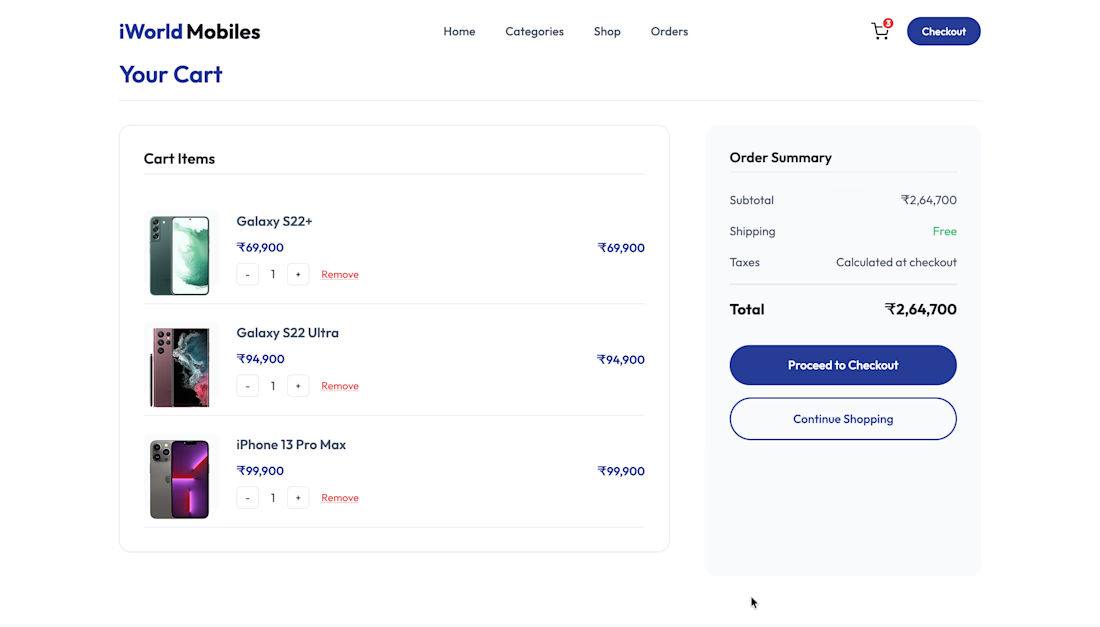
Developed a responsive eCommerce website for iWorld Mobiles, featuring product catalog, category filtering, product detail pages, shopping cart functionality, and an intuitive user experience. Optimized the website for performance, accessibility, and seamless browsing across desktop and mobile devices.


The network for creativity
Join 1.25M professional creatives like you
Connect with clients, get discovered, and run your business 100% commission-free
Creatives on Contra have earned over $150M and we are just getting started

Challenges
View all


Related posts

I usually don't stop at 3 breakpoints when building a website.
Most people think about: Mobile, Tablet, Laptop
I like adding one more: Desktop
Because what looks great at 1440px can feel completely different at 1920px...
- The layout gets too wide.
- Spacing starts feeling off.
- Content loses its balance.
So I like testing the system across: Mobile → Tablet → Laptop → Desktop
Not because every website needs exactly 4 breakpoints. But because responsive design isn't about making a few screen sizes work.
It's about making the whole system work.
Follow Rushabh for more website fundamentals, experiments, and things I learn while building for the web.

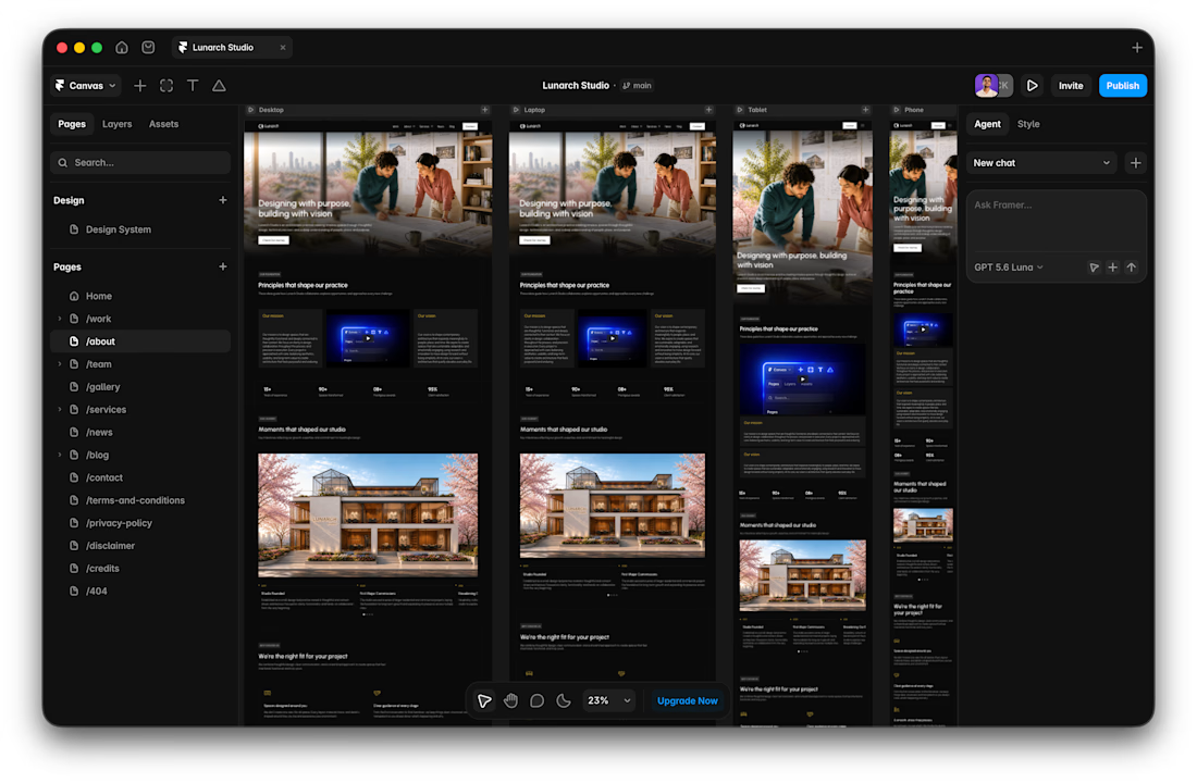

Wide screens expose spacing issues that laptop previews can hide.

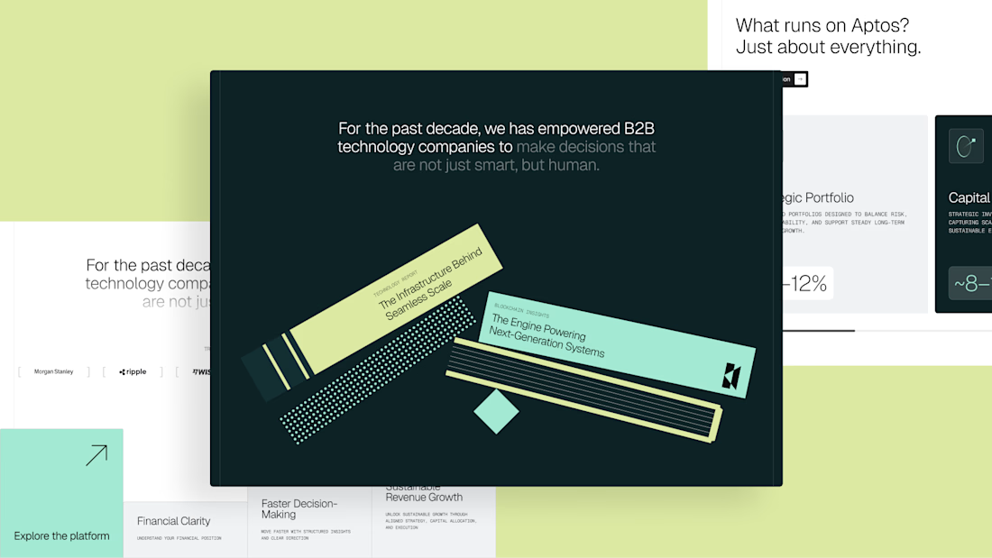
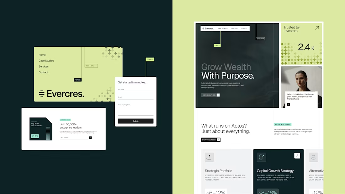
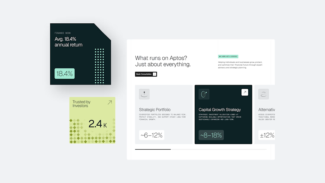
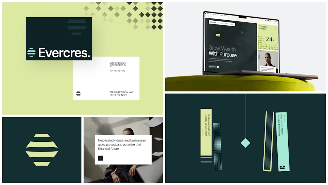

Well crafted, the details make this feel premium.


I’ve been razzmatazzing and flibbertigibbeting with Claude Code and somehow ended up with a new yels.dev.
It finally feels like me: simple on the surface, slightly complicated underneath, and very much alive.
You can see who I am, what I do, the work behind Herodot, RaptorLabs, CyberLink Security and Solmint, plus a selection of projects I’ve built across AI, cybersecurity, Web3, product systems, education, archives, and experimental digital spaces.
Built to be explored


The simple-on-the-surface, layered-underneath idea comes through so clearly in the presentation. I especially like how the project archive turns the site into something to explore rather than just a résumé of links.