The network for creativity
Join 1.25M professional creatives like you
Connect with clients, get discovered, and run your business 100% commission-free
Creatives on Contra have earned over $150M and we are just getting started
Back to feedPost

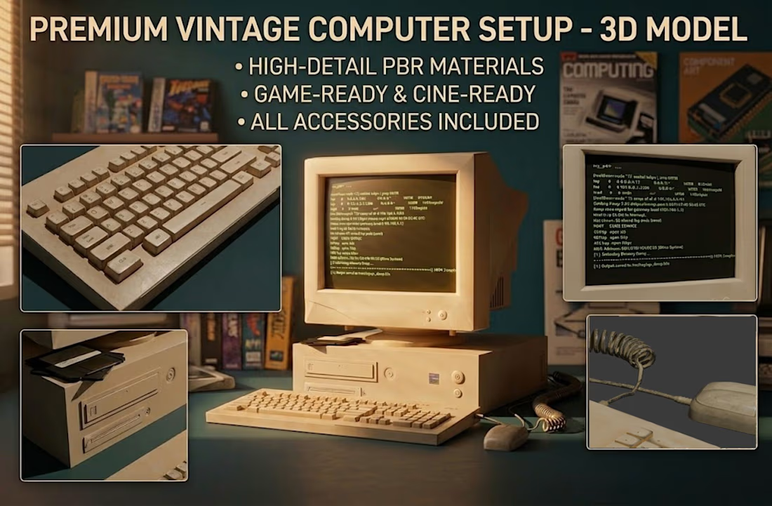
I made a Y2K nostalgic computer in Omma.🚀
It is not just a static scene. The mouse, keyboard, interface, and power button all have simple interactions and basic commands, which makes it feel more like a tiny retro desktop world you can explore.😊


I recalled my childhood
The network for creativity
Join 1.25M professional creatives like you
Connect with clients, get discovered, and run your business 100% commission-free
Creatives on Contra have earned over $150M and we are just getting started

Challenges
View all


Related posts


Contra Verified project: After Effects and Premiere Pro MOGRT templates for an AI data center.
Logo animation, animated map, lower thirds and stats auto-resize as you type, so the team can edit videos without a motion designer.


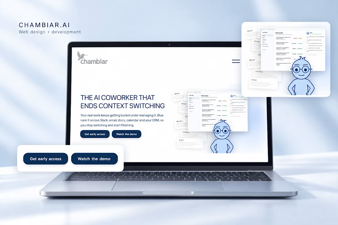
My favorite part of building Chambiar.ai was bringing the aesthetic to life through interaction.
Typography, imagery, spacing, and movement all shape how someone experiences a website. I worked on those details alongside the development, keeping the visual direction consistent as the layouts changed across devices.
I love projects where I can carry an idea from design into the finished build.
If you’re looking for a website with a clear visual identity and thoughtful interactions, let’s talk.



This is really nice