The network for creativity
Join 1.25M professional creatives like you
Connect with clients, get discovered, and run your business 100% commission-free
Creatives on Contra have earned over $150M and we are just getting started
Back to feedPost
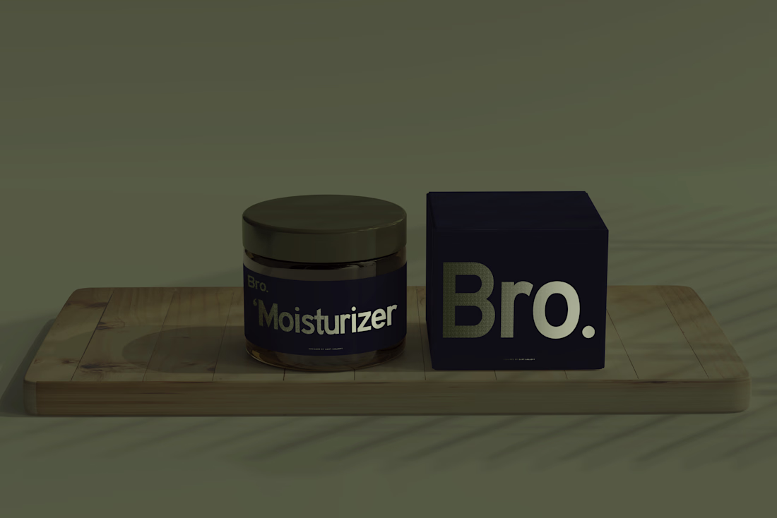
Bro. started with a focus on sun protection, evolving from BroSPF into a brand that embraces the full spectrum of men’s skincare. The design speaks to simplicity and boldness, with clean lines, functional layouts, and a color palette rooted in deep tones for timeless appeal. Every element reflects precision - from the typography that ensures clarity and recognition, to the packaging designed for effortless use. Bro. is more than a skincare brand; it’s a seamless blend of form and function, where each product is introduced with purpose, beginning with sun care as the gateway to a complete skincare journey.
Check out the full work: Bro.SPF | QART
Good work!
The simplicity feels intentional not basic and the typography + color palette give it that confident everyday use vibe. Feels premium but still real and approachable.
The network for creativity
Join 1.25M professional creatives like you
Connect with clients, get discovered, and run your business 100% commission-free
Creatives on Contra have earned over $150M and we are just getting started
Challenges
View allTrending
Claude
Claude has entered the design space. How are you using Claude Design?
Contra University
Learn from expert creatives how to earn more using next-gen AI tools.
fifaworldcup2026
The World Cup is here and the whole world's watching. How are you designing for the world stage?
creativeaiflow
Creative AI workflows are evolving. What tools do you use, and what are their strengths and weaknesses?
freelancerlife
Freelancer life is wins, pivots, and everything in between. What’s yours right now?