The network for creativity
Join 1.25M professional creatives like you
Connect with clients, get discovered, and run your business 100% commission-free
Creatives on Contra have earned over $150M and we are just getting started
Back to feedPost

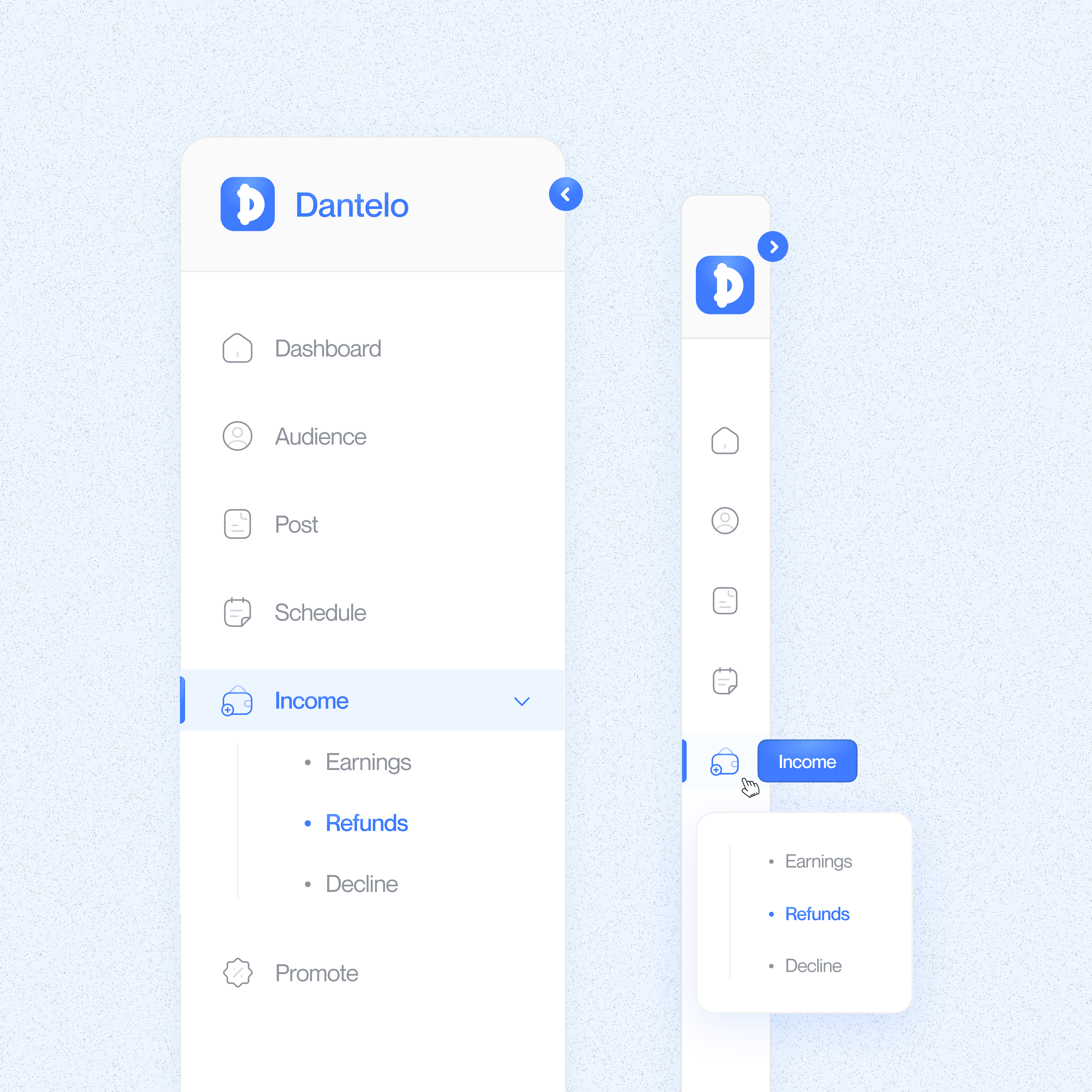
Saw a tweet yesterday that pushed me to try something new: pick one UI element and really dig into it.
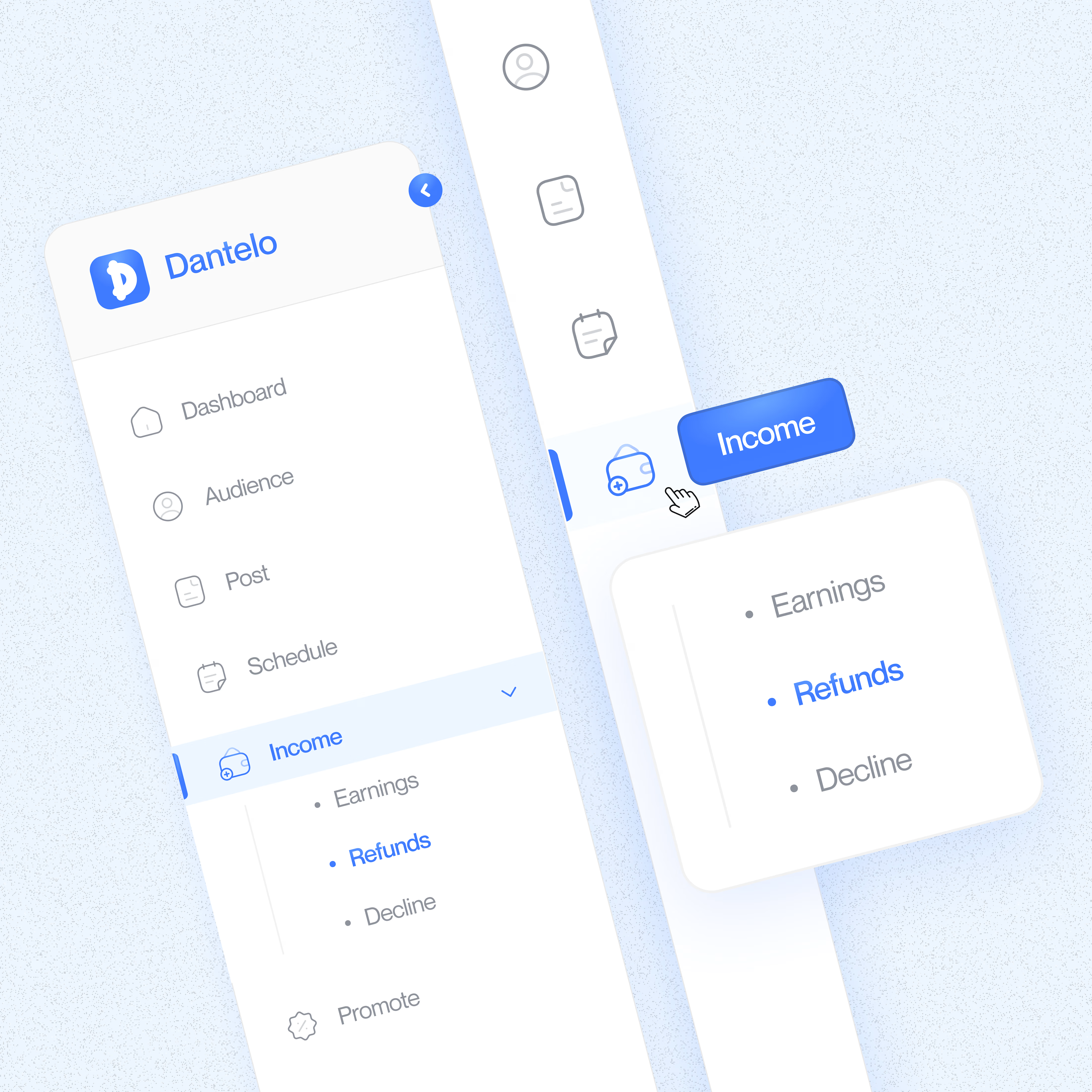
As designers, we use the same components every day without questioning them. So I decided to redesign a side navigation bar.
The goal was to make it more intuitive, less cluttered, and work smoothly on any screen size.
I focused on three things: • Putting the most important features front and center • Balancing compact design with readability • Adding small interactions that guide users without being obvious
It was a good reminder that even basic UI elements have room for improvement when you look at them differently.
Do you think navigation bars should stay familiar, or is it time to try more adaptive patterns?

The network for creativity
Join 1.25M professional creatives like you
Connect with clients, get discovered, and run your business 100% commission-free
Creatives on Contra have earned over $150M and we are just getting started










Trending

Claude
Claude has entered the design space. How are you using Claude Design?

Contra University
Learn from expert creatives how to earn more using next-gen AI tools.
creativeaiflow
Creative AI workflows are evolving. What tools do you use, and what are their strengths and weaknesses?
freelancerlife
Freelancer life is wins, pivots, and everything in between. What’s yours right now?