The network for creativity
Join 1.25M professional creatives like you
Connect with clients, get discovered, and run your business 100% commission-free
Creatives on Contra have earned over $150M and we are just getting started
Back to feedPost


The network for creativity
Join 1.25M professional creatives like you
Connect with clients, get discovered, and run your business 100% commission-free
Creatives on Contra have earned over $150M and we are just getting started



Related posts


Is text on album covers really tacky?
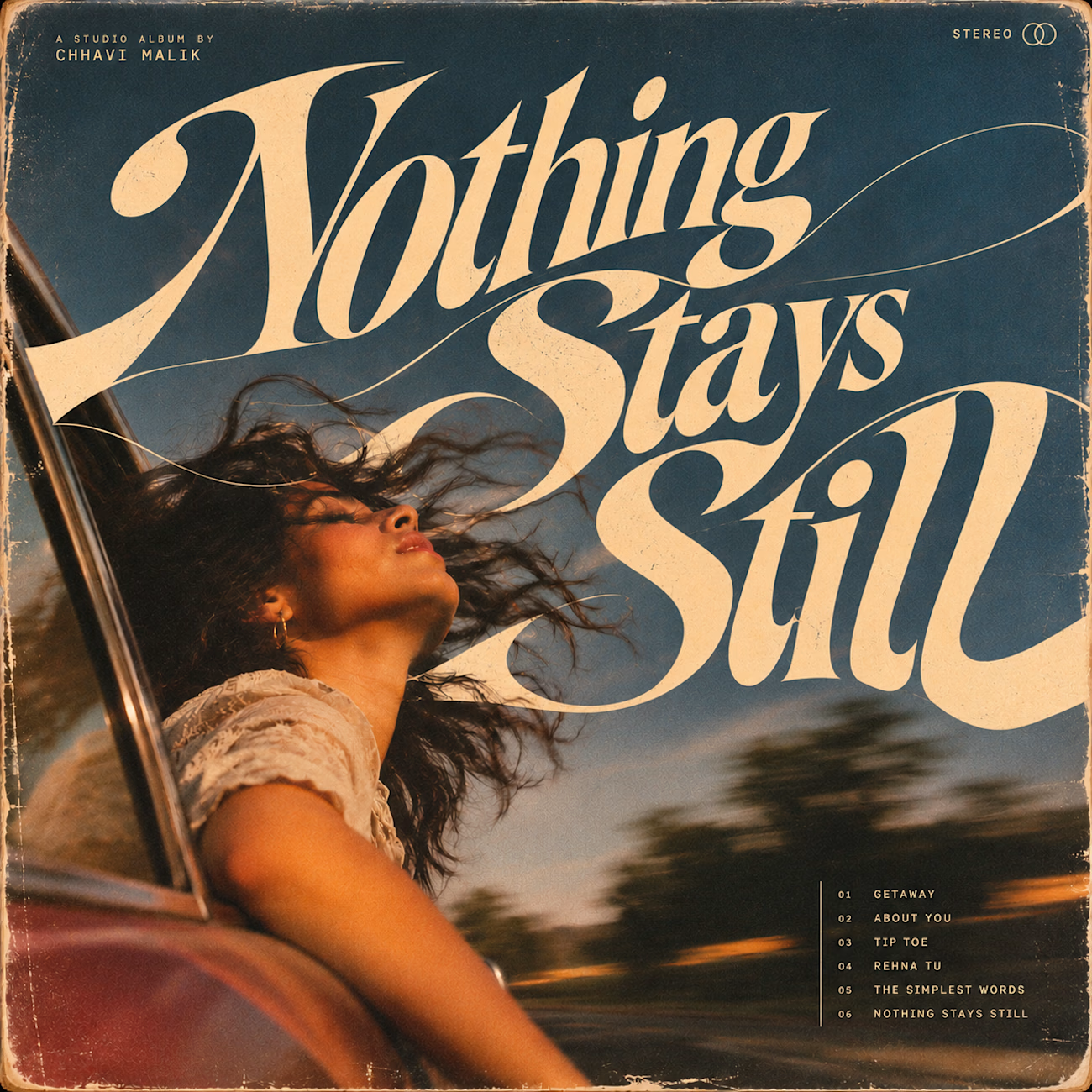
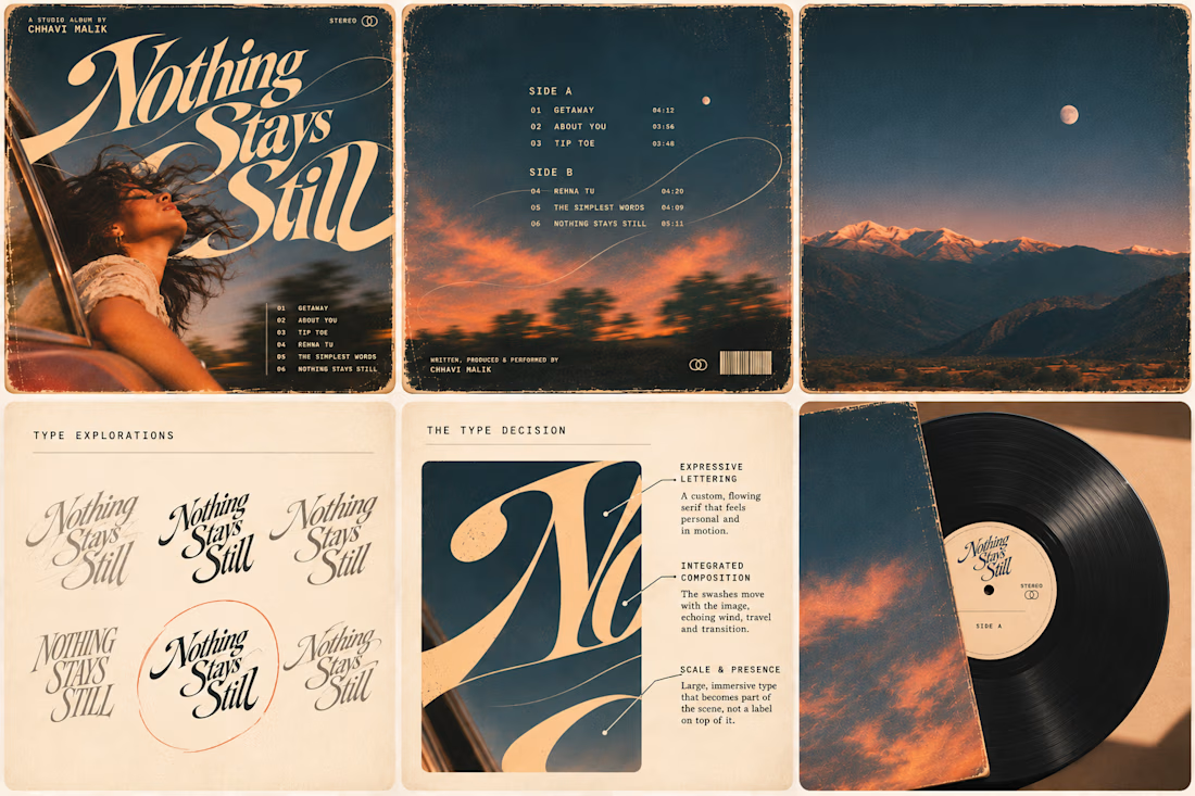
This question has been doing the rounds on X and I have to say, I'm firmly on the other side of that argument. I've always loved seeing typography become part of the artwork rather than just a title sitting on top of it.
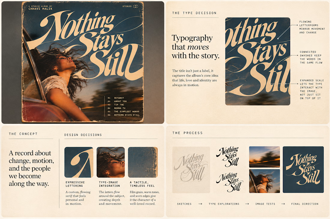
So I wanted to put that idea to the test with an imagined album called Nothing Stays Still, inspired by change, fleeting moments and everything in between:)
I played around with the lettering until it felt expressive, a little restless, and inseparable from the photograph.
Because I think badly considered typography is tacky. Typography itself? Give it a chance :)
What's an album cover where the type really makes it for you?


I fixed a logo in 10 minutes.
A client sent me an MS logo that looked cheap.
Problem: letters were too far apart, no overlap, wrong gold.
Fix: Interlocked the M + S, tightened the spacing, used metallic gold #D4AF37.
Same letters. Luxury feel.

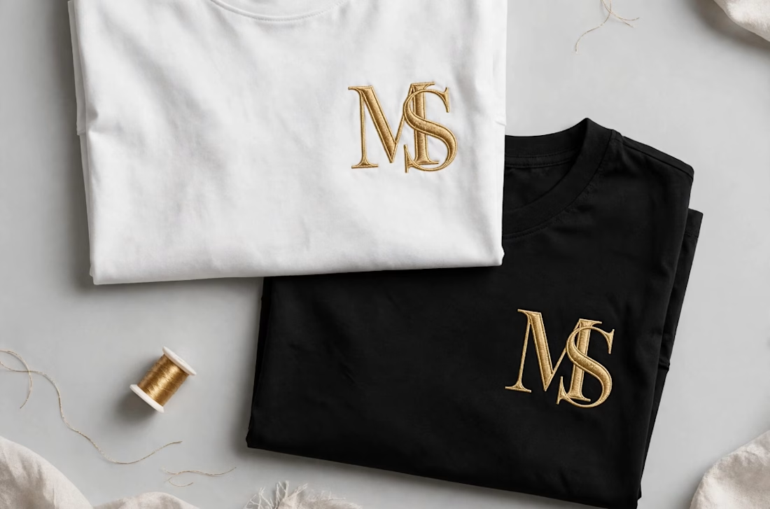

Interlocking the M and S also gives the embroidery one continuous shape to stitch, which tends to hold up better than two separate letters. Did you test how the overlap reads at chest-logo size, around 3 cm?

At 4Pixels Studio, our goal is to eliminate guesswork and help design teams secure fast client approvals. To build a highly accurate 3D master model that allows for seamless material testing and perfect lighting, a structured kickoff is essential.
I've made a post with some tips and tricks - how to make the workflow max comfortable and output - as close to designers' vision as possible, from the very first try!


🤗🧚🏻 you make magic 🌟