The network for creativity
Join 1.25M professional creatives like you
Connect with clients, get discovered, and run your business 100% commission-free
Creatives on Contra have earned over $150M and we are just getting started
Back to feedPost


NOCTURA — Editorial Video
A fusion of Google Veo 3 and Suno AI.
I’ve just released my latest experimental project, Noctura — a technical and artistic exploration of aesthetic consistency and cinematic atmosphere, created entirely with 100% generative AI.
⚙️ Tech Stack
Video: Google Veo 3 — with a strong focus on golden hour lighting, tactile textures, and realistic motion physics.
Audio: Suno AI — original music composition and vocal generation.
🎨 Concept
A surreal blend of High Fashion and Western aesthetics, pushing the boundaries of synthetic visual storytelling and AI-driven creative direction.
Watch the full project on my Contra: [Link]
#GenerativeAI #GoogleVeo #SunoAI #CreativeDirection #AIArt #AIFilm #CinematicAI:


The network for creativity
Join 1.25M professional creatives like you
Connect with clients, get discovered, and run your business 100% commission-free
Creatives on Contra have earned over $150M and we are just getting started





Related posts

👋 I'm new to Contra and I did my first post without realizing I hadn't even introduced myself!
Hey I'm Katya, I'm an AI Systems Architect, marketer and yoga teacher.
I build AI systems that bring in business and handle the work behind it. A voice agent that calls new leads back within seconds and books the appointment. A pipeline that traced 16,900+ leads to the ads that brought them. Listing videos made from the photos a real estate agent already has.
The marketing side came first. I built the multi-channel campaign for Jay Shetty's launch (22 million followers). After that I discovered the tech world and when AI came along, I realized I'm a builder at heart and never looked back! Building is so much fun 🤍
Here's what I've shared:
My first post: on building a fully AI-made YouTube video, end to end, because I'm camera shy 🙈 https://contra.com/community/MP9mFRuT-im-building-my-first-fully-ai-made
Last thing, if you're building with AI video or automation, I'd like to see what you're working on
And if you're hiring: I may be new to Contra but definitely not new to this work. Reach out for AI agent builds, apps, websites or anything in between.
P.s The video below is my AI avatar. My profile video is the real me :)


Nice Portrait....Has everything from a great pose, great composition and lighting and perfect environment setting.

Same prompt. Two builders.
One site made with Lovable, one with Google AI Studio. A Flemish still-life snack brand, gilt frames, GSAP scroll, the works.
Which one is better?
33 voted
67%

16 voted
33%

49 votes
Closed

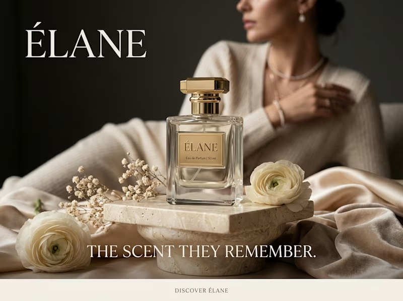
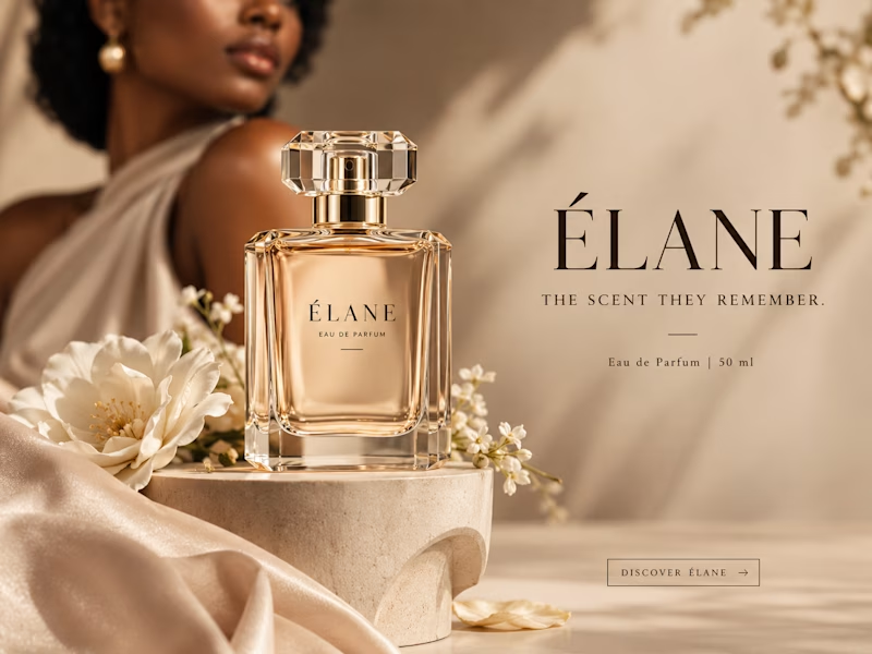
Same prompt. Same concept. Two AI tools. 👀
I gave ChatGPT and Gemini the exact same prompt to create a luxury perfume ad creative.
No changes. No extra instructions.
Now I want to know what YOU think:
Which creative did it better?
🔵 A— Gemini
🟣 B— ChatGPT
Look at the overall concept, visual quality, composition, typography, and how “ad-ready” it feels.
Who wins this round? 👀
Vote below and tell me what made you choose your answer.
#AIContent #AIAdvertising #AdCreative #CreativeStrategy #ChatGPT #Gemini #SocialMediaManager #SocialMediaStrategy #SocialMediaMarketing #MarketingStrategy #DigitalMarketing #ContentCreation
11 voted
39%
17 voted
61%
28 votes
Closed
