The network for creativity
Join 1.25M professional creatives like you
Connect with clients, get discovered, and run your business 100% commission-free
Creatives on Contra have earned over $150M and we are just getting started
Back to feedPost

What does confidence look like on a website?
For NYRA Beauty, a luxury makeup and beauty studio in SoHo, New York, it looks like a page that feels expensive before you’ve read a word of it.
A beauty studio sells a feeling. But the person booking has practical worries too: Will they match my skin tone? Can I trust these artists? Will it last all day? The design had to deliver the feeling and answer the worries.
Here’s how I approached it:
→ Set the mood first. A dark, warm palette of espresso, champagne, and gold, with soft serif headlines and editorial photography. The hero line, “More than makeup. It’s confidence,” says what the studio is really about.
→ Make the services feel like experiences. Not a price list. “Rituals of radiance, tailored to you” introduces four signature offerings: Signature Makeup, Bridal Couture, Hairstyling, and Skin & Glow Rituals.
→ Prove the details. “Luxury is in the details no one sees, but everyone feels” is backed by specifics: skin-first prep, true-tone matching across 40+ foundation shades, and an all-day lock that lasts 16 hours. The proof is what makes the premium price feel fair.
→ Introduce the people. “Hands you can trust with your face” shows each artist with their name and specialty. Nobody wants to hand their face to a stranger.
→ Let clients do the selling. A “Love Notes” section with real-sounding reviews from brides and editorial clients, then a clear booking prompt with a $50 deposit so the next step feels simple.
What I took from this one: in luxury services, the website is the first appointment. If it feels careless, no one will trust the studio with their face.
What’s the one detail that makes you trust a service business before you’ve ever visited?
#BuildingInPublic #WebDesign #UXDesign #CreativeDirection #BeautyBranding


Stunning and clean

I love this very much great design
The network for creativity
Join 1.25M professional creatives like you
Connect with clients, get discovered, and run your business 100% commission-free
Creatives on Contra have earned over $150M and we are just getting started







Related posts

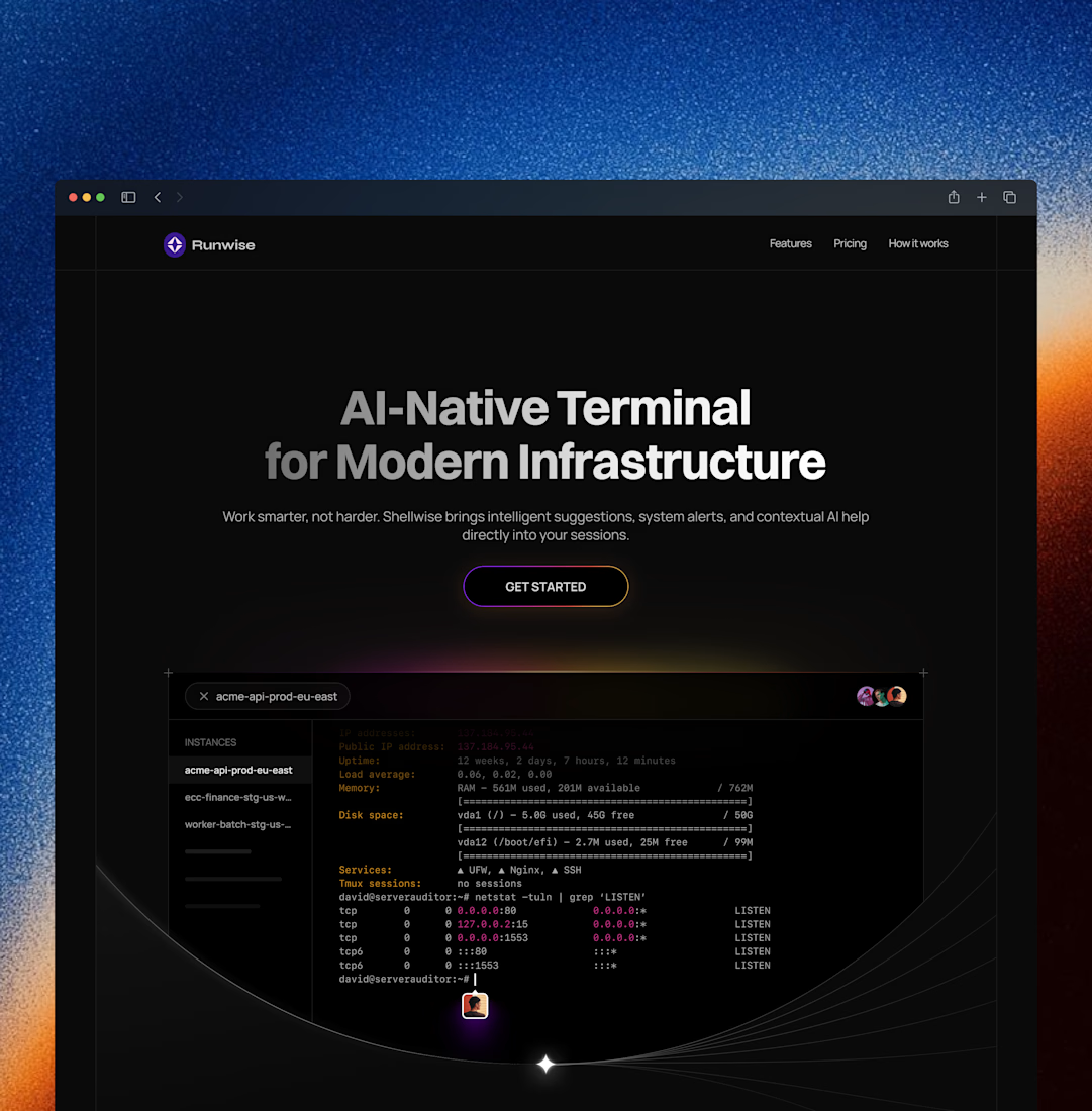
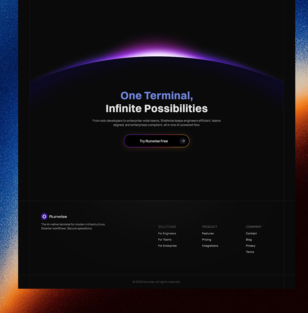
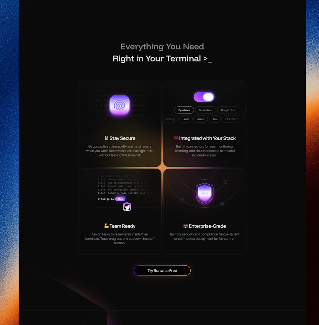
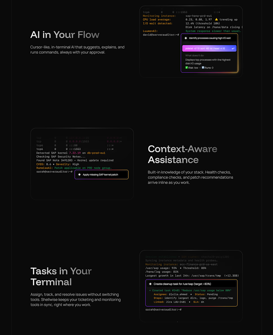
Landing page for an AI-native terminal platform



100+ people already use my free skill file to stop their AI from making the same 25 design mistakes.
Drop it into your project and your agent gets better at typography, spacing, color, and dark mode. Link in the comments.


Just launched Depth Text on the Framer Marketplace 🏔️
That iPhone lock screen effect, now for your website. Big glassy text behind your photo, with live date and time built in.
$8, and it comes with 3 months of Framer Pro free!
Link below to get the component. 👇
Beautiful 😍