The network for creativity
Join 1.25M professional creatives like you
Connect with clients, get discovered, and run your business 100% commission-free
Creatives on Contra have earned over $150M and we are just getting started
Back to feedPost


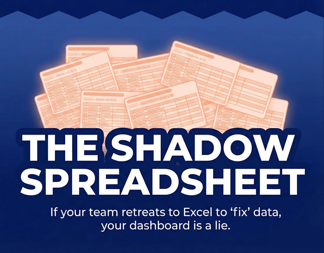
Your BI dashboard has a fatal flaw: it’s read-only.
When numbers look wrong, teams don’t fix them in the dashboard. They export to Google Sheets. Hello shadow spreadsheets. Goodbye single source of truth.
At Toolshed, we don’t just build reports, we build Operational Hubs.
For Sully.ai, we replaced manual billing workflows with a centralized platform that allows real-time adjustments with audit trails and guardrails.
For Vergo, we built a projection module supporting percentage-of-completion accounting, enabling job-level edits directly in Retool.
The takeaway: If your team exports data to “fix it,” your internal tools are failing. You don’t need more charts—you need an Adjustment Layer.
We’re Toolshed. We build internal tools that scale.
The network for creativity
Join 1.25M professional creatives like you
Connect with clients, get discovered, and run your business 100% commission-free
Creatives on Contra have earned over $150M and we are just getting started





Related posts

Revlane Revenue: SaaS Dashboard Animation (Concept)
A concept animation for Revlane, a fictional revenue dashboard. The KPIs count up, the week's bars rise, and a trend line draws across. A "New record" toast slides in and the camera pushes in on the numbers. Then the cursor clicks Sunday's bar to open its value, and the view pulls back to the full dashboard.
Made in Jitter with Counter, mask reveals, and Scale and Move for the camera. Custom UI sound. 12-second loop.


The KPI count-up + bar rise + trend draw is a classic SaaS hero beat — the “new record” toast is a nice narrative punctuation before the camera push.



Super clean work!

Oetux – SaaS Revenue Analytics Dashboard
The client had a lot of data, but the real problem was making sense of it.
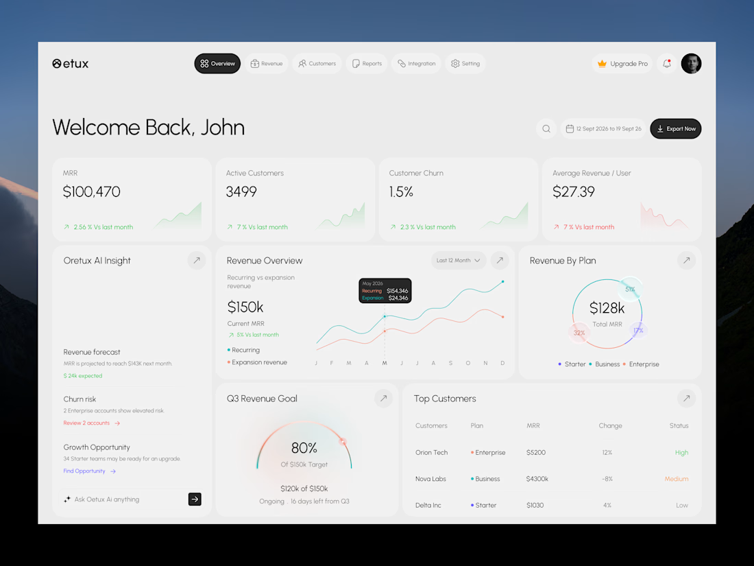
MRR, revenue, churn, active customers, growth, customer performance, goals. Every metric was important, but when everything gets the same attention, users don’t know where to look first.
The existing experience made users spend too much time switching between information and trying to connect the numbers.
So we focused on how SaaS teams actually read their business data. We structured Oetux around the questions that matter most.
How is revenue performing?
Are we growing?
Are customers staying?
Where are we losing revenue?
What needs attention right now?
Then we organized KPIs, revenue trends, customer performance, churn insights, goals, and AI powered insights into one clear experience.
The goal wasn’t to remove data.
It was to organize the data so users could understand it faster.
That’s what we solved with Oetux.
Turning a data heavy SaaS dashboard into an experience that helps teams see their business clearly and make better decisions.


Love the clean layout.