The network for creativity
Join 1.25M professional creatives like you
Connect with clients, get discovered, and run your business 100% commission-free
Creatives on Contra have earned over $150M and we are just getting started
Back to feedPost
The Softest Part of Your Day"
Why Allbirds:
I chose Allbirds because their brand embodies sustainable comfort and mindful design. Their commitment to natural materials and eco-friendly practices resonates with modern consumers who value both style and environmental responsibility.
Narrative:
My narrative focuses on the intimate, everyday moments where comfort matters most. The ad follows a journey from morning routines to urban exploration, culminating in the tagline "The softest part of your day."
Visual direction:
The 72-second piece balances product showcase with emotional storytelling, emphasizing how small comforts, like the right pair of shoes, can transform your entire day.
All visuals and audio were created end-to-end using Morphic during the challenge period, using the trial credits. No external apps were used.

awesome

thank you! ☺️


Nice!
The network for creativity
Join 1.25M professional creatives like you
Connect with clients, get discovered, and run your business 100% commission-free
Creatives on Contra have earned over $150M and we are just getting started



Related posts

A bento loop for OnlyCards where every tile has its own personality.
I had fun animating every little element to make it feel truly alive, while keeping the brand’s energy and the looping effect, which was the goal from the start.


obsessed with this, there's so much personality!

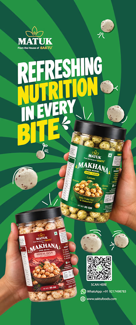
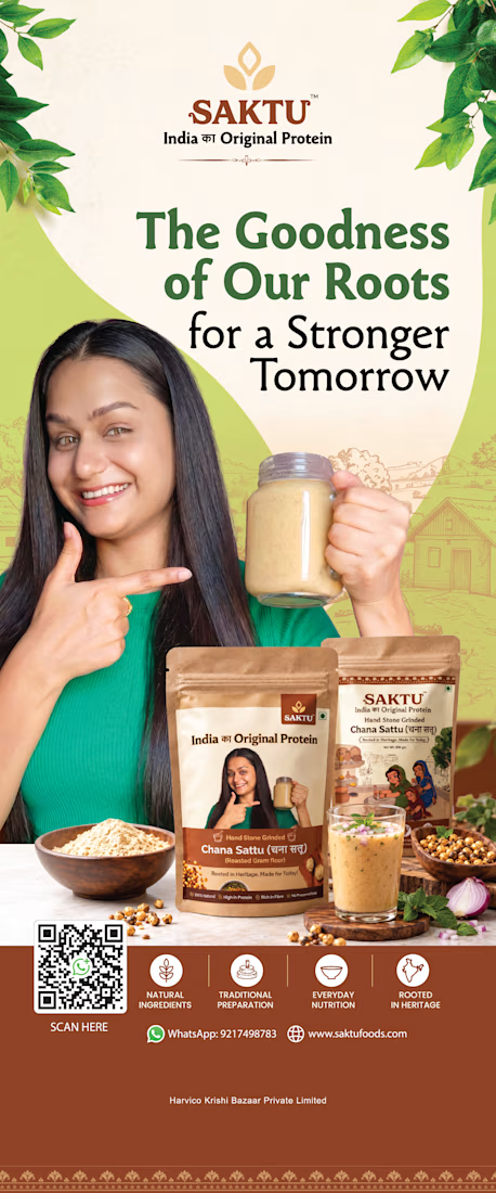
SAKTU & MATUK — Retail Standee Design & Brand Activation
Project Overview
Designed two promotional standees for SAKTU and MATUK, food brands bringing traditional Indian nutrition into contemporary consumer lifestyles.
The objective was to create high-impact, large-format promotional visuals that communicate each brand's product offering, reinforce brand recognition, and attract attention in retail and promotional environments.
Creative Direction
The two standees use distinct visual approaches tailored to each brand's identity and product positioning.
SAKTU — Rooted in Heritage. Made for Today.
The SAKTU standee highlights traditional, hand stone-ground Chana Sattu through warm earthy tones, heritage-inspired graphics, product packaging, and lifestyle-led imagery. The composition emphasizes the brand's roots in Indian nutrition while presenting the product in a modern, approachable way.
MATUK — Refreshing Nutrition in Every Bite
The MATUK standee takes a bold, energetic approach with a vibrant green palette, oversized typography, dynamic radial patterns, and prominent product visuals. The composition showcases the Makhana snack range while creating a contemporary, attention-grabbing presence suited to a retail display.
My Role
Visual Designer | Art Direction | Retail Marketing Design
My responsibilities included:
Creative and visual direction for both standees
Large-format layout and composition
Typography and visual hierarchy
Product packaging presentation
Brand messaging and promotional communication
Integration of product benefits, QR codes, and contact details
Maintaining brand consistency while differentiating the two visual identities
Design Approach
The goal was to make each standee immediately recognizable and easy to scan from a distance. SAKTU uses a heritage-led, natural aesthetic to communicate authenticity, while MATUK uses bold color, expressive typography, and energetic compositions to communicate a modern snack experience.
Together, the designs demonstrate how a shared brand family can maintain a cohesive commercial presence while giving individual product brands their own visual character.
Deliverables
1 SAKTU promotional standee
1 MATUK promotional standee
Large-format print design artwork


Two ad directions for Aura Aesthetics’ Botox Flash Sale. Same offer, different layout and feel.
Option A: split layout, model left, price card right, olive green accents, bold and direct
Option B: model fills the right, soft rounded cards on the left, all warm neutrals, quieter and more elegant
Which one makes you tap “Schedule Your Discount”? 👇
9 voted
53%

8 voted
47%

17 votes
Closed

I'd tap A: the big $179 reads first and the olive block gives the CTA real contrast. Did you run both as live ads? Curious which one won on CTR.