The network for creativity
Join 1.25M professional creatives like you
Connect with clients, get discovered, and run your business 100% commission-free
Creatives on Contra have earned over $150M and we are just getting started
Back to feedPost


Founders: quick question.
If your product were sitting on a shelf beside 10 competitors, would someone know which one was yours?
Not just because of the logo.
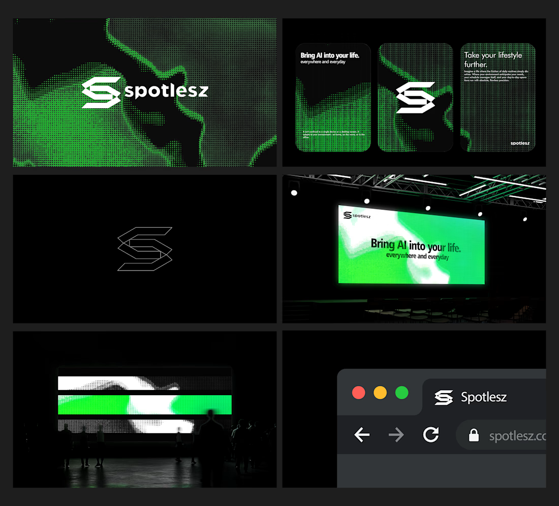
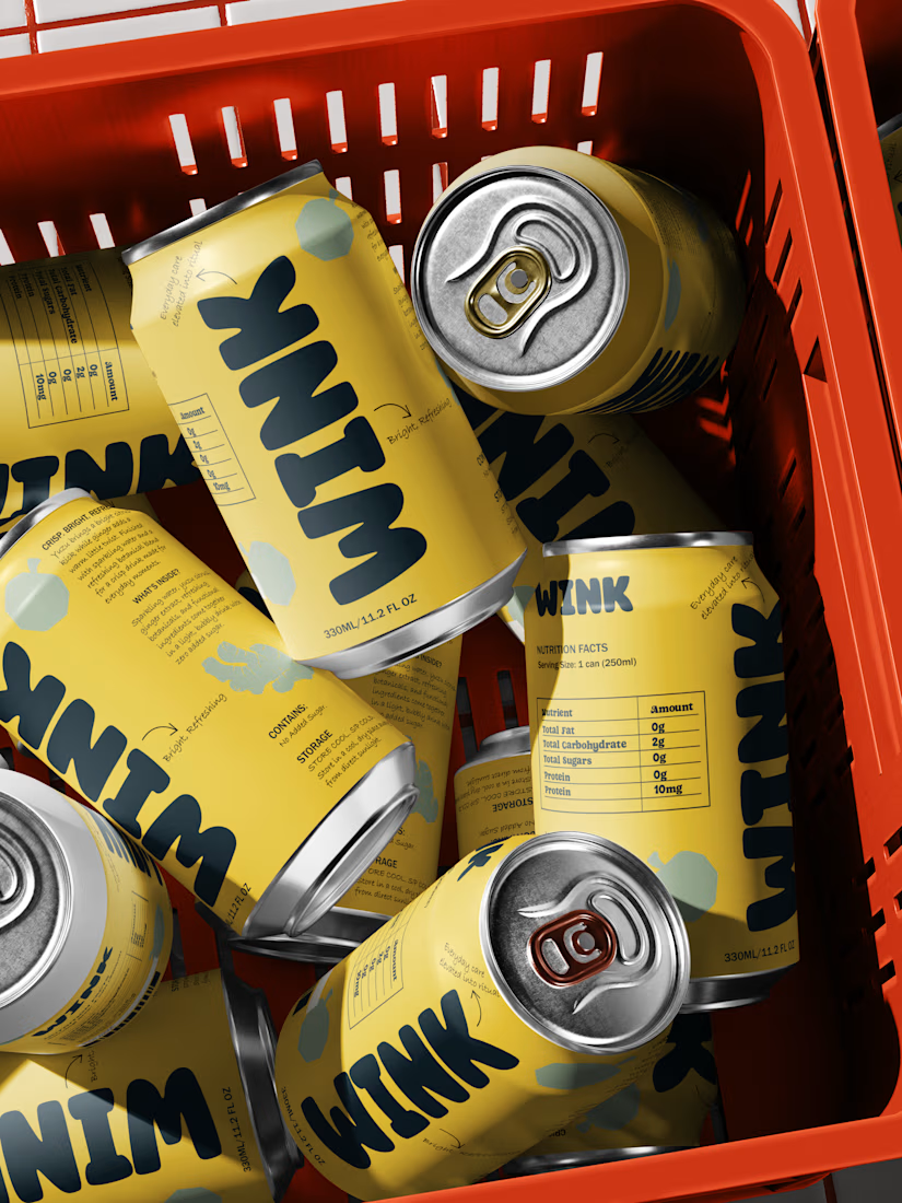
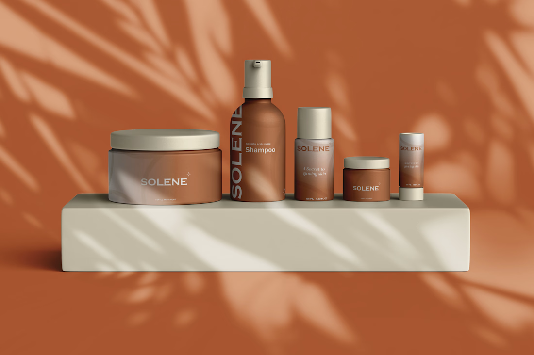
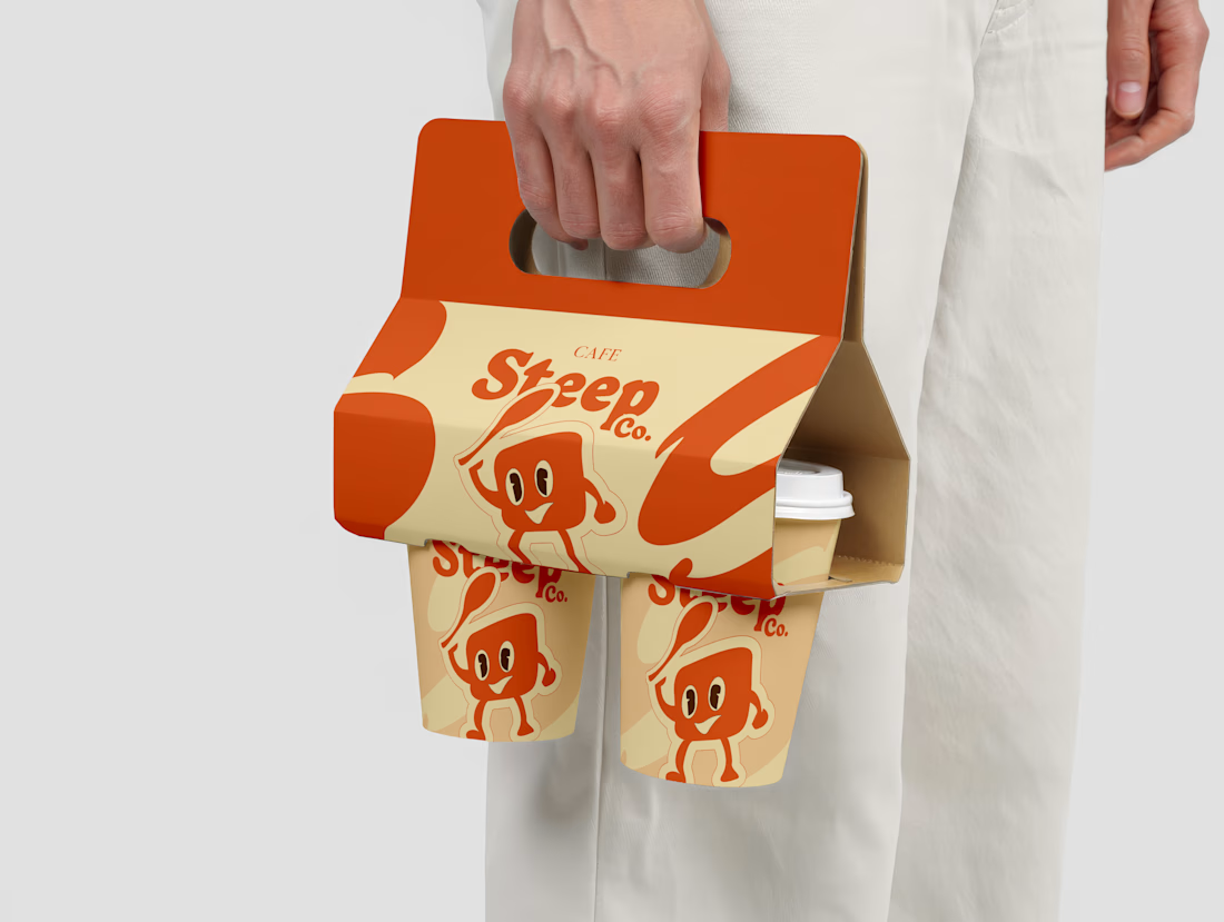
But because of the packaging system, typography, color, hierarchy and overall visual language.
That's something I think about a lot when working on brand identity and packaging.
Your first SKU shouldn't just look good on its own. It should create a visual foundation that can grow into the next 3, 5 or 10 products.
I'm currently open to working with founders in CPG, food & beverage, wellness, lifestyle and DTC.
If you're launching something new or considering a packaging refresh, I'd love to hear what you're building.
What's one thing you wish your current packaging did better?

Exactly—the shelf test is really about creating a repeatable visual system, not just a standout first SKU. The emphasis on typography, hierarchy, and packaging language is what lets a product family feel coherent as it grows.
The network for creativity
Join 1.25M professional creatives like you
Connect with clients, get discovered, and run your business 100% commission-free
Creatives on Contra have earned over $150M and we are just getting started

Challenges
View all


Related posts

One brand, very different variety products. 👀
BASYX is one of my favorite projects because the packaging had to work across categories, from skincare to food, while still feeling like one cohesive brand.
That’s the fun challenge of multi-product brands: creating a visual system flexible enough to grow without losing its identity.

wow amazing

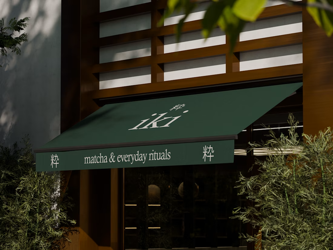
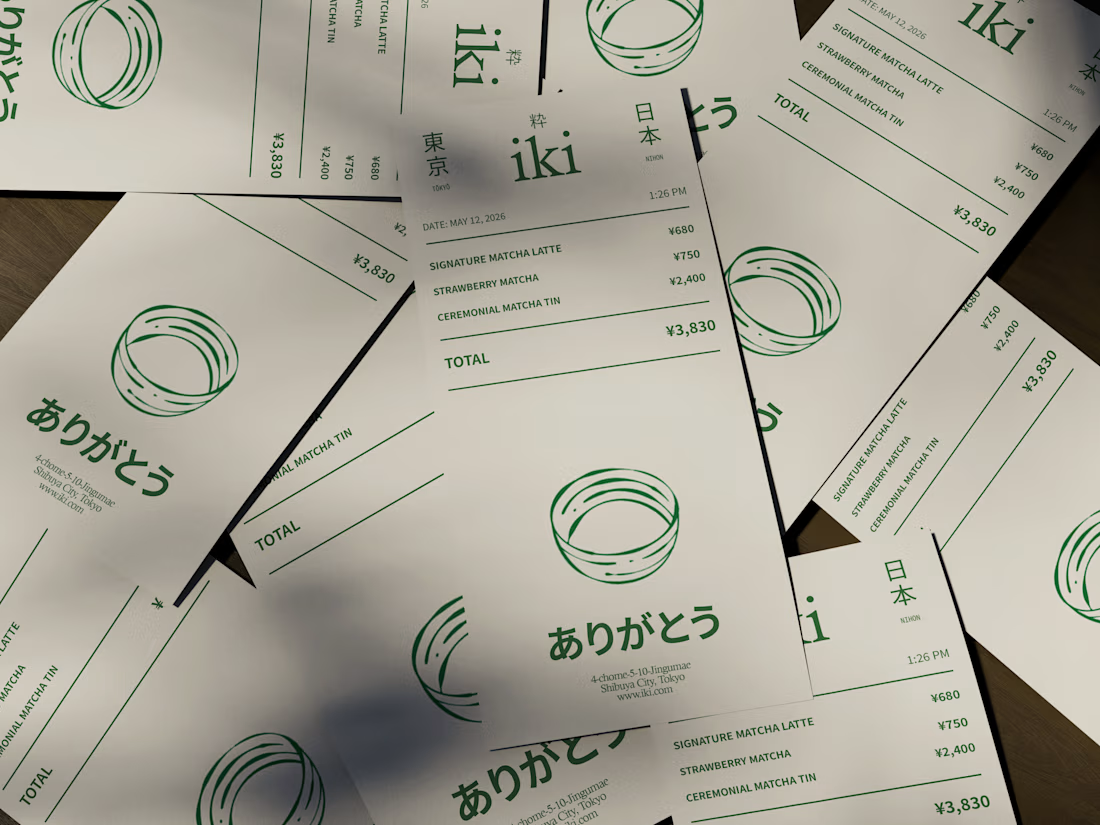
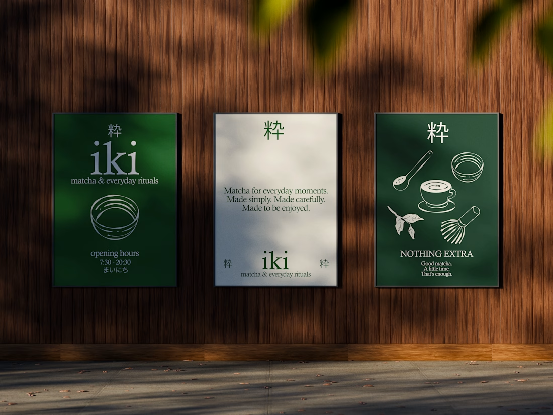
some visuals from iki, a matcha shop i’m currently working on 🍵
one of the most interesting parts of this project has been figuring out how to turn an abstract concept into something people can actually see and feel.
from the typography to the illustrations and overall visual language, every element is an opportunity to give the brand more personality and make it feel like its own world.
still exploring, but i’m really enjoying where this is going.
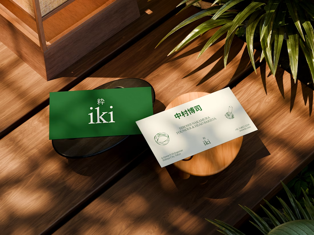


the illustration direction feels like it could take over the whole shop interior, not just the cups. thats usually where these projects fall apart

Branding identity completed for Spotlesz in just few days!