The network for creativity
Join 1.25M professional creatives like you
Connect with clients, get discovered, and run your business 100% commission-free
Creatives on Contra have earned over $150M and we are just getting started
Back to feedPost

Y'all really need to follow Mike's lead and use a typeface that's not on Google Fonts


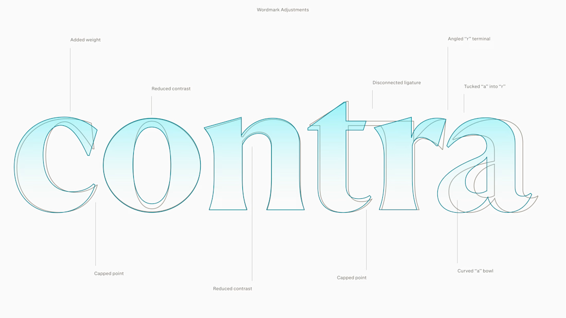
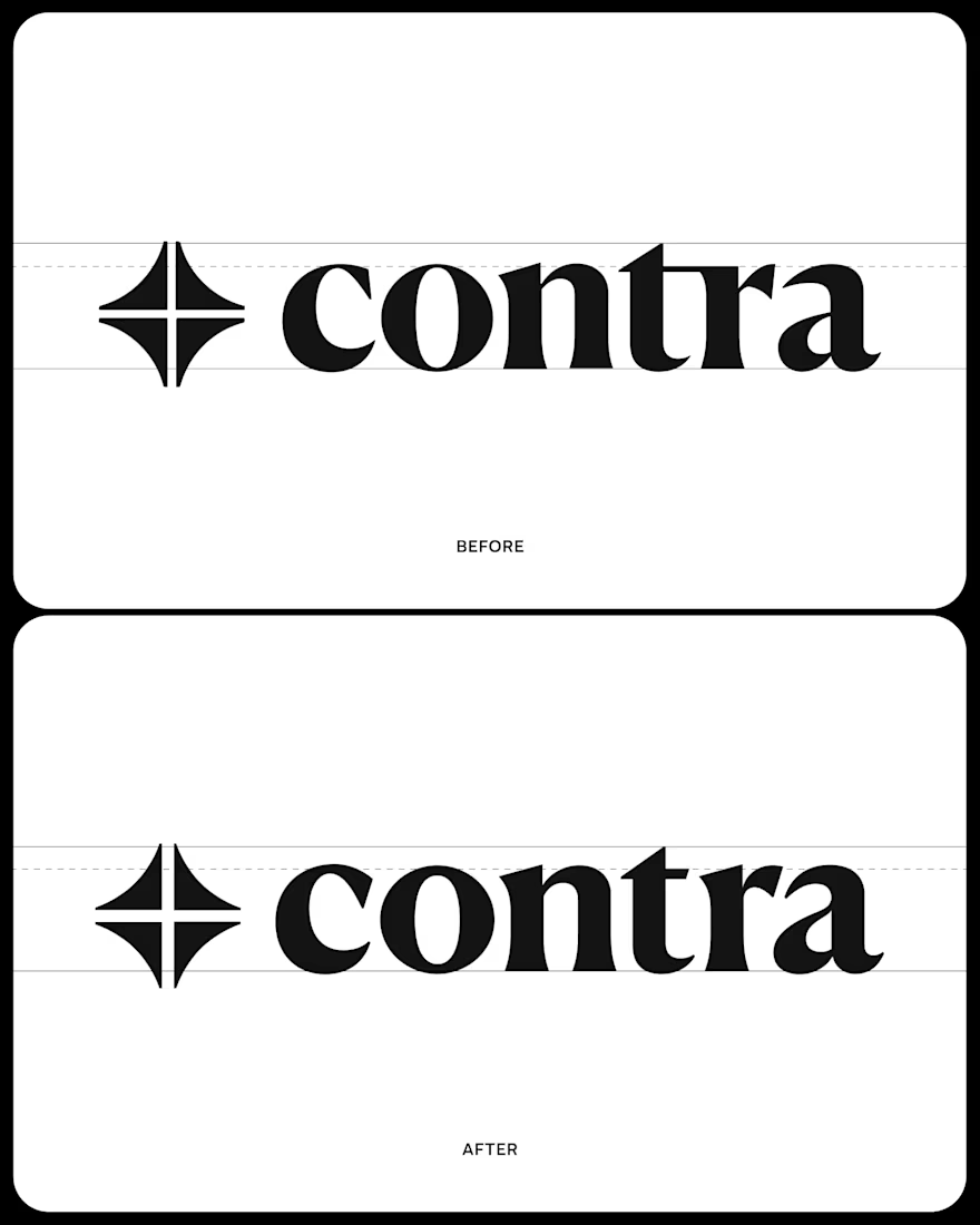
We started by just updating the symbol and wordmark everrrrr-so-slightly so it could be a little more screen friendly. We put a lot of love into that "a".
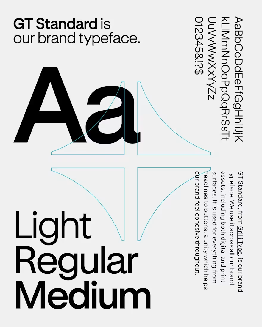
We also introduced GT Standard as an inter replacement. We just loved that the lowercase a's matched the wordmark.
The network for creativity
Join 1.25M professional creatives like you
Connect with clients, get discovered, and run your business 100% commission-free
Creatives on Contra have earned over $150M and we are just getting started

Challenges
View all


