The network for creativity
Join 1.25M professional creatives like you
Connect with clients, get discovered, and run your business 100% commission-free
Creatives on Contra have earned over $150M and we are just getting started
Back to feedPost

𝗙𝗶𝗻𝗮𝗻𝗰𝗶𝗮𝗹 𝗽𝗿𝗼𝗱𝘂𝗰𝘁𝘀 𝗵𝗮𝘃𝗲 𝗱𝗼𝘇𝗲𝗻𝘀 𝗼𝗳 𝗳𝗲𝗮𝘁𝘂𝗿𝗲𝘀, 𝗯𝘂𝘁 𝗹𝗮𝗻𝗱𝗶𝗻𝗴 𝗽𝗮𝗴𝗲𝘀 𝘀𝗵𝗼𝘂𝗹𝗱𝗻'𝘁 𝗳𝗲𝗲𝗹 𝗰𝗿𝗼𝘄𝗱𝗲𝗱.
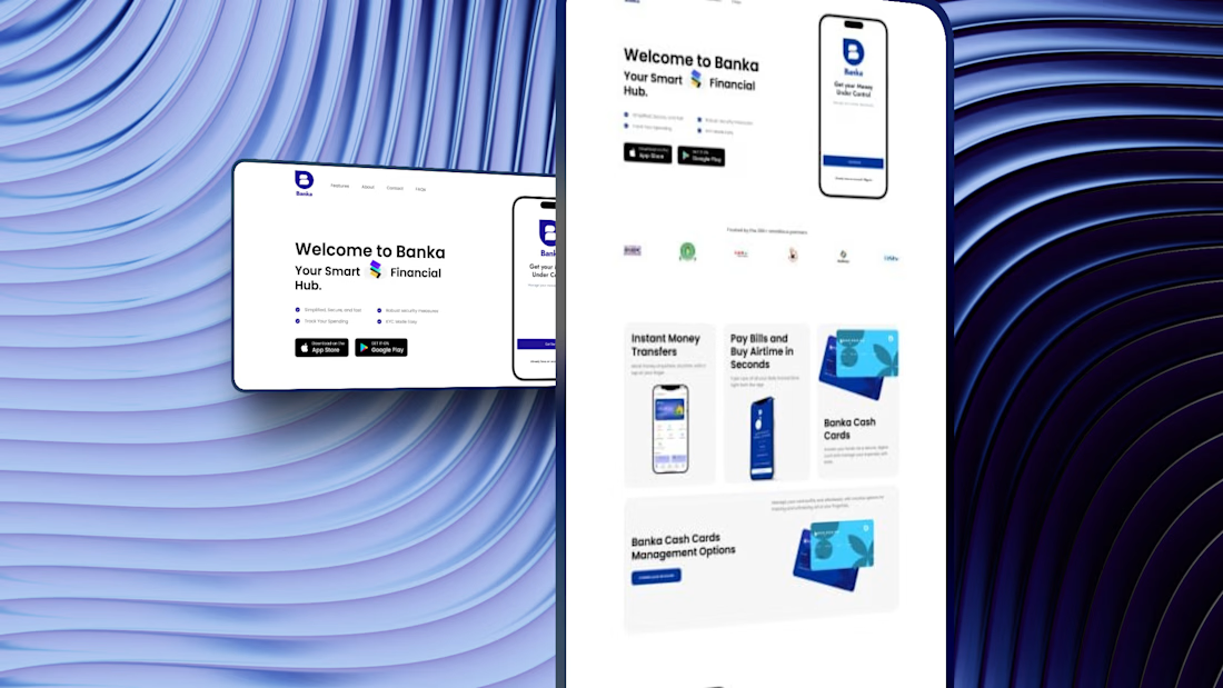
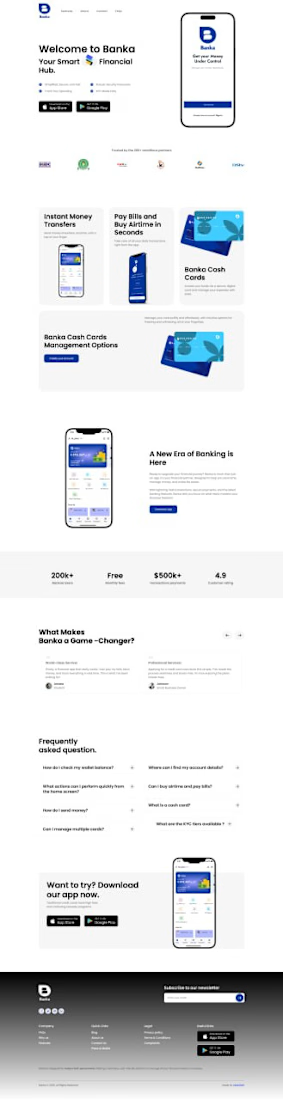
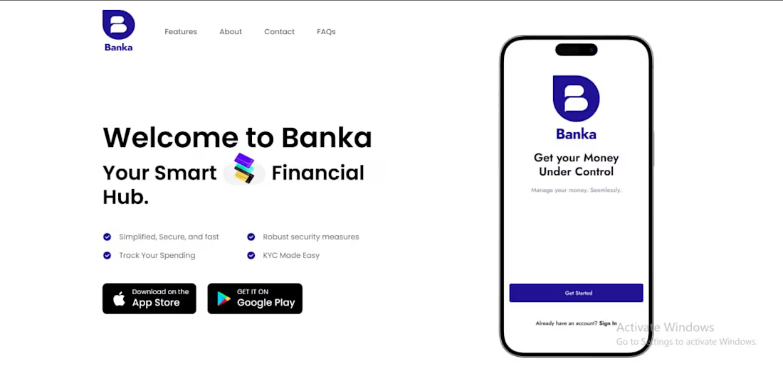
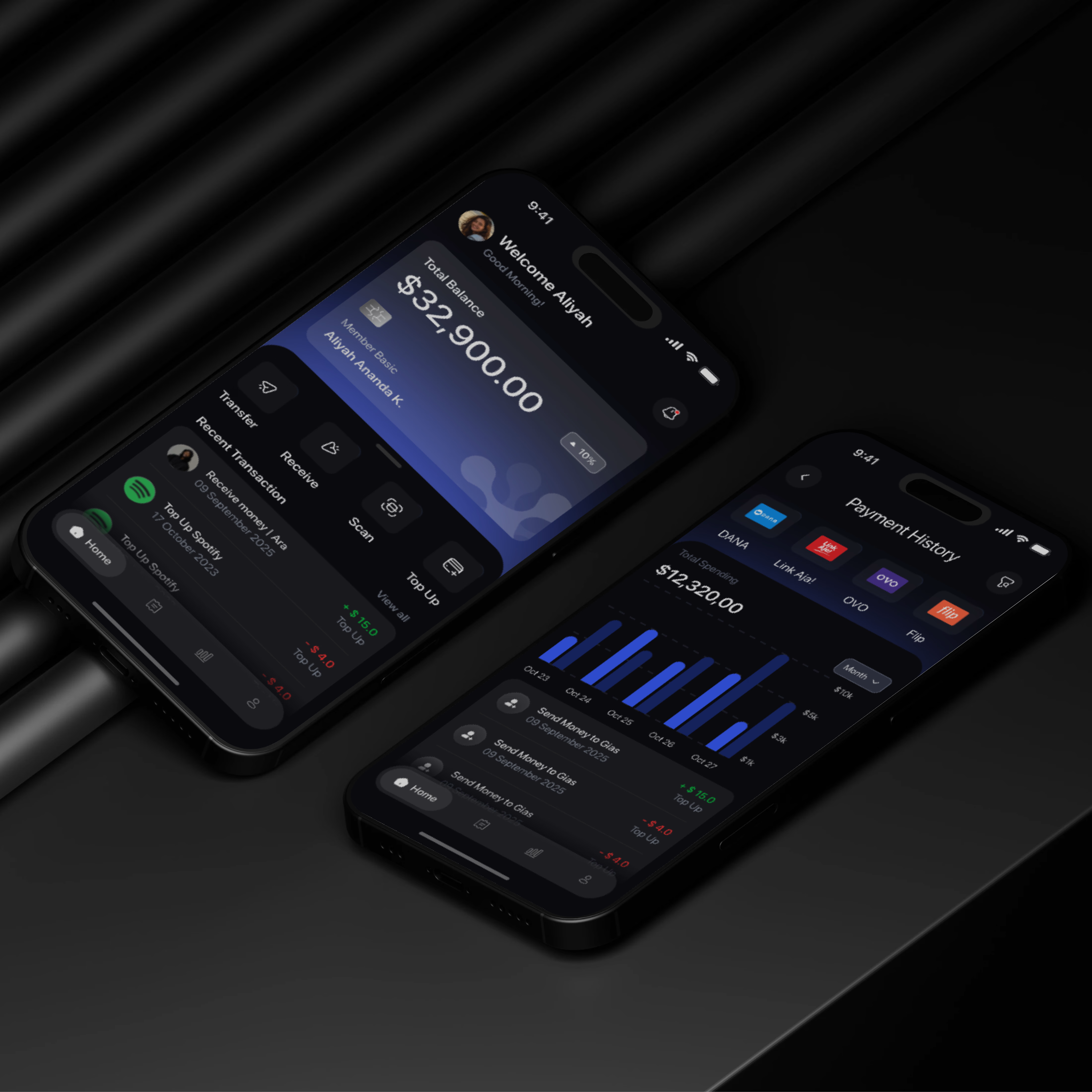
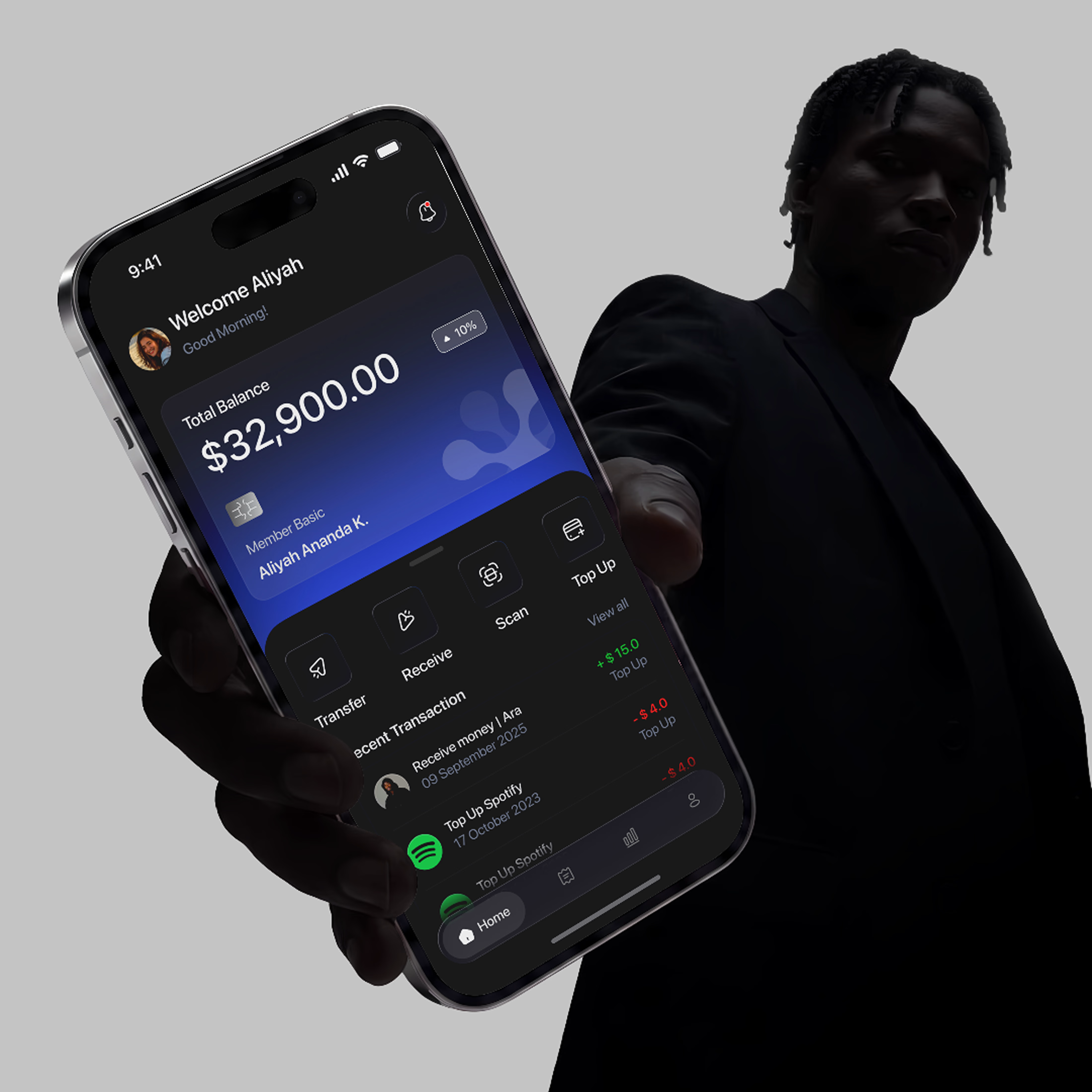
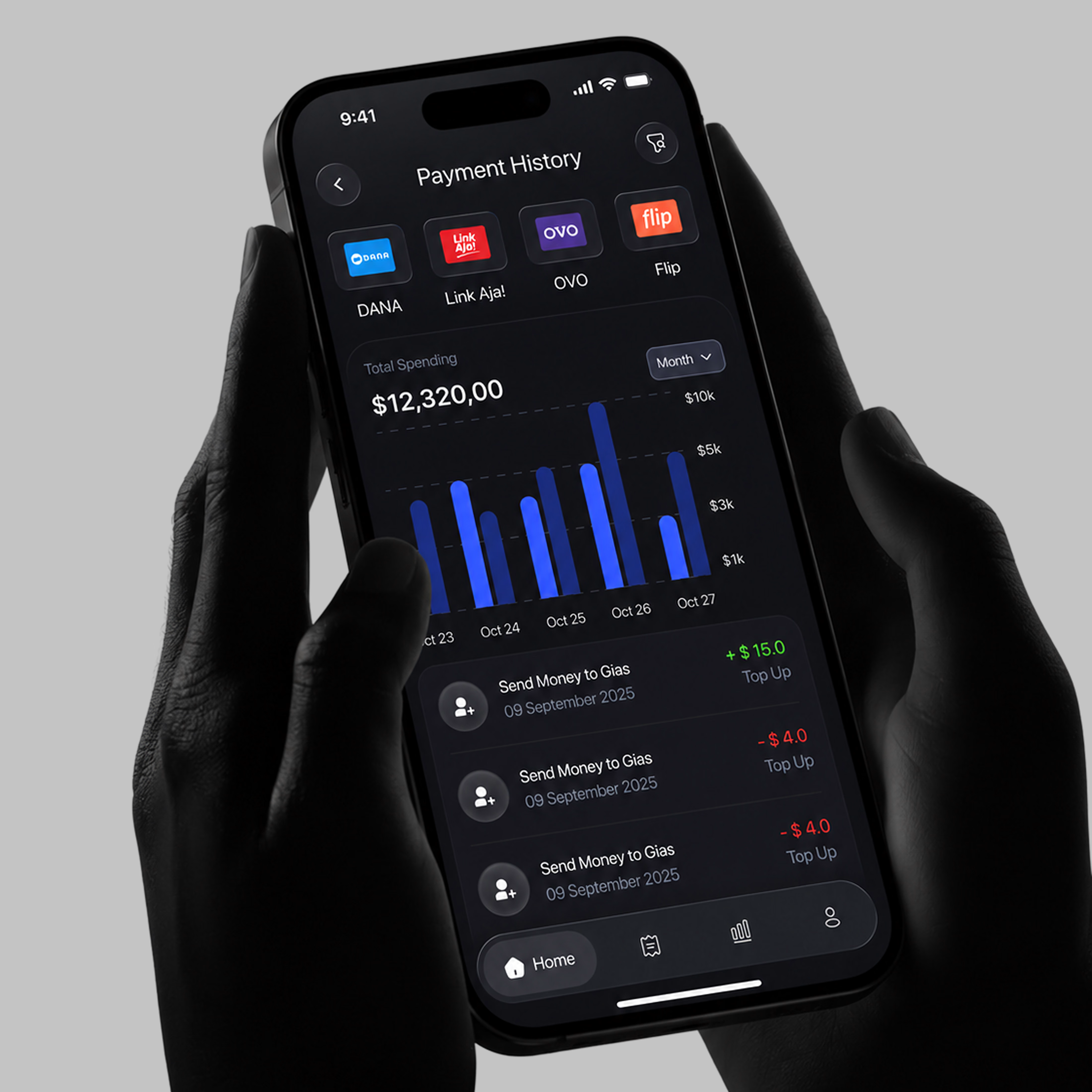
Here is a breakdown of how I organized Banka’s features using modular card UI to keep navigation smooth and intuitive.
𝗖𝗼𝗿𝗲 𝗙𝗼𝗰𝘂𝘀: Simplifying complex banking and payment features into easy-to-digest visual cards.
𝗞𝗲𝘆 𝗧𝗮𝗸𝗲𝗮𝘄𝗮𝘆𝘀 𝘁𝗼 𝗛𝗶𝗴𝗵𝗹𝗶𝗴𝗵𝘁: 𝗕𝗲𝗻𝘁𝗼 𝗚𝗿𝗶𝗱 / 𝗖𝗮𝗿𝗱 𝗟𝗮𝘆𝗼𝘂𝘁: Breaking down diverse offerings like instant transfers, airtime top-ups, and card management into clean, distinct visual modules rather than walls of text.
𝗠𝗼𝗰𝗸𝘂𝗽 𝗖𝗼𝗻𝘁𝗲𝘅𝘁𝘂𝗮𝗹𝗶𝘇𝗮𝘁𝗶𝗼𝗻: Placing real UI app screens inside feature cards so users immediately understand how the feature works on mobile.
𝗖𝗮𝗿𝗱 𝗖𝗼𝗻𝘁𝗿𝗼𝗹 𝗦𝗲𝗰𝘁𝗶𝗼𝗻: Highlighting dedicated UI cards for advanced features like digital card freezing/unfreezing options to show security control upfront.
Need a professional landing page, Book a free discovery call here: https://cal.com/babatunde-abdullahi/15mins
#WordPress #webflow #landingpage


This is a clean design, Nicely Done
The network for creativity
Join 1.25M professional creatives like you
Connect with clients, get discovered, and run your business 100% commission-free
Creatives on Contra have earned over $150M and we are just getting started





Related posts

Which hero visual feels right for this brand?
While working on the homepage for Halfspace, a website design and SEO agency, I explored two different hero visuals for the same headline and layout. Same message, same structure, just a different visual metaphor and mood.
Option 1 - Rocket Launch. Bold, literal, and energetic, visually reinforcing the "launch your business" message with motion and fire.
Option 2 - Glass Cube. Abstract, sleek, and premium, giving a more refined, tech-forward feel without relying on a literal metaphor.
Would love your honest UX/UI take, which direction feels more impactful, memorable, and aligned with a web design/SEO brand, and why?
11 voted
41%
16 voted
59%
27 votes
Closed

Both design are great; it's hard to choose one


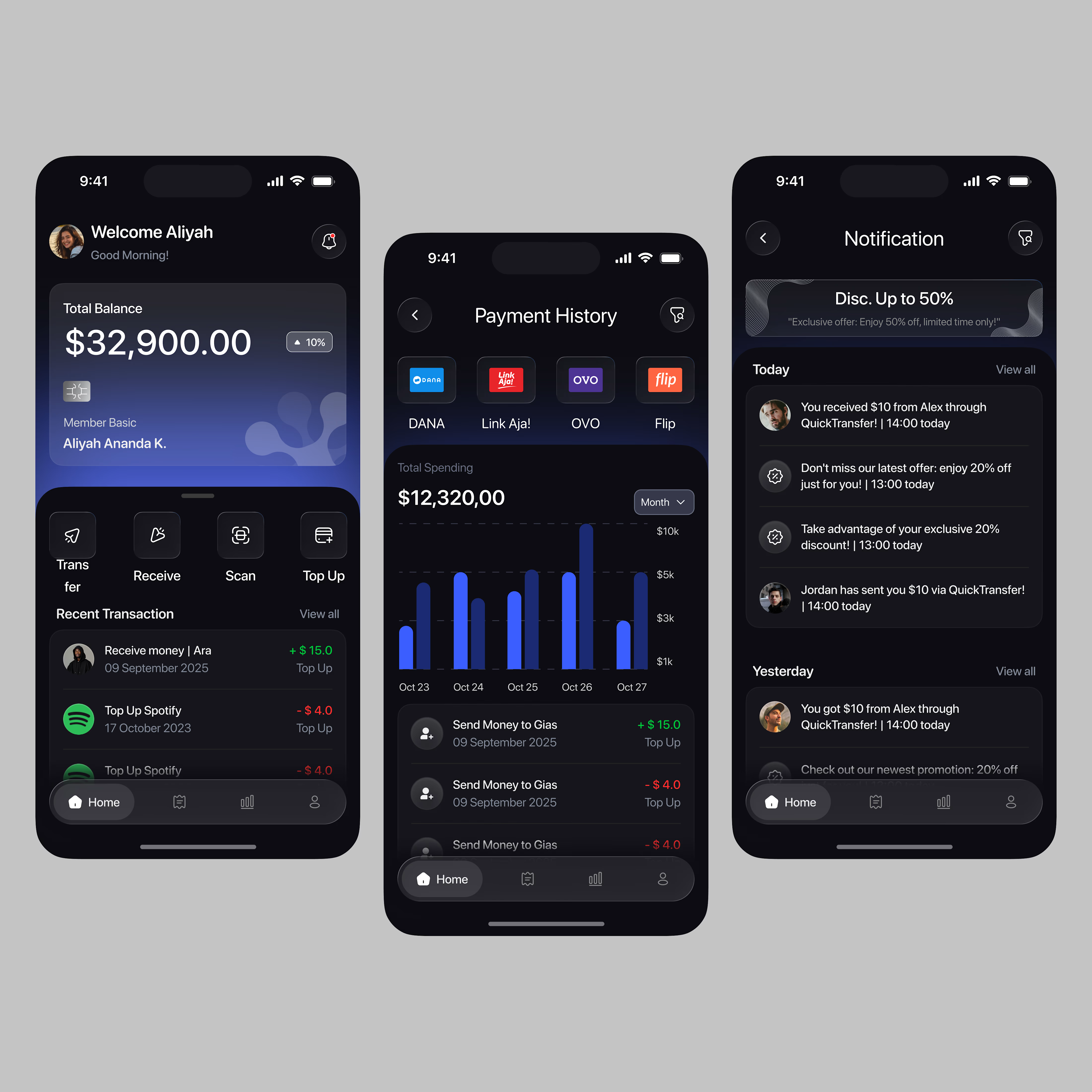

A little sneak peek at what I’ve been working on!

Share my SaaS experiment here.
Loyalty SaaS I built end to end: cashback, points and stamps on one card in Apple Wallet and Google Wallet, plus POS and CRM integrations.
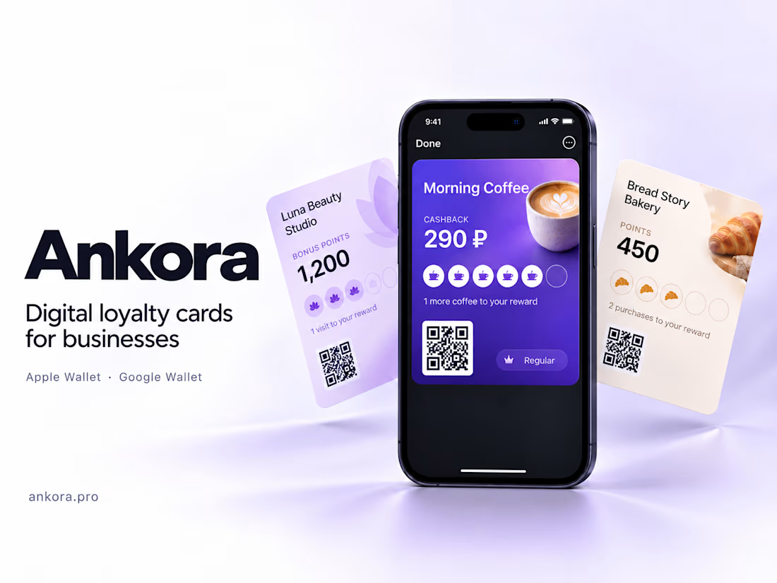

This is clean! Love how you simplified cashback + stamps into one Wallet card. The Ankora branding with the coffee mockup is super premium. Did you build the POS integration yourself? Very impressive end-to-end build!