The network for creativity
Join 1.25M professional creatives like you
Connect with clients, get discovered, and run your business 100% commission-free
Creatives on Contra have earned over $150M and we are just getting started
Back to feedPost
Beyond the Scroll: A Cinematic Webflow Build
Recently wrapped up a custom Webflow project that trades static layouts for "visual stories." The goal was to make the site feel as alive as the creator’s work without the template feel.
How I built it:
GSAP: For those high-end, cinematic scroll transitions.
Lottie: For smooth micro-interactions that add "life" without slowing things down.
Custom Build: A high-performance, bespoke site built from the ground up.
The Result: A portfolio that doesn't just show work, it narrates a brand.


Love the “visual stories” approach here. Using GSAP to bring motion into Webflow really elevates the experience beyond static layouts.

Looks great

Thanks Domagoj. 😊

This is really impressive so see. I love websites that don't just feel static but instead they have narrative and tells you all you need to know about the brand
I couldn't agree more. There’s something special about a site that feels like a conversation rather than a brochure.
It’s definitely the difference between just scrolling through a page and actually connecting with the people behind it.
The network for creativity
Join 1.25M professional creatives like you
Connect with clients, get discovered, and run your business 100% commission-free
Creatives on Contra have earned over $150M and we are just getting started







Related posts

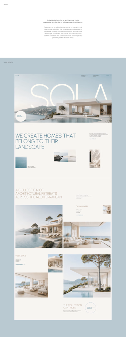
A luxury property deserves a presentation that does it justice.
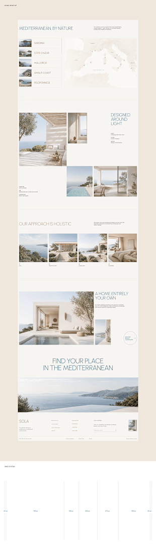
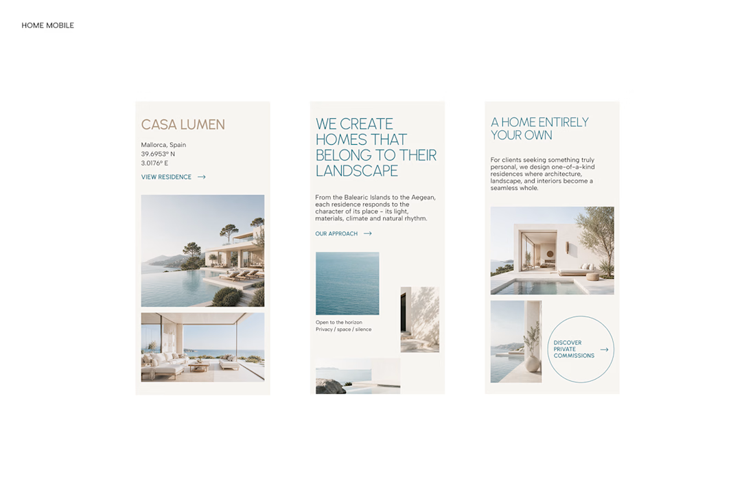

With SOLA – Architecture Studio & Luxury Real Estate, I wanted to bring the beauty of modern coastal architecture into the website itself.
From the large property images and soft blue tones to the clean layout across desktop and mobile, every part of the design helps create a calm, premium feel while making the homes the centre of attention.
I like how the website brings architecture and digital design together, giving visitors a chance to explore the properties before making an enquiry.
If you were looking for a luxury home, would a website like this make you more interested in the property?
#WebDesign #Architecture #LuxuryRealEstate


Incredible work, you transformed SOLA into a premium property brand.


Every element feels perfectly placed! 👏

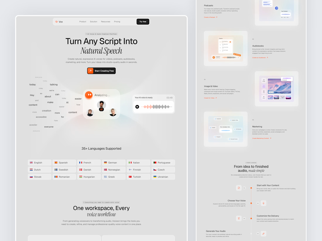
Designed a modern AI Voice SaaS Landing Page.
A soft light interface with gentle color glows, warm orange accents, and elegant italic serif headlines for a calm and creative first impression.
A floating word cloud turning into a voice wave, a language grid, use case cards for podcasts, audiobooks, video, and marketing, plus a simple step by step flow make AI voice creation feel easy to understand. Clean spacing and soft cards keep the whole page light and easy to explore.



Nice UI