The network for creativity
Join 1.25M professional creatives like you
Connect with clients, get discovered, and run your business 100% commission-free
Creatives on Contra have earned over $150M and we are just getting started
Back to feedPost


When letters have spine, symbols aren’t needed.
Big, bold, type-first, if it works alone, it’s the logo.


The network for creativity
Join 1.25M professional creatives like you
Connect with clients, get discovered, and run your business 100% commission-free
Creatives on Contra have earned over $150M and we are just getting started
Related posts

Landing page design for Lumo — banking for freelance life
Banks sell control — dashboards, charts, a card floating at fifteen degrees. Freelancers don't want control over their money. They want to stop thinking about it in the gap between sending an invoice and the money landing.
That gap is what the page is built on. The product sits in a meadow instead of on a dark grid, because the promise isn't "manage your finances better" — it's "we handle the part that keeps you up." And the strongest line on the page isn't a feature: no waiting for Monday. Freelancers don't lose weekends to fees. They lose them to timing.
The proof follows the same rule. One freelancer, one number — 4% lost on every international payment. A percentage someone can check against their own account beats any adjective.


great visuals 🙌

Inspired by, I'm sharing one of my own concepts that wasn't chosen for the final design, but that I absolutely love.
This idea is so good! We all have concepts hiding in our drafts that never get to see the light of day. I think they deserve their moment, too. ✨



How many concepts die in your drafts folder? 💀
In the spirit of Inktober, a digital sketch that never saw the light.
This was a lettering-inspired brandmark...


A lot actually, even better they enter the folder 😭
How many concepts die in your drafts folder? 💀
In the spirit of Inktober, a digital sketch that never saw the light.
This was a lettering-inspired brandmark sketch playing with the letter K and the movement of hair. I archived it before presenting it. Not because I didn’t like...
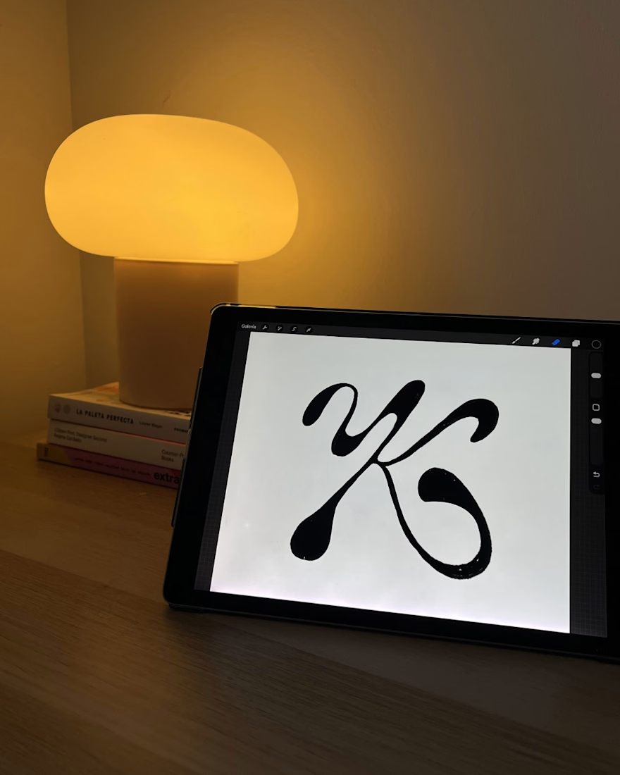
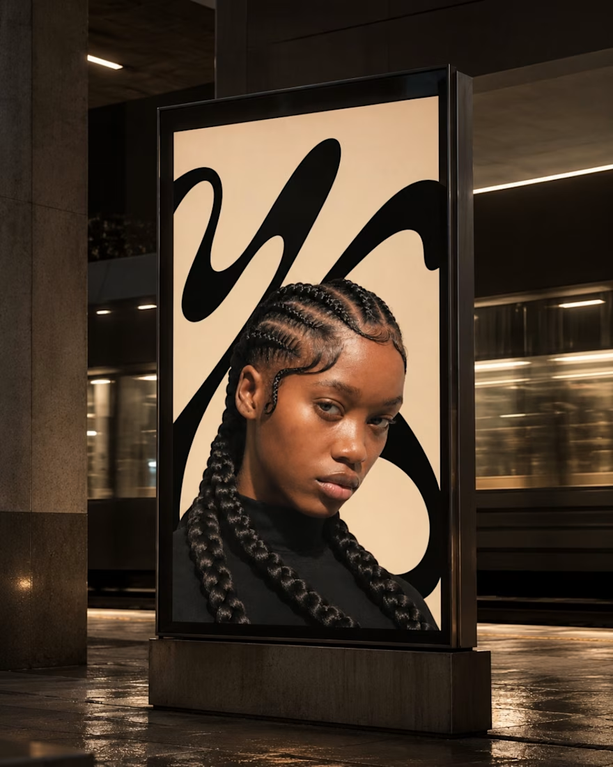
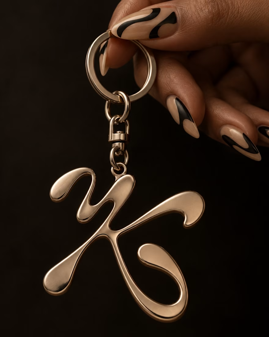

The K on the tablet has more life than most finished marks I see, and the glossy metal piece in the third frame shows the curve can carry weight outside a screen. Honest pushback: a mark this strong sitting in an archive is the real cost of skipping the pitch. Did the K lose on legibility, or was it the direction?