The network for creativity
Join 1.25M professional creatives like you
Connect with clients, get discovered, and run your business 100% commission-free
Creatives on Contra have earned over $150M and we are just getting started
Back to feedPost
Taste Test
Needed to design an image for a data security card for a new client. Tried using Claude Code at first, but soon turned to Figma.
What do you prefer?


1 voted
6%

15 voted
94%

16 votes
Closed

Your humble self looks good


thank you for the feedback.
You're welcome


Nice one! I'm curious what's your workflow with Claude Code like. for instance in a project like this?
I create a new project and feed it lots of context first. brand manual and so on. ideally also current graphics. and lots of references on how your outcome is supposed to look like.
But I am not an AI design pro to be honest.
Hey that's brilliant, thanks for replying so quick.
And we are all learning so its all good, sharing processes is the way we all get better : ) So thanks!


Looks good !

Voted Claude Design. The binary/data visual language in that version feels more native to a security context than generic iconography. For a client card like this, the atmosphere matters as much as the icons.

I prefer my humble self option

Designers are always better than AI. These principal roles No AI can ever compete with designers is empathy, brand strategy, and marketing.
well said
You're welcome


Nice!
The network for creativity
Join 1.25M professional creatives like you
Connect with clients, get discovered, and run your business 100% commission-free
Creatives on Contra have earned over $150M and we are just getting started





Related posts

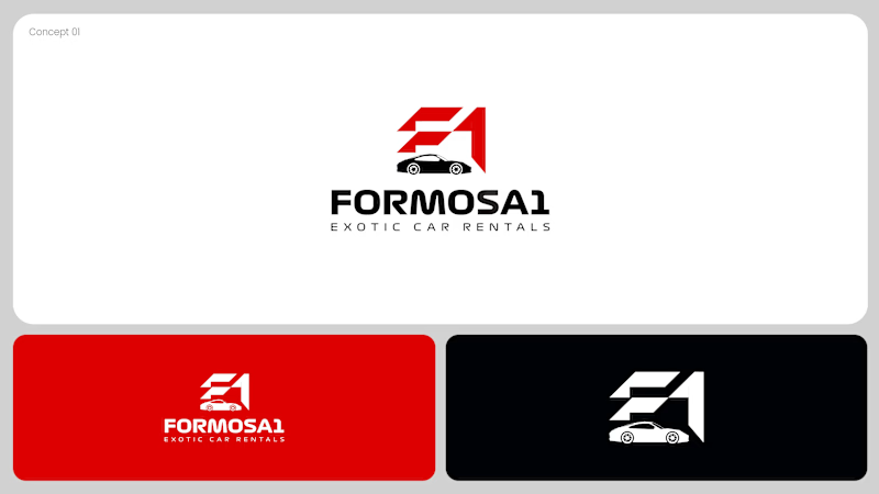
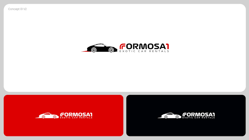
Two logo concepts for Formosa1 Exotic Car Rentals. Which one wins?
A: bold geometric F1 monogram, car tucked inside the mark. Strong and iconic.
B: car silhouette leads, red wordmark with a speed streak. Fast and clean.
Drop your vote 👇
17 voted
53%
15 voted
47%
32 votes
Closed

Both are great but I feel that was something special in the bottom one that's why I choose it❤️❤️

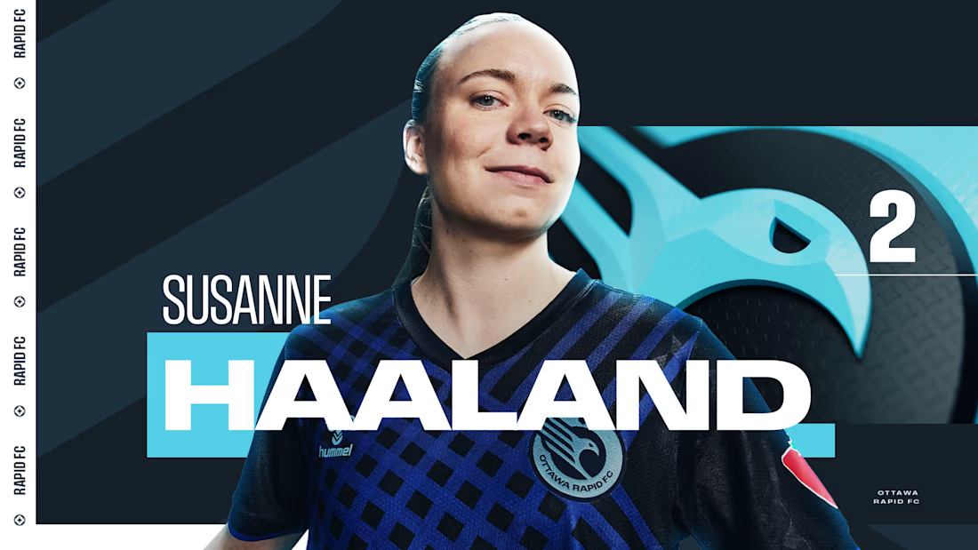
Sharing a project I'm really proud of: the 2025 broadcast design for the Northern Super League, Canada's new professional women's soccer league.
What made this one special is that the league had no visual history on TV. Every graphic viewers saw in that first season had to be created from zero, for a league that was introducing itself to the country.
The goal was a broadcast identity that feels as ambitious as the league itself: bold enough to stand out on screen, clear enough to follow at a glance, and flexible enough to carry six different clubs inside one consistent system.
The biggest lesson for me: when you design for a league that's just being born, you're not only packaging matches. You're helping define how people will remember its first season.
I'd love to hear from anyone working in sports or broadcast design: how do you approach building a visual system for a league that's launching from scratch?



Great Work demands great efforts

I’ve been working on Astaleria and I’m thinking about selling it as a brand package, including the design assets and Astaleria.com.
I put together this little video to show how it all comes together.
Would you buy a brand with the matching .com instead of starting from scratch? Curious what you think, and if you could see yourself building something with this one.

Wonderful design, really nice