The network for creativity
Join 1.25M professional creatives like you
Connect with clients, get discovered, and run your business 100% commission-free
Creatives on Contra have earned over $150M and we are just getting started
Back to feedPost

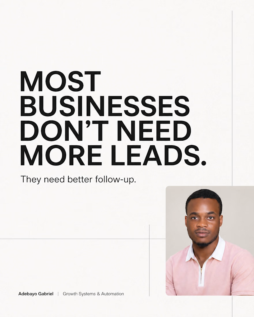
A lead doesn't usually disappear because they're not interested.
They disappear because nobody followed up.
Someone visits your website.
Makes an inquiry.
Downloads your free resource.
And then...
Nothing.
No follow-up.
No reminder.
No system.
While you're busy running the business, your competitors are staying top of mind.
Many businesses think they need more leads.
What they really need is a better process for managing the leads they already have.
Because growth isn't always about generating more opportunities.
Sometimes it's about converting more of the opportunities already in front of you.
#BusinessGrowth #LeadGeneration #MarketingAutomation #CRM #BusinessSystems


The network for creativity
Join 1.25M professional creatives like you
Connect with clients, get discovered, and run your business 100% commission-free
Creatives on Contra have earned over $150M and we are just getting started





Related posts

👋 I'm new to Contra and I did my first post without realizing I hadn't even introduced myself!
Hey I'm Katya, I'm an AI Systems Architect, marketer and yoga teacher.
I build AI systems that bring in business and handle the work behind it. A voice agent that calls new leads back within seconds and books the appointment. A pipeline that traced 16,900+ leads to the ads that brought them. Listing videos made from the photos a real estate agent already has.
The marketing side came first. I built the multi-channel campaign for Jay Shetty's launch (22 million followers). After that I discovered the tech world and when AI came along, I realized I'm a builder at heart and never looked back! Building is so much fun 🤍
Here's what I've shared:
My first post: on building a fully AI-made YouTube video, end to end, because I'm camera shy 🙈 https://contra.com/community/MP9mFRuT-im-building-my-first-fully-ai-made
Last thing, if you're building with AI video or automation, I'd like to see what you're working on
And if you're hiring: I may be new to Contra but definitely not new to this work. Reach out for AI agent builds, apps, websites or anything in between.
P.s The video below is my AI avatar. My profile video is the real me :)


Nice Portrait....Has everything from a great pose, great composition and lighting and perfect environment setting.

What if every new lead could be handled before you even open your inbox? ⚡
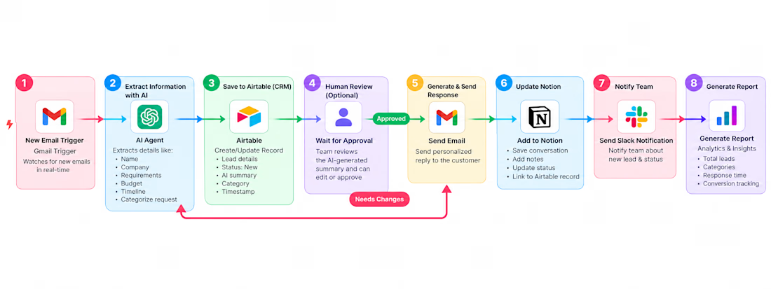
This AI-powered workflow turns a new email inquiry into a structured, ready-to-handle lead — automatically.
A new inquiry arrives → AI extracts the important details → Airtable/CRM is updated → the response goes through optional human approval → a personalized email is sent → Notion is updated → the team gets notified in Slack → performance data is collected for reporting.
The goal isn't to remove people from the process. It's to remove the repetitive work around them.
This type of workflow can be customized for B2B companies, SaaS businesses, agencies, real estate, e-commerce, recruitment, consulting, customer support, healthcare, finance, education, and other service businesses.
Already know what you want to automate? → Send me your current workflow and I’ll map out how we can automate it.
Still doing repetitive work manually? → Tell me the task that consumes your team’s time, and I’ll help identify what can be automated.
#AIAutomation #AIWorkflow #AIWorkflows #AIAgents #Automation #WorkflowAutomation #BusinessAutomation #ProcessAutomation #n8n #n8nAutomation #ArtificialIntelligence #GenerativeAI #B2B #B2BAutomation #SaaS #SaaSAutomation #SalesAutomation #LeadGeneration #LeadAutomation #LeadManagement #EmailAutomation #CRMAutomation #CustomerSupport #CustomerServiceAutomation #MarketingAutomation #AgencyAutomation #RealEstateAutomation #EcommerceAutomation #RecruitmentAutomation #HRautomation #FinTech #HealthcareAutomation #EdTech #BusinessGrowth #BusinessEfficiency #DigitalTransformation #NoCode #LowCode #OpenAI #AIAgent #CRM #Airtable #Notion #Slack #Productivity #FutureOfWork



I'd use the human approval step to capture corrections, not just a yes/no decision. If a reviewer changes the extracted lead details, does the workflow update Airtable and the reporting record before sending the email?

speculative marketing campaign ideas have been HITTING me lately. which would you rather see first? (first of two, we're gonna bracket vote these down.)
happy to answer any questions or hear any takes you might have below!
3 voted
38%

5 voted
62%

8 votes
Closed
