The network for creativity
Join 1.25M professional creatives like you
Connect with clients, get discovered, and run your business 100% commission-free
Creatives on Contra have earned over $150M and we are just getting started
Back to feedPost

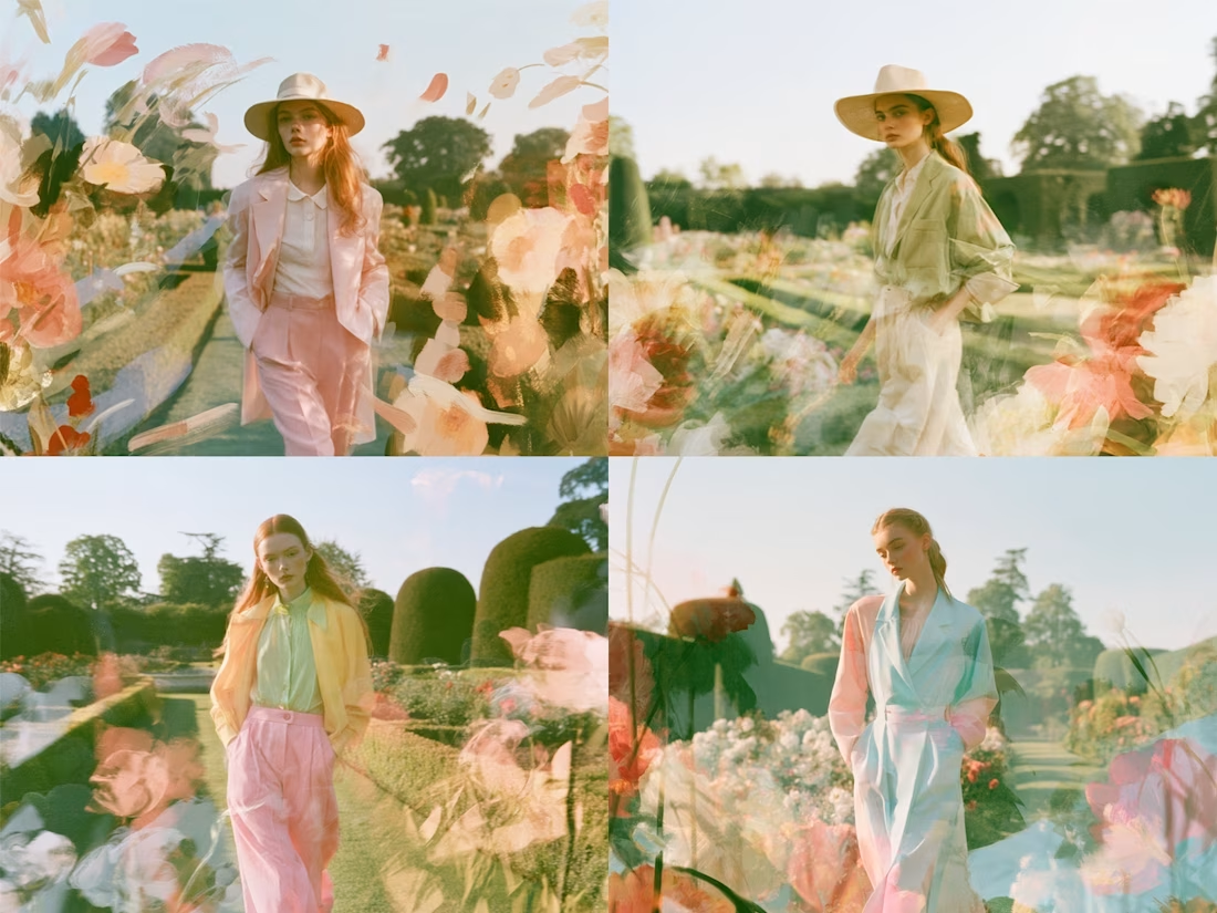
Beautiful visuals get attention. Strategic visuals give people a reason to remember a brand.
I created this fashion concept around that idea.
The goal was to build a visual world that feels soft, premium and distinctive while making the clothing feel like part of a story.
Every detail has a job. The setting, styling, color, composition and movement all work together to shape perception.
Because the question is not just “Does it look good?”
It is “What does this make the audience feel about the brand?”
That is where creative strategy starts.
aicreativeaidesignfashioncreativeCreative Design Creative DirectionProduct DesignAdobe FireflyGoogle FlowMidjourney


The network for creativity
Join 1.25M professional creatives like you
Connect with clients, get discovered, and run your business 100% commission-free
Creatives on Contra have earned over $150M and we are just getting started




Related posts

What should a creative agency website actually feel like?
For Orvika, we didn't want another agency site built around the same safe layouts and predictable sections.
We pushed the visual direction further with oversized typography, editorial layouts, bold imagery, and stronger contrast, while keeping the experience structured enough to communicate the agency's work and capabilities clearly.
The goal wasn't just to make it look different.
It was to make the agency feel different.
Designed in Figma and built in Framer.
We're sharing more of the websites and digital experiences we've been working on here over the next few weeks.




Very neat man

ADCB × Shukran - Credit Card Landing Page.
I designed a landing page for the co-branded credit card partnership between ADCB and Shukran, Landmark Group’s loyalty programme.
The page brings together the card’s benefits, participating brands and application entry point, helping visitors understand the offering and explore how to get started.
The design uses a black-and-gold palette, prominent card imagery and distinct content sections to present a wide range of rewards in a cohesive visual experience. The work shown includes the landing-page design, benefits presentation and “How it works” section.

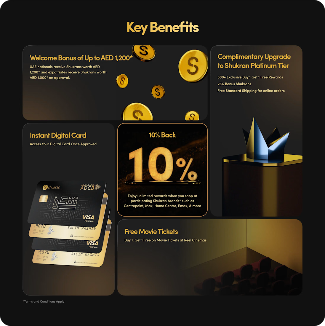
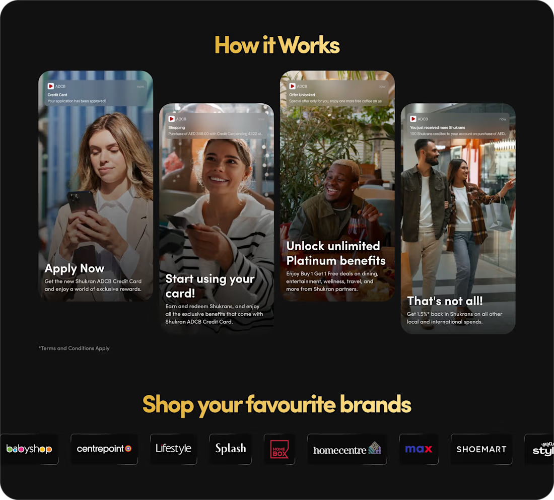
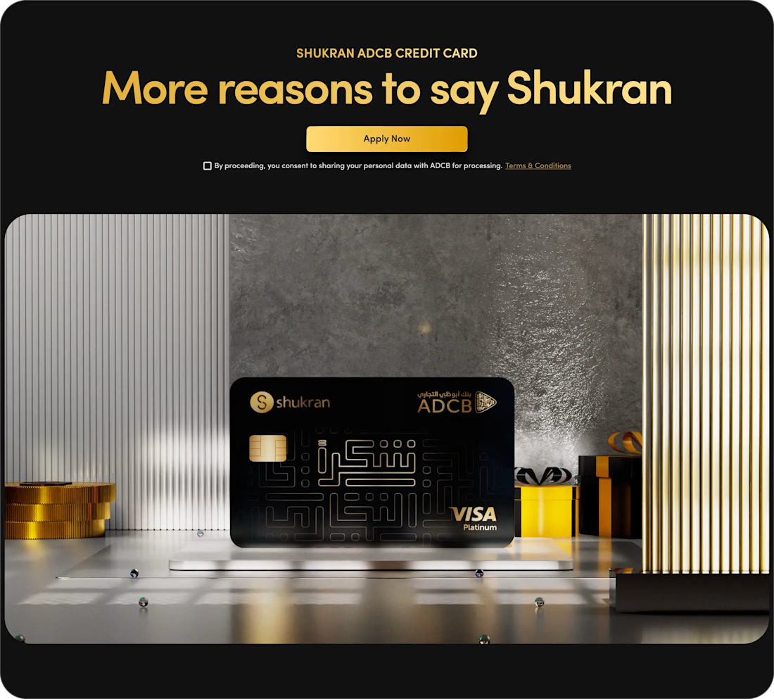
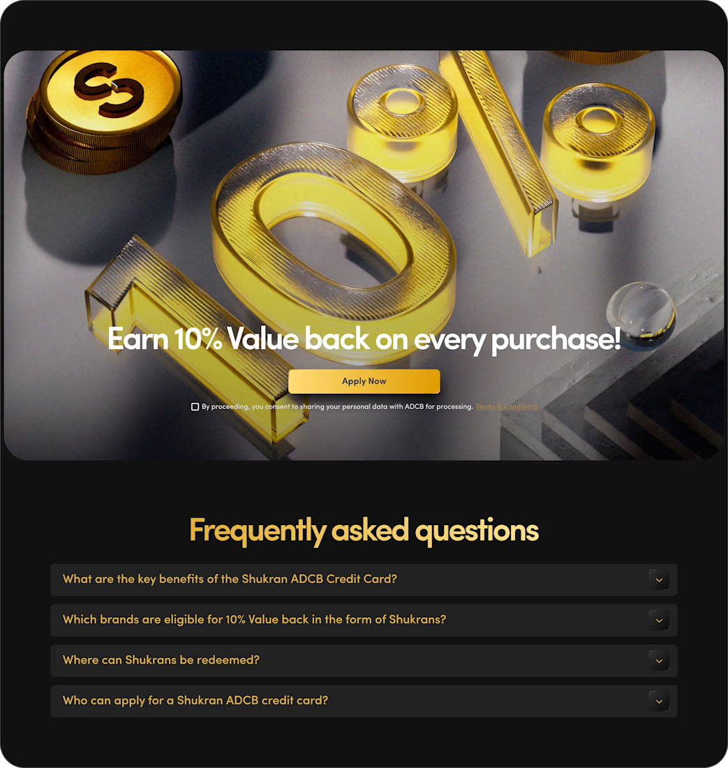

The benefits and application path are presented with clarity.

I built QuoteKit because quoting a project should not feel like guessing in public.
A client starts with a package, shapes the scope, chooses a timeline and explains what they need. QuoteKit turns those choices into a working estimate, a realistic range and clear reasons behind the price.
It works in English and French, adapts to mobile and gives both sides a summary they can copy, download or print.
I designed the product, pricing logic and interface for NexusHub Studio. It is a small tool with a simple goal: make the first client conversation clearer.
QuoteKit is available for 10 USD with a commercial license.
What would you want an estimator like this to explain before you send a quote?
Quote clearly. Start better.
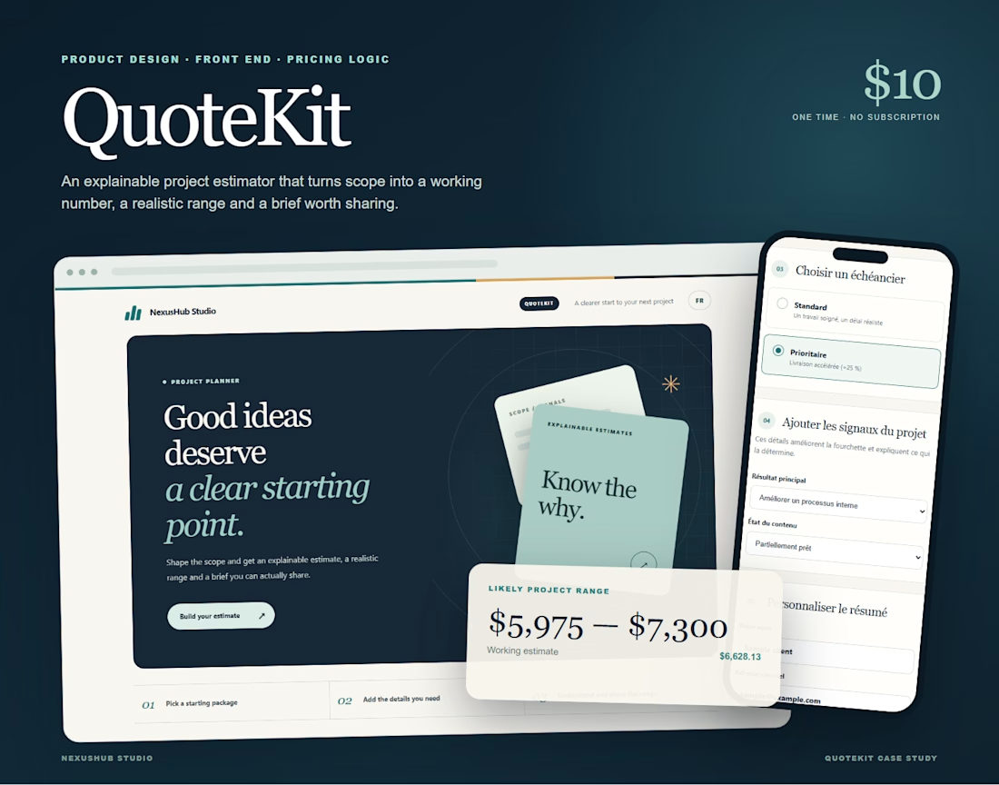
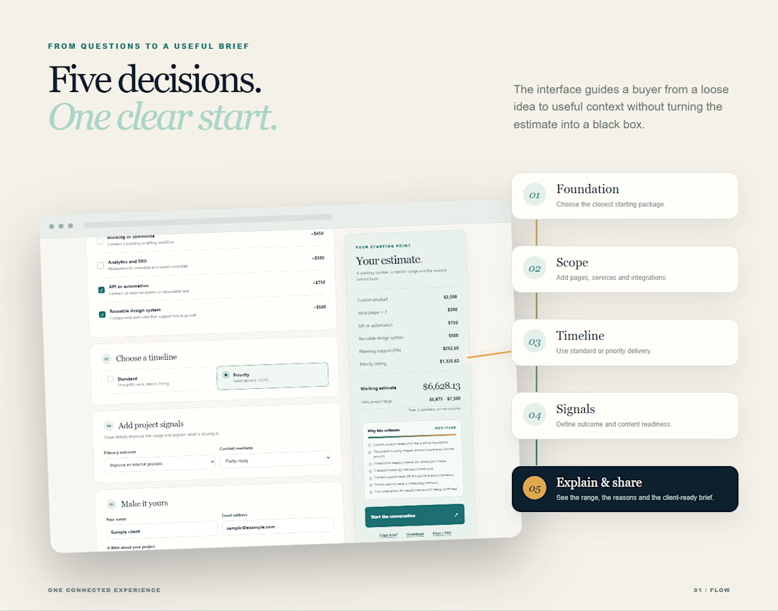
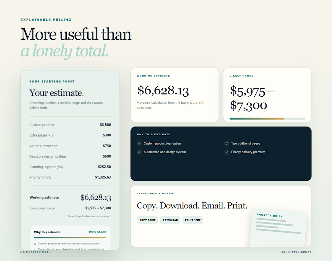
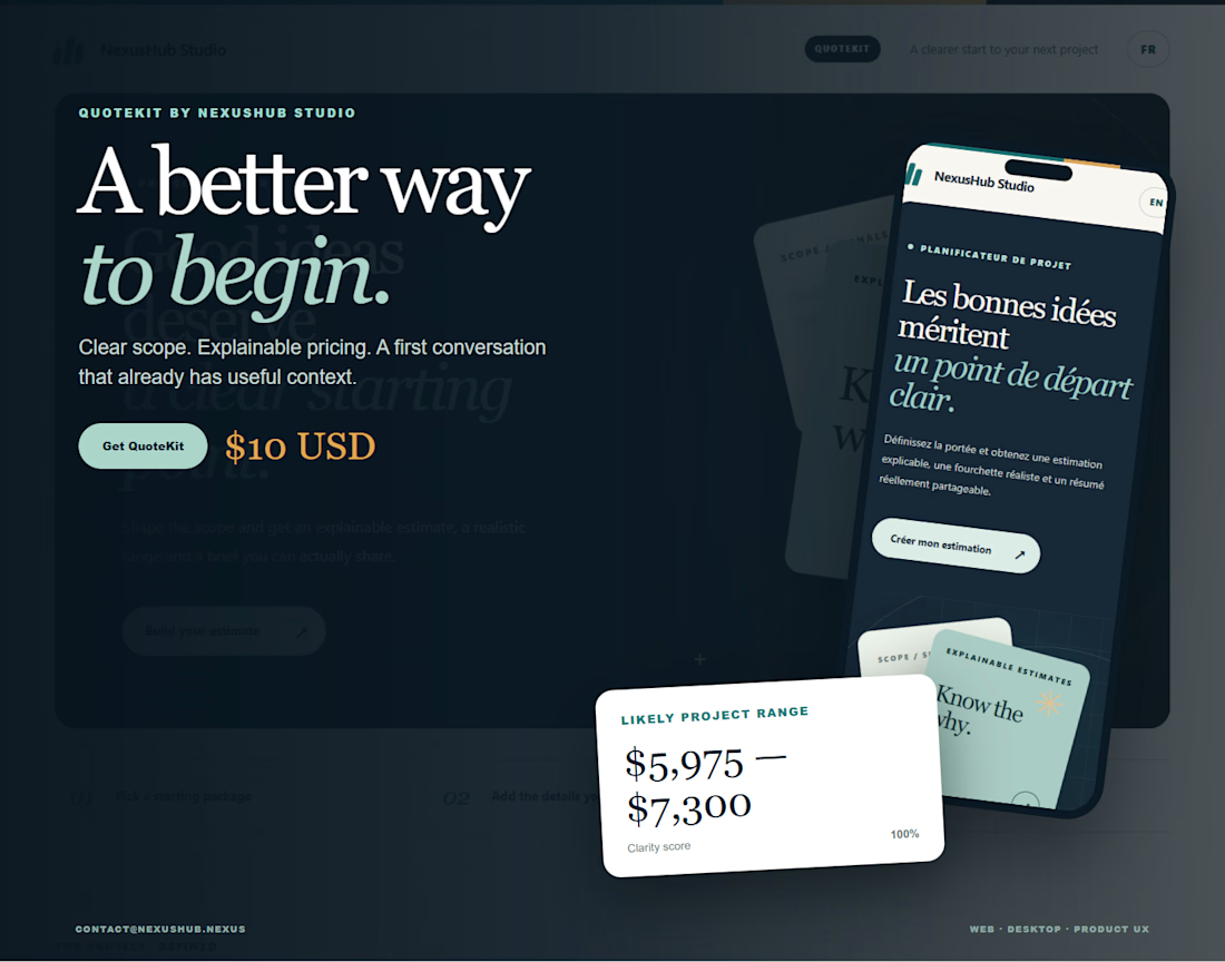
Explaining the estimate turns pricing into a much clearer conversation.