The network for creativity
Join 1.25M professional creatives like you
Connect with clients, get discovered, and run your business 100% commission-free
Creatives on Contra have earned over $150M and we are just getting started
Back to feedPost

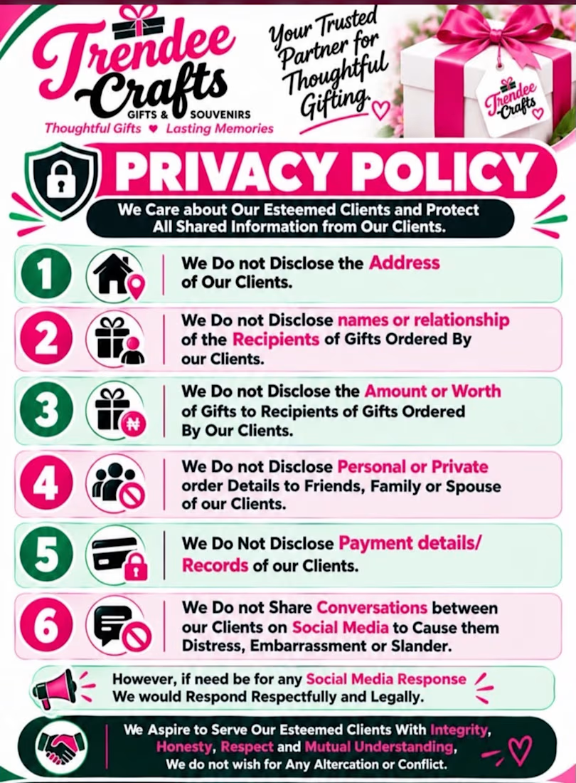
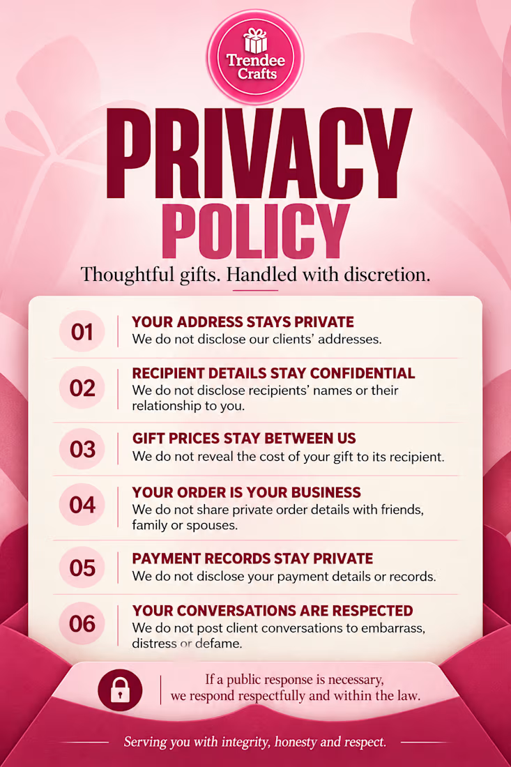
Before & After | Trendee Crafts Privacy Policy Flyer
On the right is the client’s original AI-generated flyer, which contained too much information in a condensed layout.
On the left is my redesign. I simplified the copy, improved the visual hierarchy, and made the policy easier to read while preserving the brand’s colour palette and maintaining a consistent logo.
Same brand identity. Clearer communication. Better design.
1/3
The network for creativity
Join 1.25M professional creatives like you
Connect with clients, get discovered, and run your business 100% commission-free
Creatives on Contra have earned over $150M and we are just getting started



Related posts


What happens when one website has to talk to two different people?
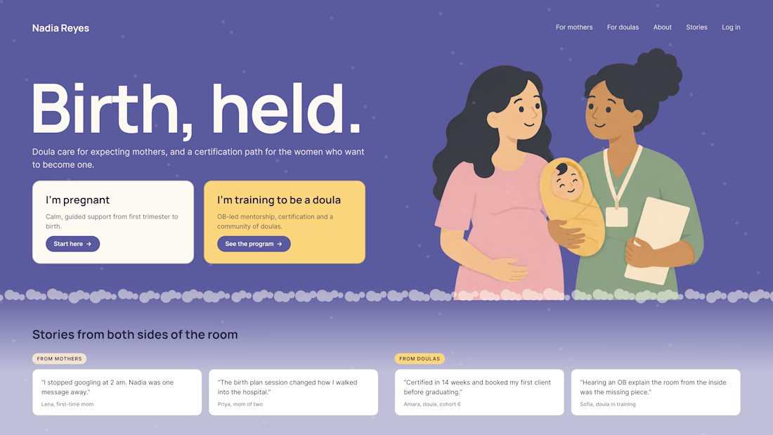
A client of ours teaches two audiences at once: expecting mothers who want a calm pregnancy, and women who want to become doulas. One brand, one site, two very different reasons to visit.
The usual fix is a hero that speaks to "everyone" and lands with no one. We designed it as a fork in the road instead:
1. Two doors in the hero. "I'm pregnant" and "I'm training to be a doula", side by side, equal weight. The visitor picks a path in one click, and the headline above them stays about the shared value.
2. One voice, two tones. The mothers' path is softer: fewer words, more room, gentle photos. The doula path is more structured: modules, certification, dates. Same fonts, same colors, different rhythm.
One proof section, split in two. Testimonials from mothers on the left, from doulas on the right. Each visitor sees people like them before the price.
Writing for everyone is writing for no one. Give each reader a door.
Have you ever designed a page for two audiences at once? How did you split it?


Really great point! Designing for two distinct audiences under one brand is always a challenge. Excited to see your approach to solving it.

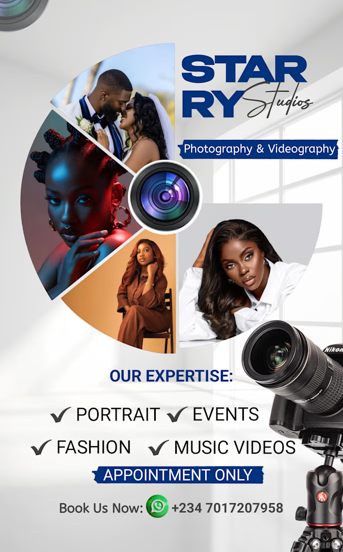
I Designed a bold, professional promotional flyer for Starry Studios, a photography and videography brand.
The goal was to create an eye-catching visual that communicates the brand’s expertise and encourages potential clients to book their services.
The design combines striking photography, a clean layout, and strong typography to showcase the brand’s services, including portraits, events, fashion, and music videos.




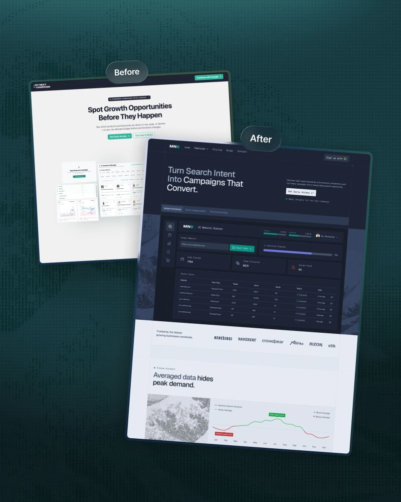
We redesigned ‘My Next Campaign’s website recently.
Clarity and a modern design were the entire plan behind this project.
The old website wasn’t up to date and didn’t match the app.
We wanted consistency throughout the brand so the product's easy to understand and navigate, and users know what to do next.
• A focused headline, supporting copy, and primary CTA.
• Kept features in a scannable module.
• Kept visual hierarchy to make the site less cluttered.
• Comparison with other tools to make the decision faster.
• Client testimonials, pricing plan, FAQ, and final CTA placed strategically.
We simplified the ‘My Next Campaign’ logo into the more distinctive ‘MNC’ mark.
The original wordmark is visually long.
It could be difficult to read at smaller sizes, and was challenging to place consistently in headers, navigation, and other branded sections.
This structure connects visuals with business goals.
Are you thinking about a redesign?
DM or comment here. Let’s work together.


Comparison with other tools placed before the pricing is a bold choice. Did you see it help people decide faster, or was it mostly a clarity move?