The network for creativity
Join 1.25M professional creatives like you
Connect with clients, get discovered, and run your business 100% commission-free
Creatives on Contra have earned over $150M and we are just getting started
Back to feedPost
The previous website (also designed by me) was done earlier, but he didn’t actively work on the business at that time. This redesign happened when he was ready to take it seriously.
The biggest challenge: no photos.
Since it’s still a client-side hustle, communication was sometimes slow and requirements weren’t always very clear....
That said he’s very Gen-Z coded, so somehow things still worked out between us 😄
From a design perspective:
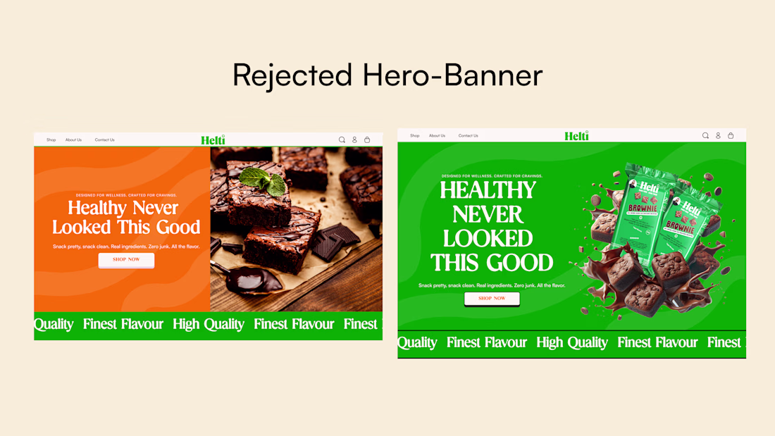
The core brand color was green, and the client wanted to stick strictly to it
I experimented with orange to add energy and contrast, but he didn’t like it
Being limited to one color reduced visual flexibility, especially without product photography
So I leaned heavily on bold, large typography to carry the hero message
I explored around four hero banner directions.
The network for creativity
Join 1.25M professional creatives like you
Connect with clients, get discovered, and run your business 100% commission-free
Creatives on Contra have earned over $150M and we are just getting started
Trending
Claude
Claude has entered the design space. How are you using Claude Design?
Contra University
Learn from expert creatives how to earn more using next-gen AI tools.
creativeaiflow
Creative AI workflows are evolving. What tools do you use, and what are their strengths and weaknesses?
freelancerlife
Freelancer life is wins, pivots, and everything in between. What’s yours right now?