The network for creativity
Join 1.25M professional creatives like you
Connect with clients, get discovered, and run your business 100% commission-free
Creatives on Contra have earned over $150M and we are just getting started
Back to feedPost
I built Atmos in 2 days 🫠 during the Figma Makeathon 🏃♂️
As a remote graphic designer, I love shaping my environment, light, sound and mood. So I created a customizable ambient web app that lets you choose illustrated scenes and soundscapes to design your work atmosphere.
I designed the illustrations, logo, and identity, and built the experience in Figma Make.
Hope you enjoy it, now I can finally go to sleep 😅
👉 Click the link below to try Atmos.
https://invert-reach-21943865.figma.site/


Thank you Madi! 😍


love this!
The network for creativity
Join 1.25M professional creatives like you
Connect with clients, get discovered, and run your business 100% commission-free
Creatives on Contra have earned over $150M and we are just getting started





Related posts

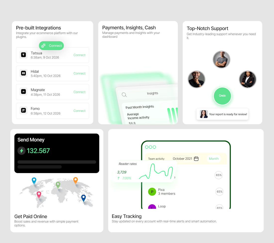
A bento system designed to make a SaaS product feel tangible.
I wanted each card to do more than display a feature — it needed to show the experience.
So I designed a collection of interactive-looking product cards around:
→ Integrations
→ Payments & insights
→ Customer support
→ Global payments
→ Real-time tracking
The visual direction combines minimal layouts, soft green accents, dashboard UI, subtle gradients and strong typography to create a modern fintech/SaaS feel.
The goal was simple:
Make the product feel useful before the user even clicks anything.
I'm currently open to UI/UX, Product Design and freelance opportunities.
If you're building a SaaS, fintech, Web3 or Web2 product and need a designer who can turn ideas into polished interfaces, let's work.
Available for new projects →
#UIDesign #ProductDesign #SaaS #Fintech #UXDesign #Figma #WebDesign #FreelanceDesigner


Love the vibe of this!

Built Loop - a landing page that turns “noise into a system.”
Warm gold, dark glass, subtle data-flow animations, and an interactive scroll story.
Built using Cadence Studios
What do you think? 🚀


the gold accents work really well here bro. just enough color to guide the eye without making the page feel busy

Which one brings more clarity to the hero section?
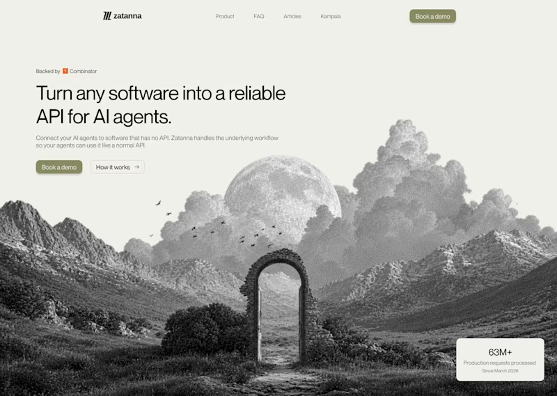
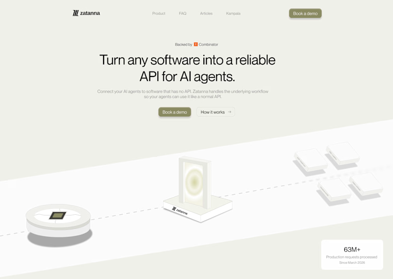
I was exploring a hero section concept for an AI product and tried two different visual directions.
Visual-led — focuses on explaining the idea through the interface/visual.
Isometric — uses a visual system to represent how the product works.
Both look good, but the real question isn't which one looks better.
Which one helps you understand the product faster?
That's something I always try to think about when designing hero sections — the visual should help explain the product, not just make the page look good.
Which one would you choose?
7 voted
58%
5 voted
42%
12 votes
Closed

The visual direction looks great, but I think Isometric does a better job of explaining the product.