The network for creativity
Join 1.25M professional creatives like you
Connect with clients, get discovered, and run your business 100% commission-free
Creatives on Contra have earned over $150M and we are just getting started
Back to feedPost
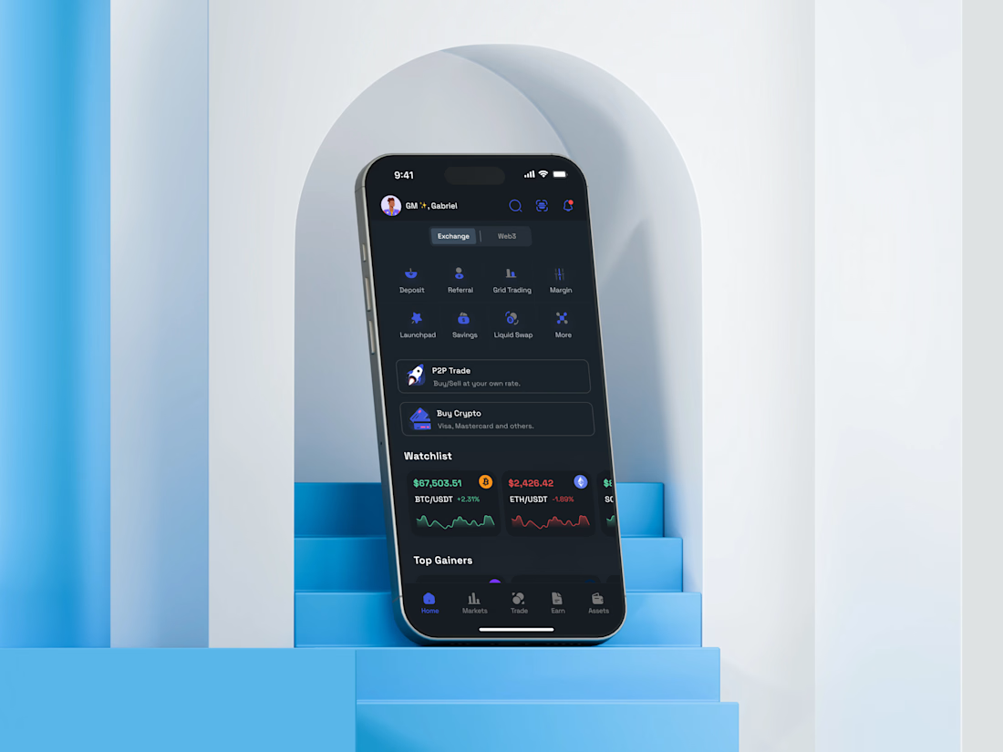
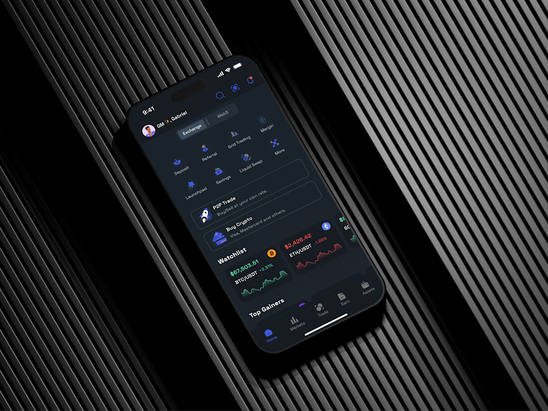
Recently wrapped up the homepage experience for a Crypto Exchange & Web3 mobile app.
The goal was to solve key usability challenges around information overload and complex financial interactions, making it easier for users to understand digital assets and take action with confidence. The design focused on reducing friction, improving clarity and ensuring critical actions are easy to find and complete.
Here are a few shots from the final design.
I’d love to hear your thoughts and feedback.


This is the kind of UI/UX work that makes users feel comfortable instantly—clean, engaging, and thoughtfully designed.

Thank you Rajesh! That was exactly the goal, to create an experience that feels intuitive and approachable from the very first interaction.
I appreciate your kind words.
The network for creativity
Join 1.25M professional creatives like you
Connect with clients, get discovered, and run your business 100% commission-free
Creatives on Contra have earned over $150M and we are just getting started



Related posts

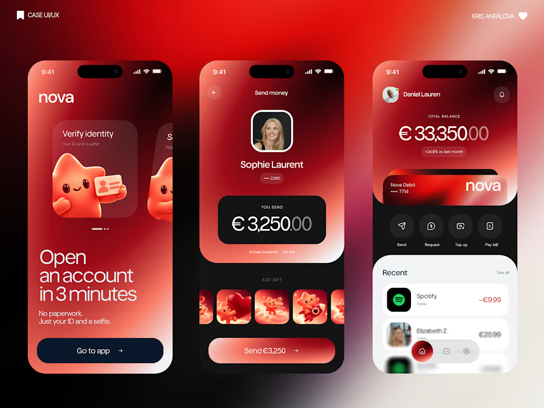
What if sending money felt a little more like giving a gift?
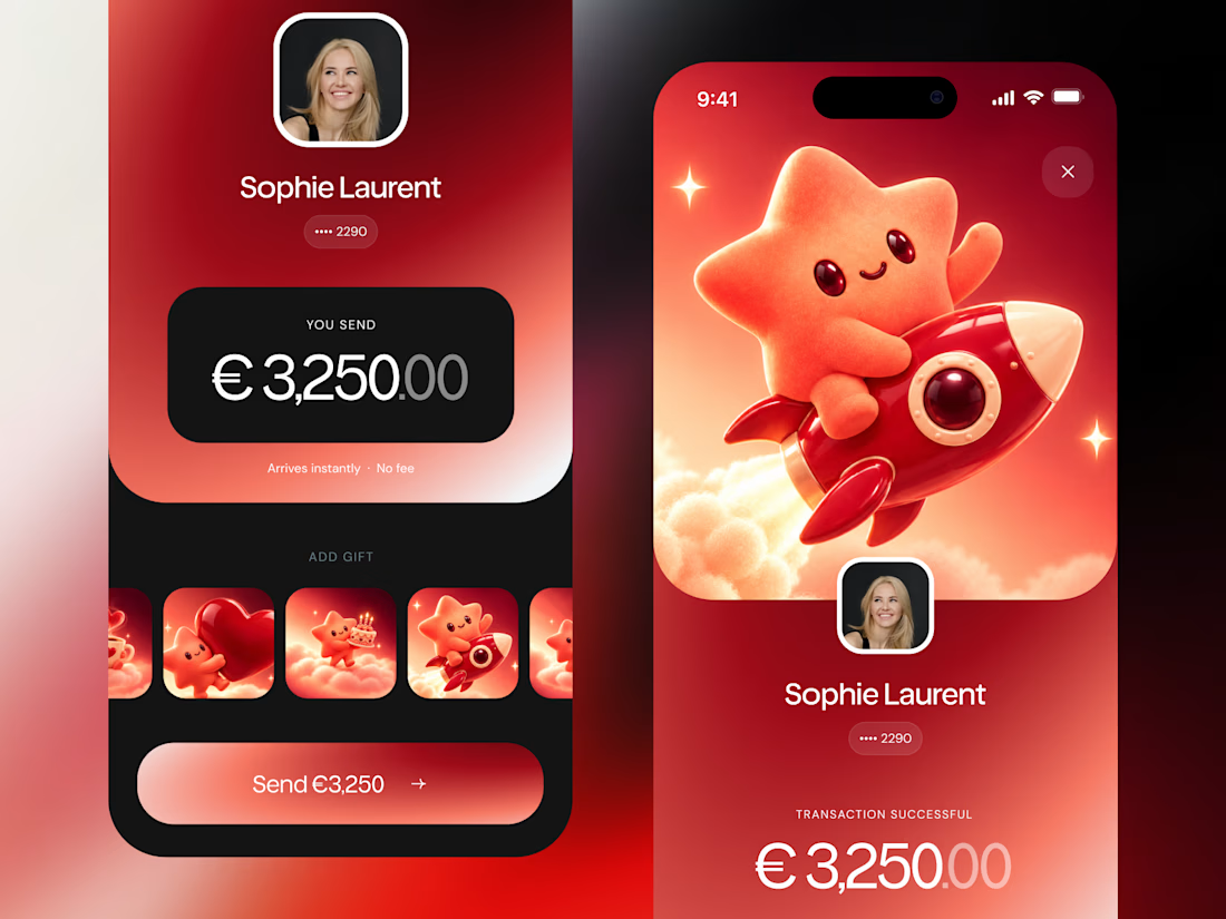
For Nova, I explored a banking app that brings payments, cards, and a bit of personality together. You can check your balance, browse recent transactions, send or request money, top up, and pay bills.
My favorite part is the digital postcard feature. Before sending a transfer, you can add a little illustrated card—a heart, a birthday greeting, or a playful character. A simple way to make birthday money or a thank-you feel more personal.
I carried that same 3D character into onboarding, pairing it with bold red gradients and large, clear payment details. There’s room for play, while the recipient and amount stay easy to check.
Would you add a postcard to a transfer? I’d love to know what occasion you’d use it for.




Some concept work from the agency. Planning to share more of what we create, from clean interfaces to the little motion details that bring them to life.
Check out the website: https://urest.agency/


Great!!