The network for creativity
Join 1.25M professional creatives like you
Connect with clients, get discovered, and run your business 100% commission-free
Creatives on Contra have earned over $150M and we are just getting started
Back to feedPost

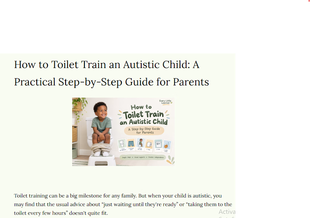
A step-by-step blog guide for parents on toilet training autistic children, covering readiness signs, predictable routines, visual supports, positive reinforcement, handling accidents, and common challenges.


The network for creativity
Join 1.25M professional creatives like you
Connect with clients, get discovered, and run your business 100% commission-free
Creatives on Contra have earned over $150M and we are just getting started



Related posts


A simple Kajabi funnel that works
You don't need a complicated funnel in Kajabi. Start with four pieces:
Opt-in page: one promise, one form, nothing else
Thank-you page: deliver the freebie and point to the next step
Email sequence: 3–5 emails that teach first, then invite
Sales page: the offer, proof, FAQ, and one button repeated
Build it with a Kajabi Pipeline, then style each page to match your brand, so it doesn't look like every other Kajabi site.
Building in Kajabi right now? Tell me which step you're stuck on.
#Kajabi #SalesFunnel #OnlineCourse #KajabiWebsite #CourseCreator


I’d add one test before sending traffic: submit the opt-in with a fresh email, check the freebie delivery, then follow the sales-page CTA through checkout. The pages can look finished while a tag, email or access rule still breaks the journey.

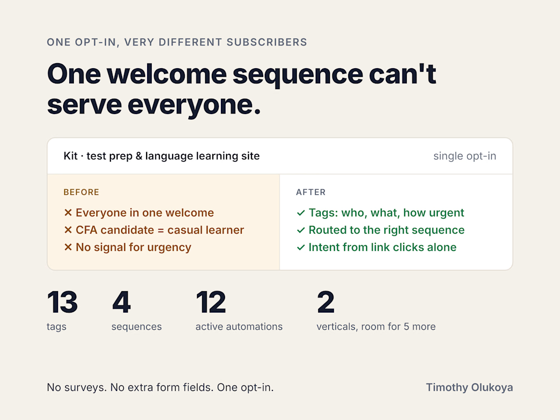
One opt-in. A CFA Level 3 candidate two weeks from their exam, and a casual Spanish learner. Same welcome sequence.
That was the starting point for a test prep and language learning site on Kit: very different audiences, and every new subscriber landing in the same emails.
The fix was a tag-based setup that works out who someone is, what they're preparing for and how urgently they need help, all from a single opt-in. No surveys, no extra form fields. Conditional automations route each person into the right sequence, and a behavioural layer picks up intent from link clicks alone.
What went live:
→ 13 tags, 4 sequences, 12 active automations across 2 verticals
→ Fully QA tested and documented
→ Built to add 5 more verticals without rebuilding
The client after handover: "Clean delivery, strong comms, genuinely useful advice. Will hire again for phase 2."
If your list serves more than one audience, how are you telling them apart today: a survey at signup, separate forms, or nothing yet?


Thirteen tags from a single opt-in sounds like a spreadsheet's love language. Honestly, respect.

AI-Generated Handbag Visuals for E-commerce & Marketing
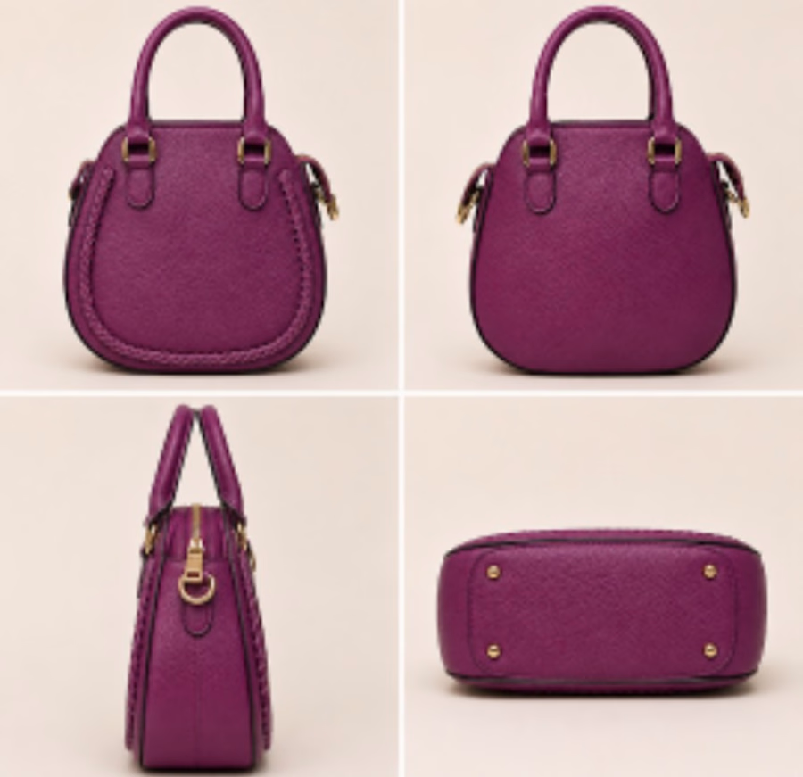
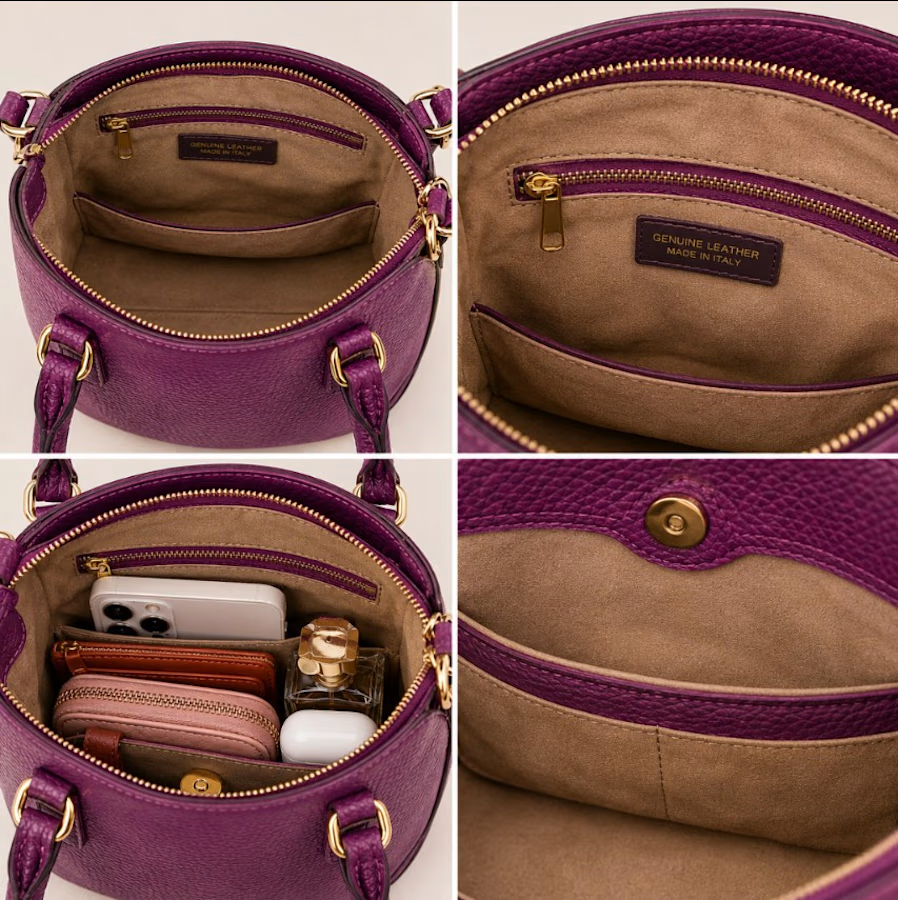
Developed a cohesive set of AI-generated visuals for a plum leather handbag, designed to help fashion brands present products with greater clarity and appeal across ecommerce and marketing channels.
The visual direction pairs a lifestyle image with detailed views of the bag’s texture, hardware, braided trim, interior, and storage. This gives prospective customers a fuller sense of the product while providing the brand with versatile imagery for product pages and promotional campaigns.
Created with ChatGPT.



Stunning