The network for creativity
Join 1.25M professional creatives like you
Connect with clients, get discovered, and run your business 100% commission-free
Creatives on Contra have earned over $150M and we are just getting started
Back to feedPost
You spent 3 hours on that design.
Your audience spent 3 seconds on it. And in those 3 seconds,
their eyes never even landed on your CTA.
Here is the uncomfortable 𝘁𝗿𝘂𝘁𝗵 most 𝗱𝗲𝘀𝗶𝗴𝗻𝗲𝗿𝘀 and 𝗰𝗿𝗲𝗮𝘁𝗼𝗿𝘀 ignore.
You are designing based on
what looks 𝗴𝗼𝗼𝗱 𝘁𝗼 𝘆𝗼𝘂. Not based on
where 𝗲𝘆𝗲𝘀 actually go.
Then, Lemme tell you something! 🙃
You place your headline in the center because it feels balanced.
You drop your CTA in the bottom-right because that is where it fits.
You fill the top of your carousel with a logo instead of a hook.
Meanwhile, your viewer's brain already decided to scroll past.
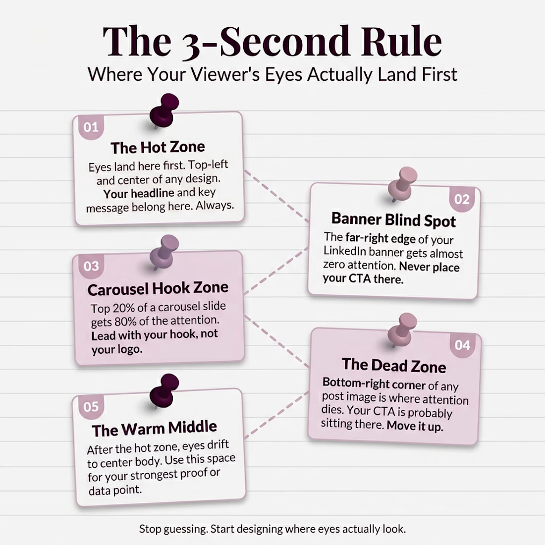
The hot zone on any design is the top-left and center.
That is where eyes land first. Every single time. If your most important
message is not sitting there, it is invisible.
The bottom-right corner?
That is the dead zone. Almost nobody
looks there. And that is exactly where most people
put their call to action.
Here is the 3-second rule I follow for every design now.
1. Hot zone gets the 𝗵𝗲𝗮𝗱𝗹𝗶𝗻𝗲.
Top-left and center. No exceptions.
2. 𝗛𝗼𝗼𝗸 first on carousels. The 𝘁𝗼𝗽
𝟮𝟬% of your slide gets 𝟴𝟬% of attention.
3. Move the 𝗖𝗧𝗔 𝘂𝗽. If it is in the
bottom corner, it does not exist.
4. Banner 𝗯𝗹𝗶𝗻𝗱 𝘀𝗽𝗼𝘁 is real. The far-right
edge of your LinkedIn banner gets almost zero eyes.
5. The warm middle earns the proof. After the hook
lands, eyes drift to center body. Put your strongest point there.
Stop designing for
𝗮𝗲𝘀𝘁𝗵𝗲𝘁𝗶𝗰𝘀. Start designing for 𝗮𝘁𝘁𝗲𝗻𝘁𝗶𝗼𝗻.
Save this infographic.
Send it to someone whose CTA is sitting in a dead zone right now.


This deserve more than just liking

Ahhhh, thank yuh man
The network for creativity
Join 1.25M professional creatives like you
Connect with clients, get discovered, and run your business 100% commission-free
Creatives on Contra have earned over $150M and we are just getting started
Related posts



nice!

danielll.design is live.
My corner of the internet. See the work, learn what I do, and book a call if you need a dedicated design partner.
Launching a product, redesigning a landing page, or need someone for ongoing design. This is where it starts.
Officially taking new projects 📩


Beautiful design!

Stop scrolling and start breathing. ☁️✨
Want to cram product shots, testimonials, and a killer header into a single viewport without the clutter? This layout is the ultimate hack for high-conversion hero sections.
Get maximum content density with maximum whitespace. It’s clean, it’s breathable, and it’s built for smooth motions that keep users engaged. 🚀
Save this for your next design sprint! 📌

Trending

Claude
Claude has entered the design space. How are you using it?

Contra University
Learn from expert creatives how to earn more using next-gen AI tools.
Brand Design
The best brand designers are on Contra. Scroll to see what's trending in brand design. What are you building?
creativeaiflow
Creative AI workflows are evolving. What tools do you use, and what are their strengths and weaknesses?
freelancerlife
Freelancer life is wins, pivots, and everything in between. What’s yours right now?