The network for creativity
Join 1.25M professional creatives like you
Connect with clients, get discovered, and run your business 100% commission-free
Creatives on Contra have earned over $150M and we are just getting started
Back to feedPost
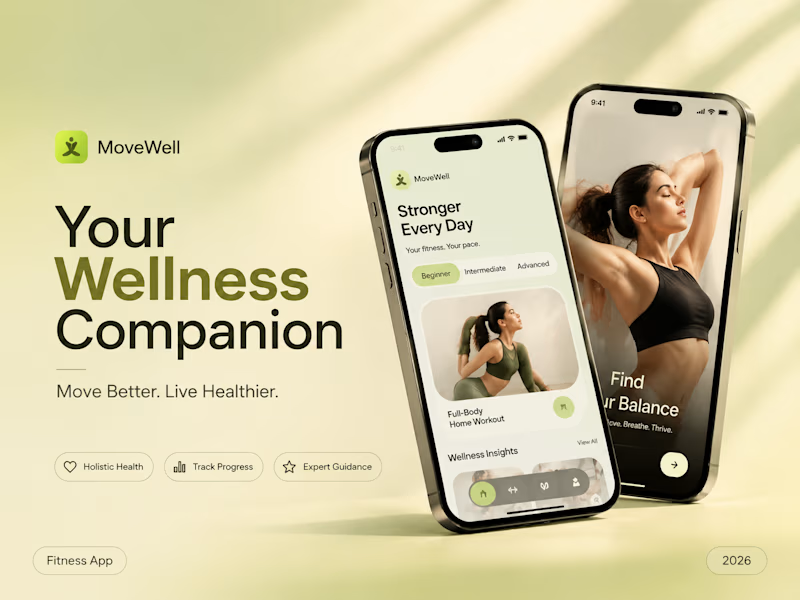
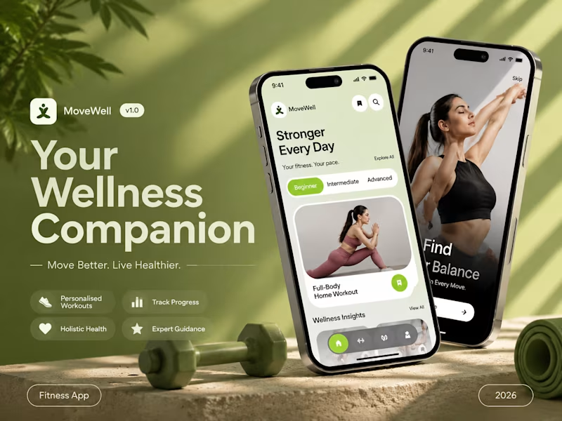
Taste Test

Which visual direction would make you more interested in exploring a wellness app? 👀
Both designs communicate the same product, but the visual experience creates a different first impression.
I'm curious to know which direction you'd choose and why.
Vote below!
2 votes
Ends in 1d

Soft & Minimal — calm suits wellness best.

Of course, it depends on personal preference, but for me, the soft design looks better and feels less busy.

Bold 🔥
The network for creativity
Join 1.25M professional creatives like you
Connect with clients, get discovered, and run your business 100% commission-free
Creatives on Contra have earned over $150M and we are just getting started





Related posts

For freelancing which one will you choose, I will choose contra.
1 voted
4%

24 voted
96%

25 votes
Closed


Very close to finish a website project! Help me out!
Blue or orange scheme?
38 voted
47%
43 voted
53%
81 votes
Closed

The orange scheme was stunning 😍

An agent that checks your receipts.
Which one do you prefer over the other - left or right?
1 voted
25%
3 voted
75%
4 votes
Closed