The network for creativity
Join 1.25M professional creatives like you
Connect with clients, get discovered, and run your business 100% commission-free
Creatives on Contra have earned over $150M and we are just getting started
Back to feedPost

A restaurant homepage has about 5 seconds to turn a hungry visitor into a guest. Here is what it must show instantly:
The menu — or at least today's highlights
Where you are — neighborhood and hours
One clear button: Reserve a table or Order online
If a visitor has to hunt for any of these, they will leave and book somewhere else. The prettiest homepage in the world will not save a restaurant that hides the basics.
What is the first thing you look for on a restaurant's website?

Good point about making the menu easy to find.
The network for creativity
Join 1.25M professional creatives like you
Connect with clients, get discovered, and run your business 100% commission-free
Creatives on Contra have earned over $150M and we are just getting started



Related posts


What makes a website feel cohesive?
It’s not just the colors.
It’s not just the typography.
And it’s definitely not about making every section look the same.
A cohesive website is built when every visual decision feels like part of the same story, from typography and imagery to spacing, buttons, cards, and even the smallest details.
The goal isn’t repetition.
It’s creating a visual language that people recognize and remember.
That’s when a website starts to feel like a brand, not just a collection of sections.
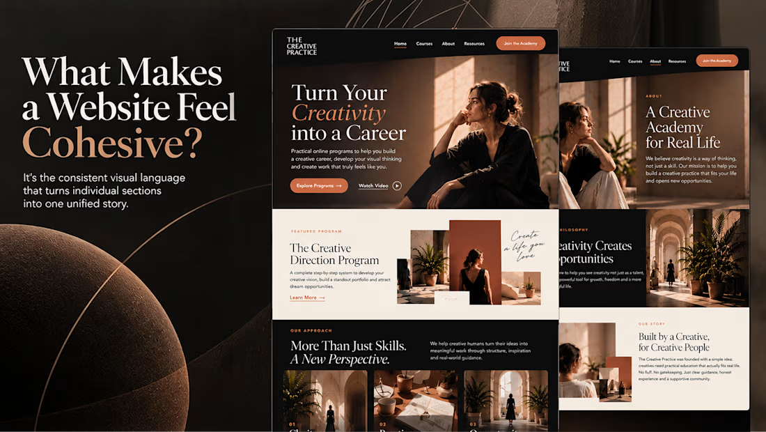

Well put, Serge. Consistent spacing, buttons and cards do more for that feeling than making sections match, and they are usually the first things to drift as a site grows.


A bold, modern landing page for a creative agency, built around immersive visuals and strong typography. We’d love to hear your thoughts!


Meet the Mental Reps squad!
We got a chance to bring these seven characters to life, including building a fully custom Shopify store for Mental Reps Co., a performance-psychology brand that teaches kids the mental game.
Each one lives in mentalrepsco.com
Big feelings, tiny monsters.


Love the concept and illustration style here. Making complex emotions friendly and tangible for kids is tough, but this squad nails it effortlessly. The branding looks super playful and clean!


