The network for creativity
Join 1.25M professional creatives like you
Connect with clients, get discovered, and run your business 100% commission-free
Creatives on Contra have earned over $150M and we are just getting started
Back to feedPost

From user research to polished interfaces, we design digital products that are intuitive, scalable, and built for real users. 🚀

The network for creativity
Join 1.25M professional creatives like you
Connect with clients, get discovered, and run your business 100% commission-free
Creatives on Contra have earned over $150M and we are just getting started
Related posts

Landing page design for Lumo — banking for freelance life
Banks sell control — dashboards, charts, a card floating at fifteen degrees. Freelancers don't want control over their money. They want to stop thinking about it in the gap between sending an invoice and the money landing.
That gap is what the page is built on. The product sits in a meadow instead of on a dark grid, because the promise isn't "manage your finances better" — it's "we handle the part that keeps you up." And the strongest line on the page isn't a feature: no waiting for Monday. Freelancers don't lose weekends to fees. They lose them to timing.
The proof follows the same rule. One freelancer, one number — 4% lost on every international payment. A percentage someone can check against their own account beats any adjective.


great visuals 🙌

I design websites, build them in Framer, and also do branding
Here’s some of my recent work
See more at dhirajingle.com
DM me or book a call 🤝

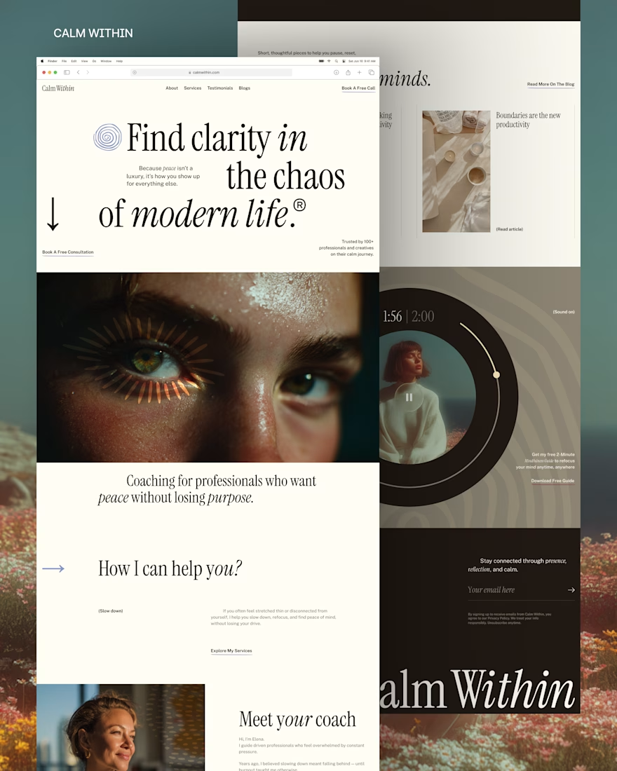
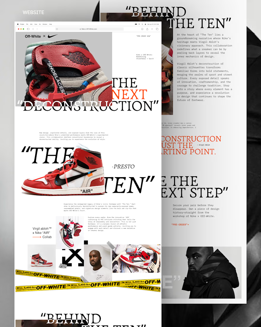
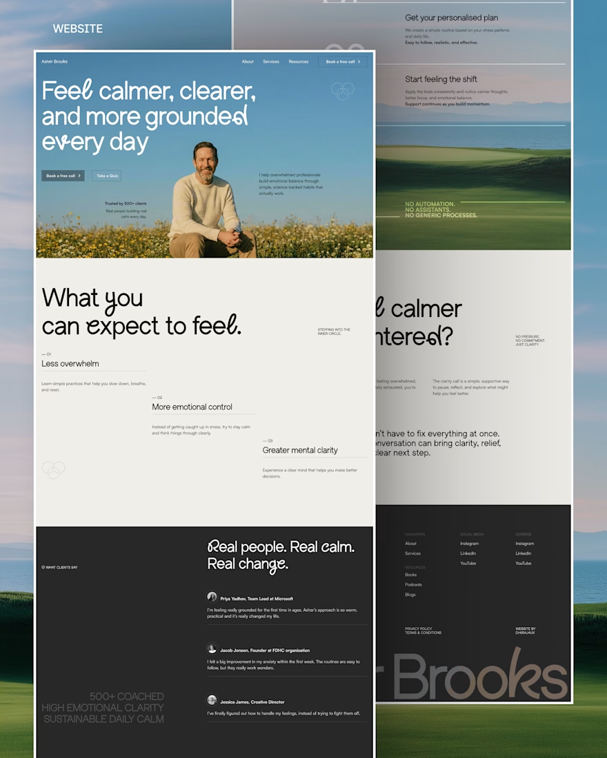
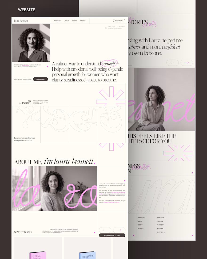


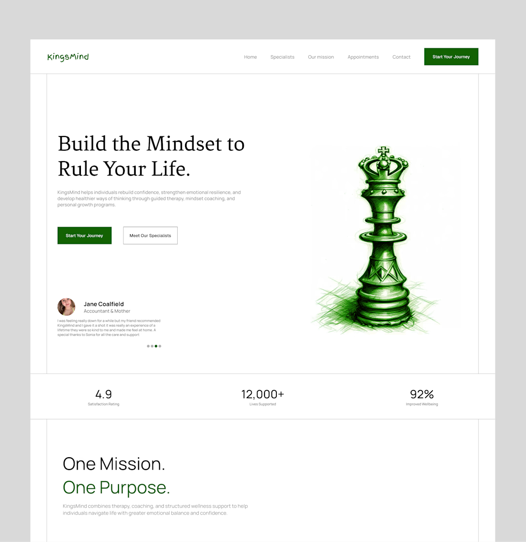
Bringing an old hero section design back to the spotlight. ✨
A hero section is often the first thing people see when they visit a website, so it needs to do more than just look good. It should capture attention, communicate the brand's message, and guide visitors toward the next step.
For this concept, I focused on creating a clean layout, strong visual hierarchy, and a balanced composition that makes the content feel clear and engaging without overwhelming the viewer.
Looking back at older projects is always a good reminder of how much thought goes into the little details that make a design work.
What do you think of this one? 👀
#WebDesign #UIUXDesign #HeroSection #LandingPageDesign #Framer #WebDesigner #UIDesign #DesignInspiration #Contra #PortfolioWork


this is amazing design