The network for creativity
Join 1.25M professional creatives like you
Connect with clients, get discovered, and run your business 100% commission-free
Creatives on Contra have earned over $150M and we are just getting started
Back to feedPost

Looking back one year ago these times I started using contra and it completely changed my life! I actually really moved to Dubai afterwards :D
The network for creativity
Join 1.25M professional creatives like you
Connect with clients, get discovered, and run your business 100% commission-free
Creatives on Contra have earned over $150M and we are just getting started
Related posts

Just signed off on a project @Contra
Client reached out from Behance (which is wild, I know), looking for a B2B landing page for fintech / POS (point-of-sale) software company.
Hopped on a discovery call right away and discussed a few key things, and the client knew immediately I was the right person for the job.
What's crazy is that I also offered motion design services, and he said, "Yes, please!"
Great clients don’t haggle.
They know what they want and move fast.
Excited to get started!
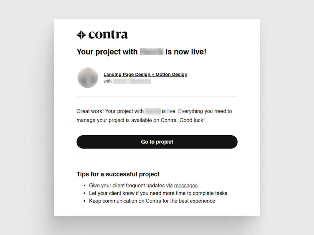

Love that a client found you on Behance and it turned into a B2B fintech landing page. Jumping on a discovery call right away probably made all the difference.

Day 5 of my Contra Pro experiment. Honest update.
What's working: followers, likes, real conversations.
What's not working yet: clients. Zero so far.
So the plan changes. More activity:
3 posts a day
1 new portfolio piece every day (I have hundreds of works sitting in my files)
Adding Threads and LinkedIn to the mix
Which channel actually brought you clients: Contra, LinkedIn or Threads? 👇
#contrapro #buildinpublic #freelancetips #findingclients

A little transparency. A lot of character.
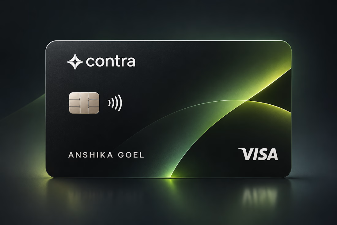
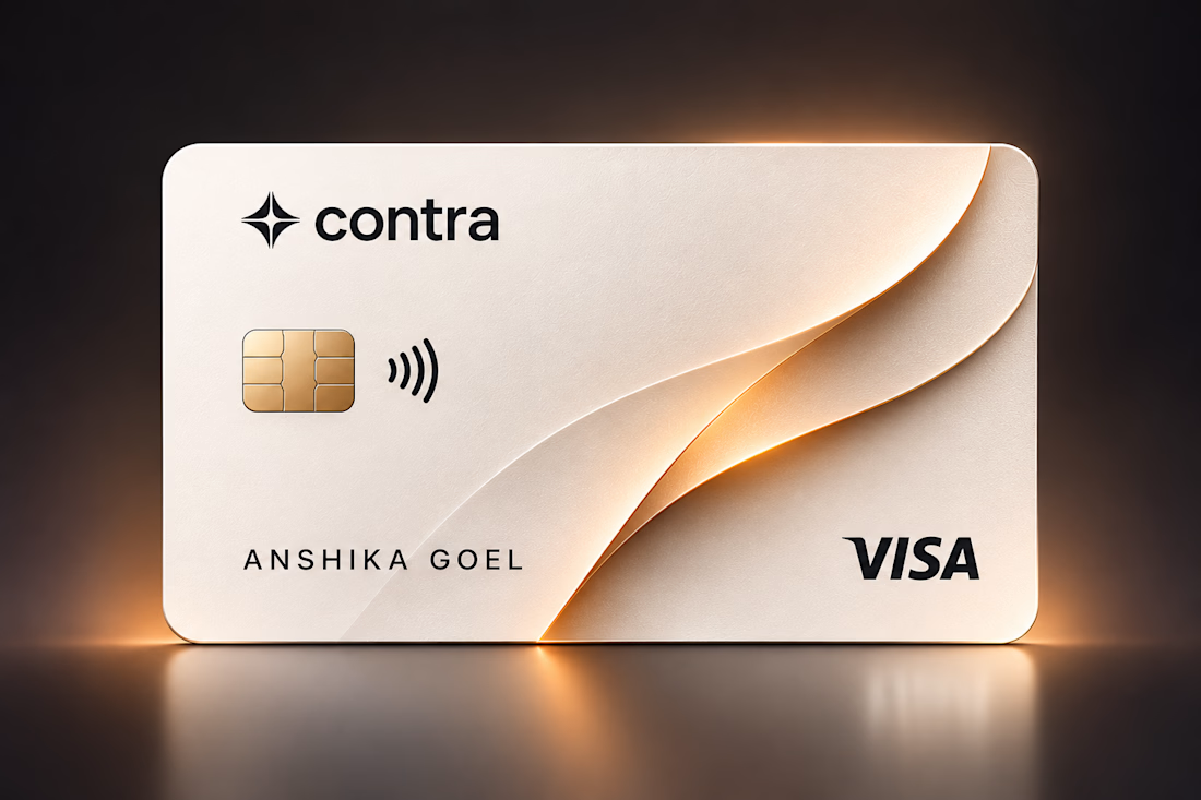
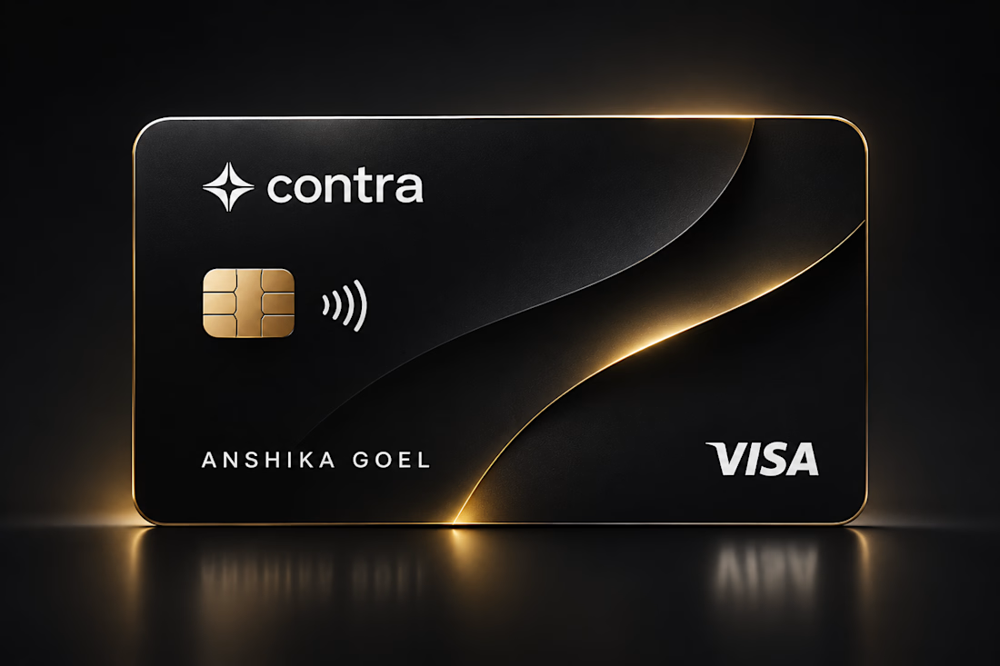
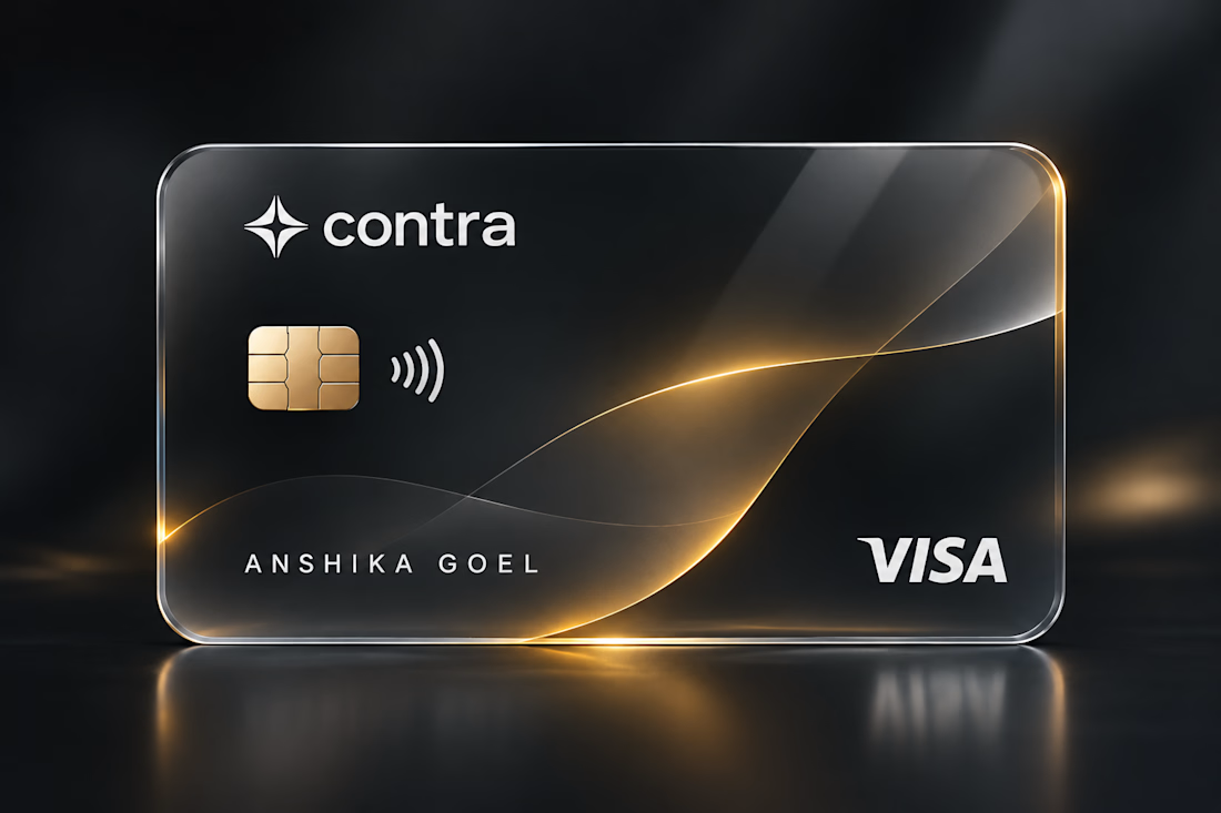
What if a payment card felt less like a financial product and more like a piece of design?
Exploring a new direction for Contra’s card concept, combining transparent materials, soft metallic edges, and subtle gold reflections to create something that feels premium without trying too hard.
The idea was simple: make everyday payments feel a little more intentional.
Minimal by design. Distinct by nature.
#FintechDesign #VisualDesign #3DDesign #ConceptDesign