The network for creativity
Join 1.25M professional creatives like you
Connect with clients, get discovered, and run your business 100% commission-free
Creatives on Contra have earned over $150M and we are just getting started
Back to feedPost
Taste Test


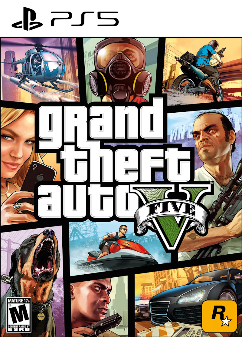
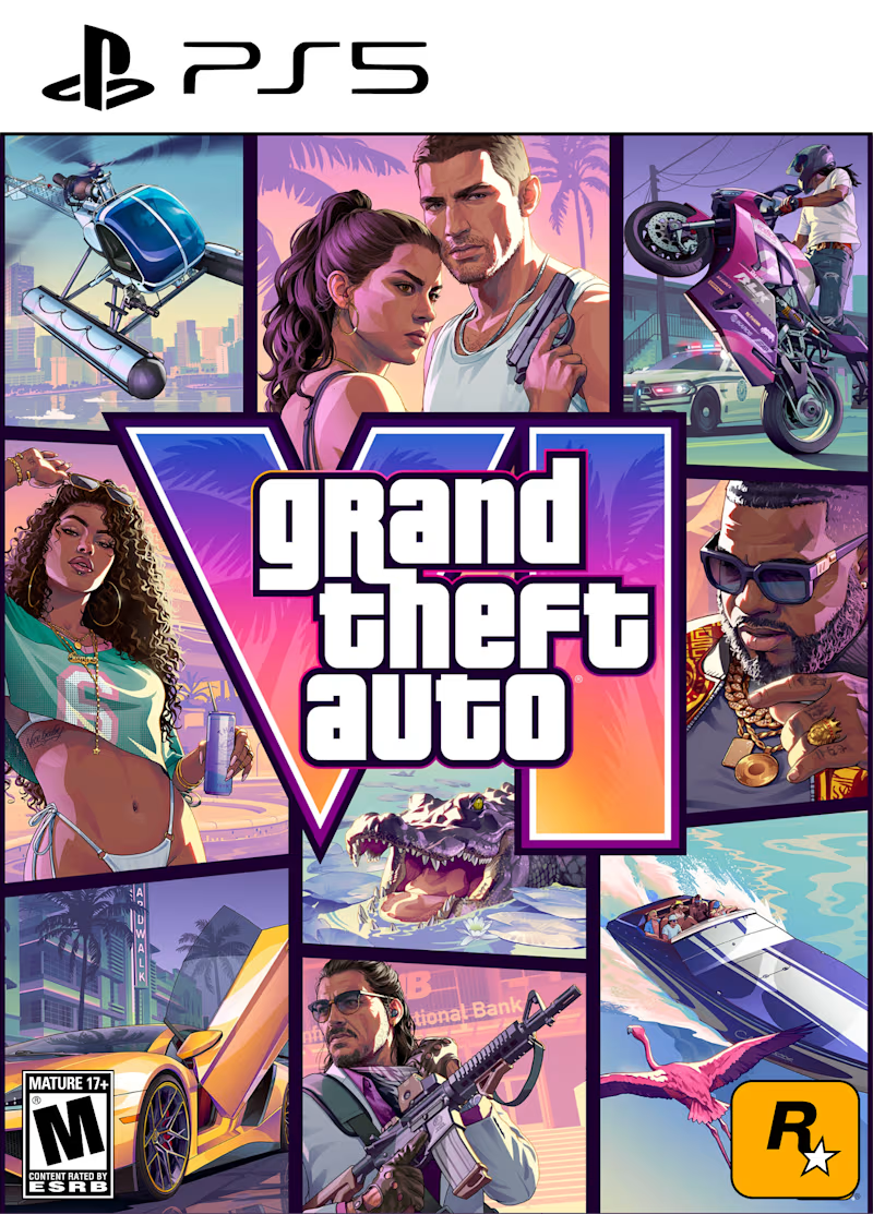
Which cover art do you prefer?👀
Rockstar has always been faithful to its classic mosaic grid system. This rigorous visual consistency is undoubtedly one of the pillars that helps solidify the franchise as an incredibly strong and instantly recognizable brand worldwide.
But thinking about design, which do you prefer and why? Has there been any design evolution since 2013?
0 voted
0%
11 voted
100%
11 votes
Closed

GTA 6 for me. The mosaic system is still there, but the hierarchy feels much stronger. The oversized VI creates a clear focal point, while the surrounding panels have more room to breathe. GTA 5 feels information-dense, GTA 6 feels more intentional.

Both for what they are. I'd say the styles are not interchangeable.

Going for GTA 6 version

GTA 6 (2026) version


Not options in my opinion. Old design was best in its time and still pretty cool, new design is the best right now.

Will go for GTA 6 (2026) Version

GTA 6 for me. The color palette shift is the most interesting evolution. The warmer, more vivid tones feel more contemporary while the grid system stays intact. Rockstar basically updated the mood without touching the structure, which is smart brand continuity.
The network for creativity
Join 1.25M professional creatives like you
Connect with clients, get discovered, and run your business 100% commission-free
Creatives on Contra have earned over $150M and we are just getting started





Related posts

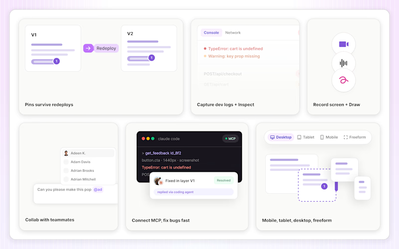
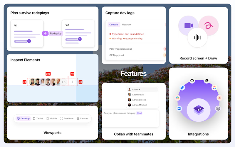
Which one's more cooked for LayerDock's Chrome Store screenshot? 👀
3 voted
15%
17 voted
85%
20 votes
Closed

2 'pops' in the best way.

I published my first Framer template. It’s free.
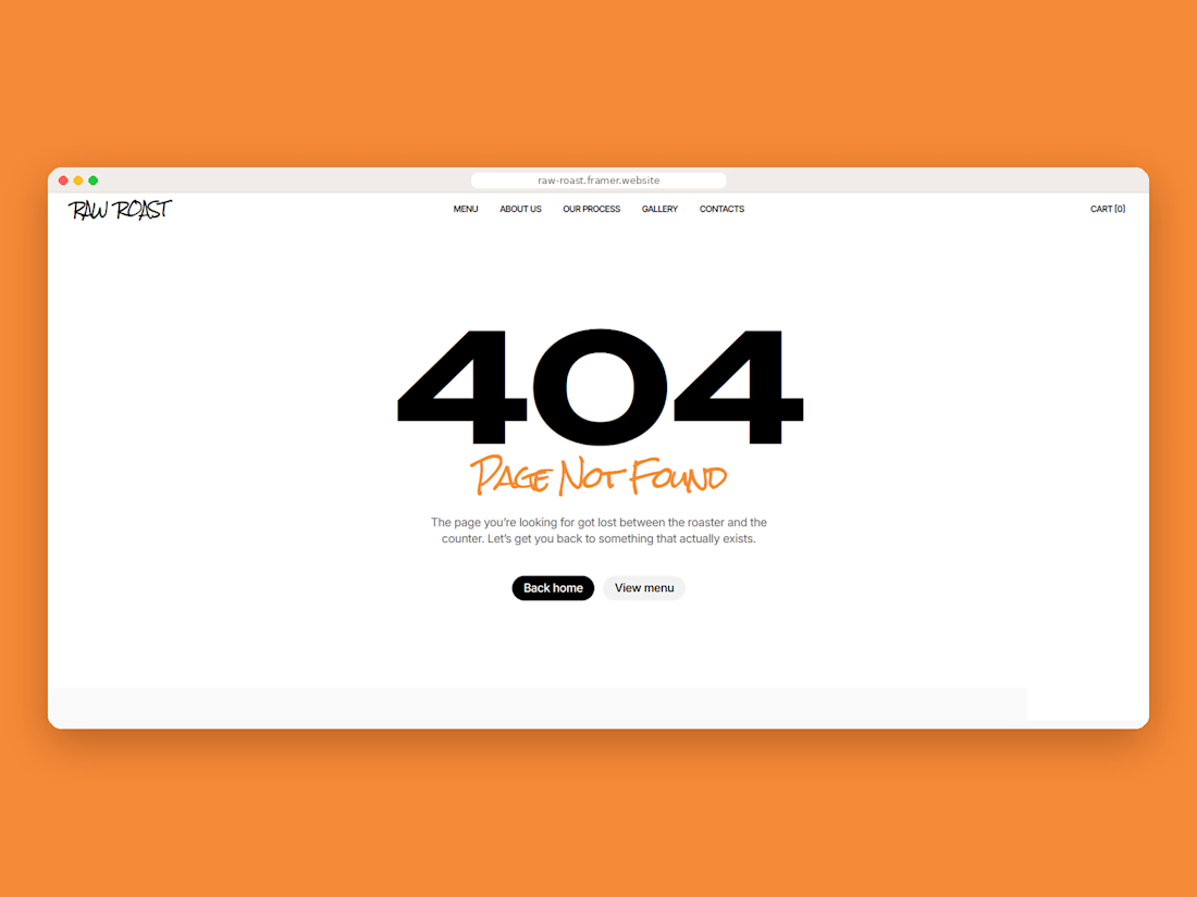
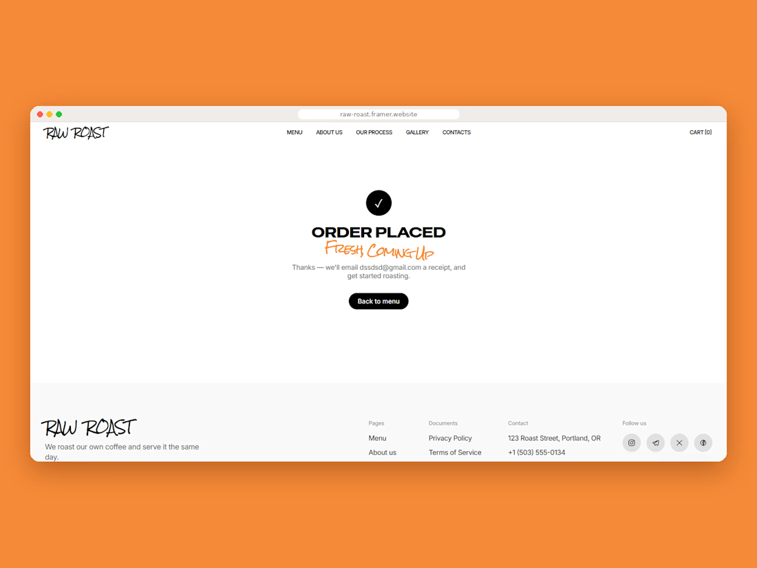
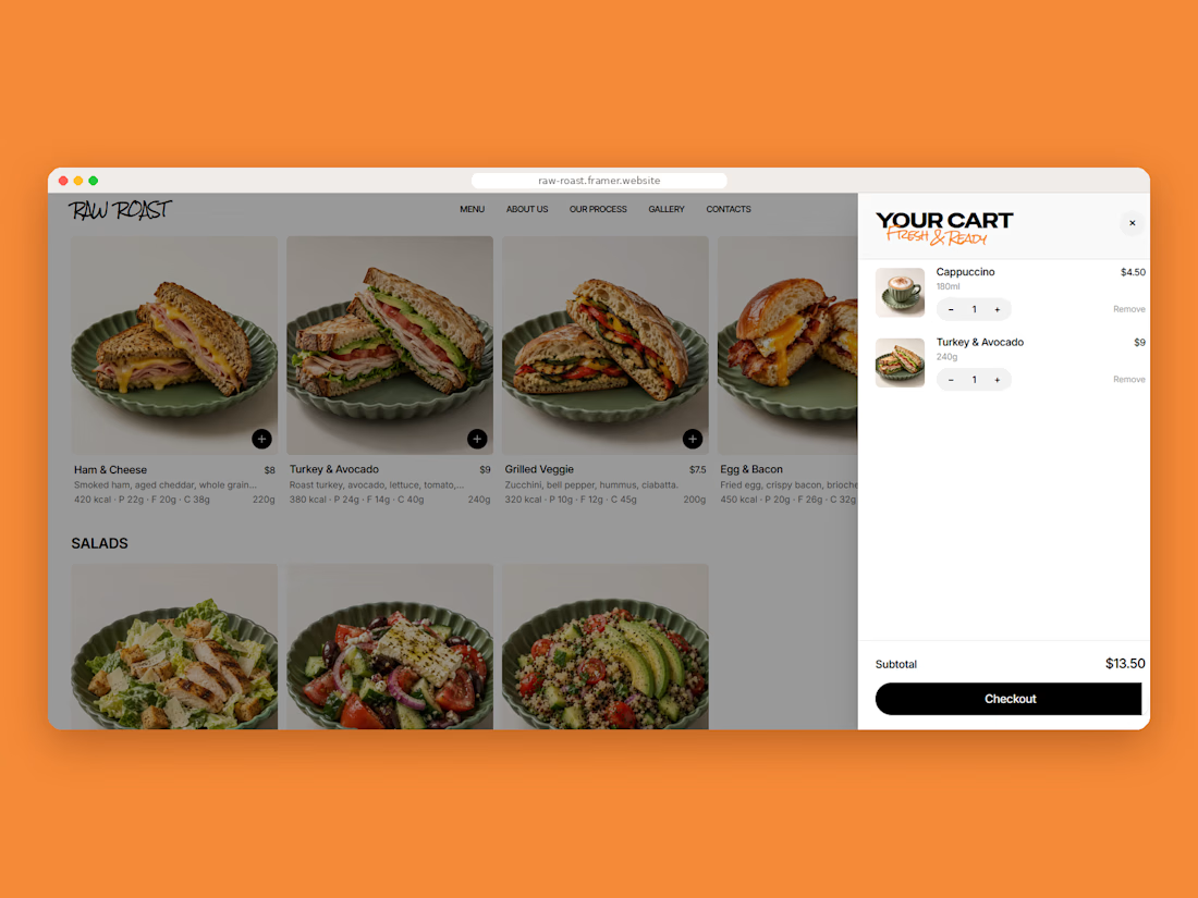
Raw Roast is a site for a coffee shop that roasts its own beans. The style is street-like: big hand-drawn lettering and black-and-white doodles.
What’s in it:
Home, About, Our Process, Gallery, CMS-based menu, Item page, Cart, 404, 401 and legal pages, Desktop, tablet and phone layout.
Links
Template in Framer: https://www.framer.com/marketplace/templates/raw-roast/
Live preview: https://raw-roast.framer.website/
Feel free to use it and change it for your own shop. If you do, I’d be glad to see the result.😍



Crisp, clean, and effective.

Which book cover design theme speaks the clearest?
6 voted
38%

10 voted
62%

16 votes
Closed