The network for creativity
Join 1.25M professional creatives like you
Connect with clients, get discovered, and run your business 100% commission-free
Creatives on Contra have earned over $150M and we are just getting started
Back to feedPost


The network for creativity
Join 1.25M professional creatives like you
Connect with clients, get discovered, and run your business 100% commission-free
Creatives on Contra have earned over $150M and we are just getting started





Related posts


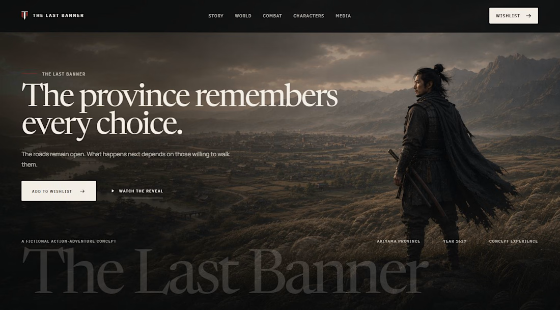

A Japanese cinematic gaming tone is hard to hold in a single CTA section. Which parts did you build in Webflow and Framer, and where did ChatGPT help?

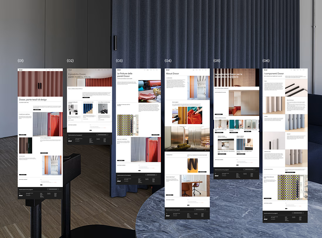
This project was slightly out of my comfort zone.
Most of my work tends to be warmer, more elegant and feminine. So when this client asked for something very rigid, minimal and clean, I knew I was going to have to approach the project differently.
They are architects, and they wanted their structural, precise and highly organised way of thinking to come through in the website.
I have to admit, I was a little scared at the beginning.
It’s always interesting when a project doesn’t immediately feel like “you”. There’s a temptation to bring your own aesthetic into everything you create — but sometimes the real challenge is knowing when not to.
Looking at the final website now, I actually love how consistent it feels with their identity.
And perhaps that’s the real goal of design: not to make everything look like your work, but to create something that feels unmistakably like your client.
Have you ever worked on a project that was completely outside your usual aesthetic? Did you embrace it, or did you find yourself trying to bring it back into your own visual language?