The network for creativity
Join 1.25M professional creatives like you
Connect with clients, get discovered, and run your business 100% commission-free
Creatives on Contra have earned over $150M and we are just getting started
Back to feedPost

Built this the other day, a figjam inspired endless notepad perfect for quick thoughts and random doodles. Making personal software rocks!
Built with cursor + opus 4.6
https://nidhijamps.vercel.app/prototypes/noted-os

The network for creativity
Join 1.25M professional creatives like you
Connect with clients, get discovered, and run your business 100% commission-free
Creatives on Contra have earned over $150M and we are just getting started





Related posts

Some of you saw the Spotify prototype I shared a couple of weeks ago. A few days later, Frank Bach tweeted about wanting Spotify to remember the album he was on when he jumps to a podcast.
So I prototyped it (React + Motion). The album waits behind the podcast, and one tap takes you back to where you were.
Try it here: https://uzookafor.com/two-streams/


Nice one man

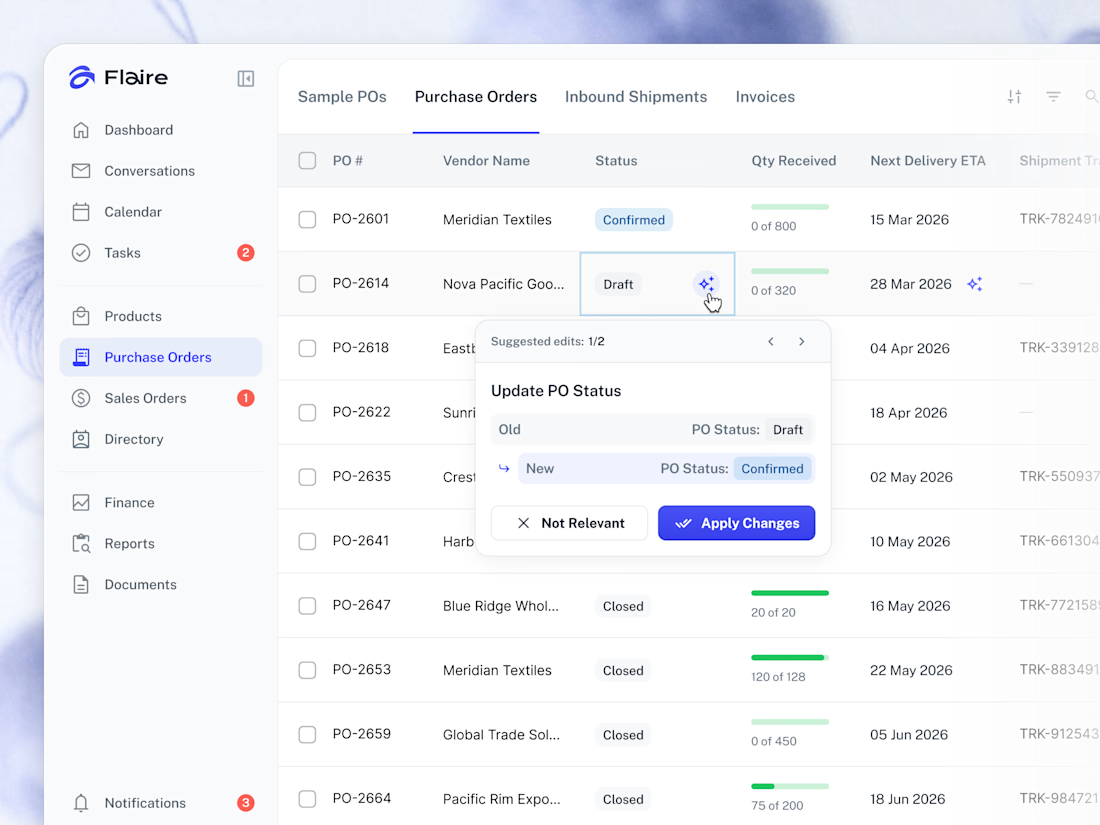
✨ AI Suggestions on the Purchase Orders list. Proposed record edits surface inline for the user to apply or dismiss in one tap.



Great work


Well done