The network for creativity
Join 1.25M professional creatives like you
Connect with clients, get discovered, and run your business 100% commission-free
Creatives on Contra have earned over $150M and we are just getting started
Back to feedPost
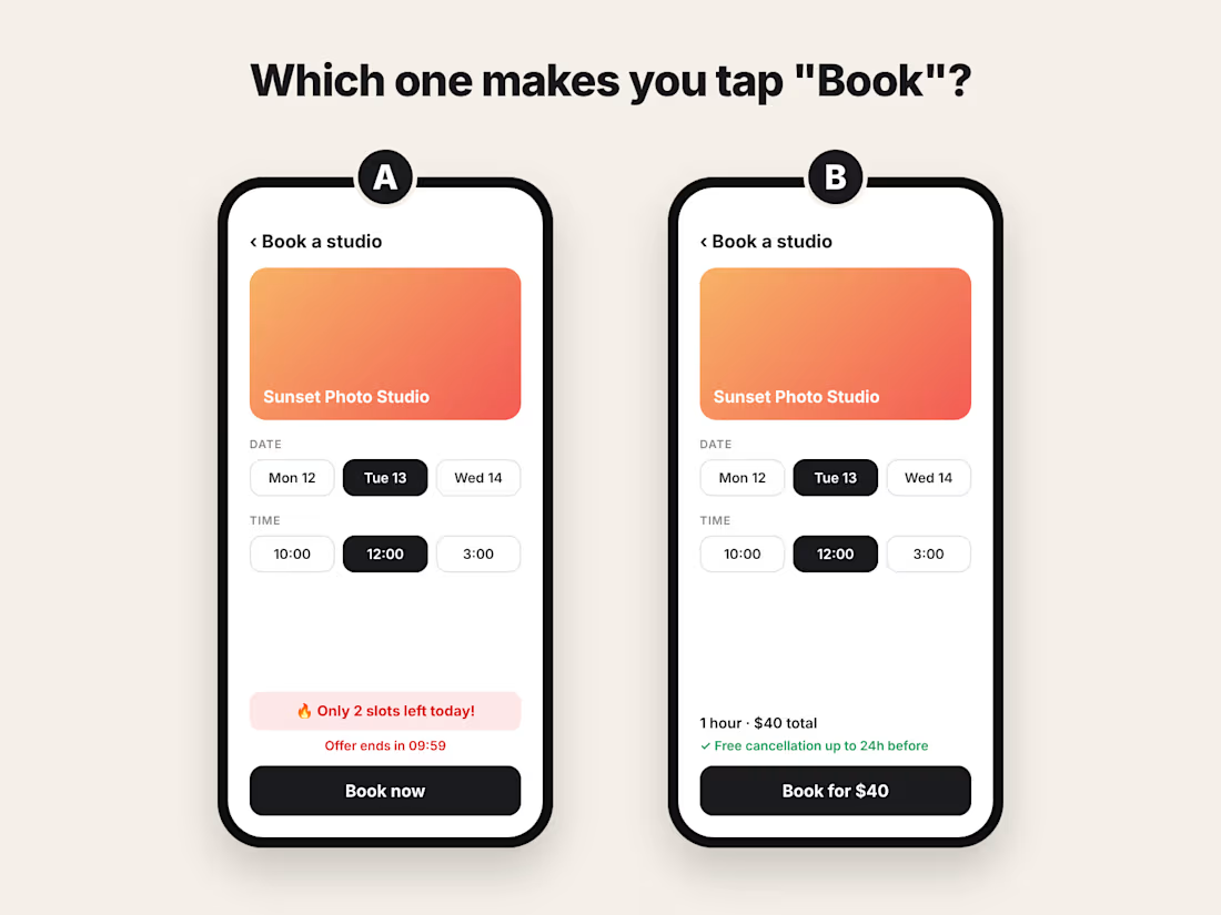
Same app. Same studio. Same time slot.
Only one thing is different.
Screen A rushes you. "Only 2 slots left." A timer. A red warning.
Screen B calms you. The full price. Free cancellation.
I build booking apps, and I see this choice a lot.
𝗢𝗻𝗲 𝗼𝗳 𝘁𝗵𝗲𝘀𝗲 𝗴𝗲𝘁𝘀 𝘁𝗵𝗲 𝘁𝗮𝗽. 𝗧𝗵𝗲 𝗼𝘁𝗵𝗲𝗿 𝗴𝗲𝘁𝘀 𝘁𝗵𝗲 𝗯𝗼𝗼𝗸𝗶𝗻𝗴.
Which one would make you book? A or B?
Tell me why in the comments.

what would you change on either screen to get more people to book?

B. Seeing the total and free cancellation up front makes booking feel safe. The timer on A just makes me hesitate.
The network for creativity
Join 1.25M professional creatives like you
Connect with clients, get discovered, and run your business 100% commission-free
Creatives on Contra have earned over $150M and we are just getting started





Related posts

Designing for therapists means prioritizing what matters in the next few minutes, not just what looks good on a dashboard.
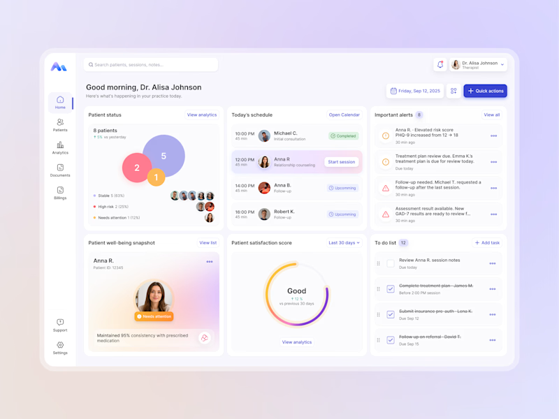
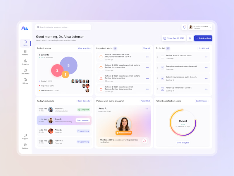
I explored two layout directions for a mental health practice management web app that helps psychologists manage sessions, patients, documentation, tasks, and follow-ups.
Both concepts use the same core widgets, but with different positioning and visual hierarchy. The goal was to make daily priorities easier to scan and act on.
Which option feels more intuitive - A or B? 🤔
17 voted
68%
8 voted
32%
25 votes
Closed


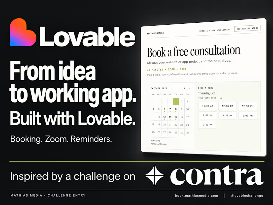
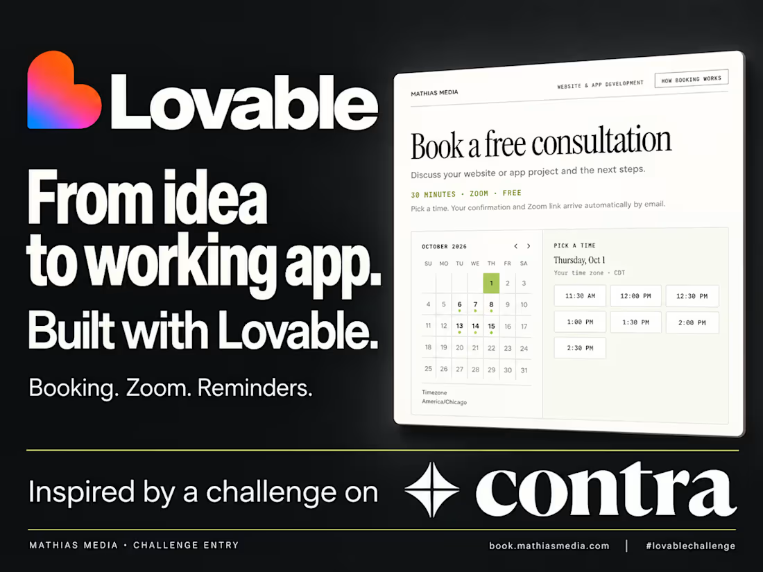
I used @Lovable to build a working booking app for my business—and the most useful part happens after someone clicks “Book.”
The goal: easier booking for clients, less scheduling work for me.
The app creates their Zoom meeting, sends their confirmation, schedules reminders, and lets them reschedule or cancel.
The client’s part? Pick a time. Enter a name and email. Done.
I built this for Mathias Media, my website and app studio in Minneapolis, as part of @Contra’s #lovablechallenge.
With Lovable, I built around how I actually work: consultations Tuesday through Thursday, a maximum of three calls a day, and buffers between appointments. The app handles those rules while keeping booking simple.
That’s what makes this Contra challenge worthwhile: a reason to turn a real business need into something useful with Lovable.
Try it: https://book.mathiasmedia.com/
Walkthrough and build-process recording attached.
Have a business process you wish worked better? Give Lovable a try.

Baking the Tuesday to Thursday, three calls max rule right into the app is the smartest part of this imo. Most booking tools make you bend around them. Have clients noticed the limits or does it just quietly feel like you're in demand?
Built with @Lovable for @Contra HQ’s #lovablechallenge.
I built a booking app for Mathias Media, my solo web studio in Minneapolis.
Pick a time. Enter your name and email. Zoom links, confirmations, and reminders happen automatically. Clients can reschedule or cancel, and a three-call daily limit protects time for client work.
Try it: https://book.mathiasmedia.com/
Walkthrough and build recording attached.