The network for creativity
Join 1.25M professional creatives like you
Connect with clients, get discovered, and run your business 100% commission-free
Creatives on Contra have earned over $150M and we are just getting started
Back to feedPost

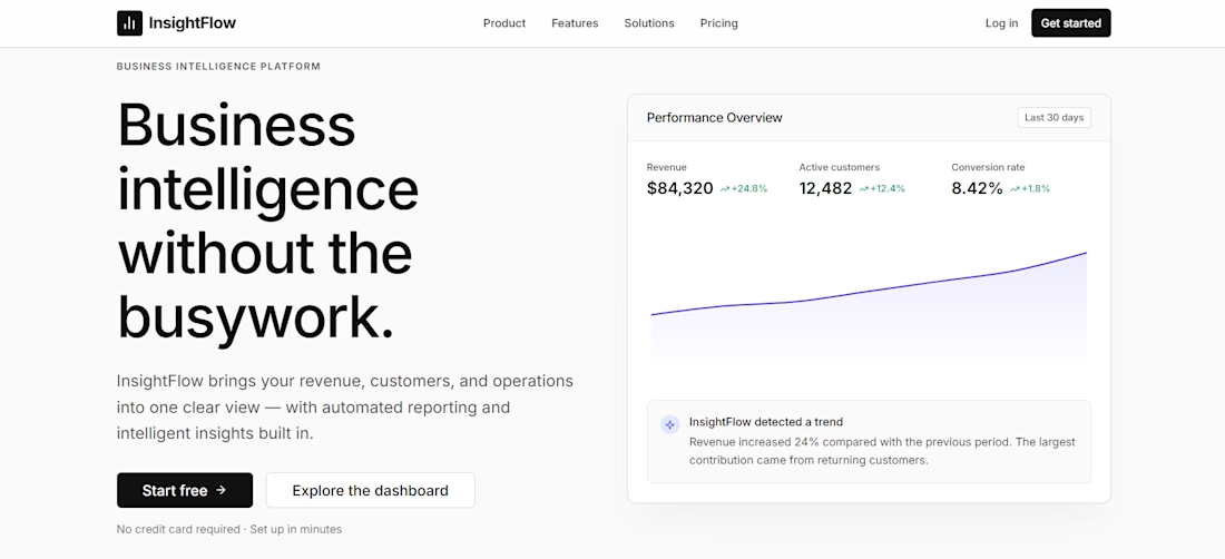
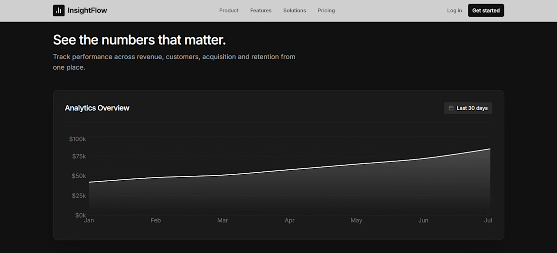
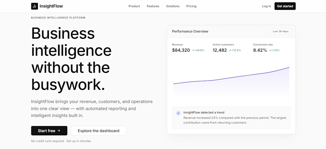
InsightFlow — AI SaaS Analytics Sample
Built with React, Vite, Tailwind CSS & Framer Motion, featuring a responsive landing page, analytics dashboard, AI insights, reports, integrations, and polished interactions.

The network for creativity
Join 1.25M professional creatives like you
Connect with clients, get discovered, and run your business 100% commission-free
Creatives on Contra have earned over $150M and we are just getting started



Related posts

Claude Vibe Code website.
AI Automation + Digital marketing website with scrolling & micro interactions
Live URL = https://vireoland.com/


Great work on the scroll interactions.


We rebuilt effekt.design from the ground up.
Over the past weeks we changed how we talk about ourselves and how the site feels. Less is more, and simple is easier to maintain, so we cut the site down to what founders and marketing leads actually need: the work, how we work, and an easy way to start a conversation.
The new positioning: the design partner for fast-moving tech companies. Strategy-led design, shaped by your business goals and measured against them.
The brand is quieter on purpose. The goal was to let the work be the loudest thing on the page, and to put the care into the little details instead. A few examples: a cursor that tells you what a click will do, projects you can filter by discipline, and a light mode switch hiding in the footer. There are many more small moments across the site for anyone who looks closely.
We focused on these interactions because they are a small preview of how we work. The goal is for clients to feel in good hands from the first click, clear on what is happening and confident the details are covered.
Case studies are next. Feedback is always welcome.

Love the idea of the work being the loudest thing on the page. The light mode switch hidden in the footer is a fun detail.

A live web app that maps 195 Marvel films and series across 24 universes into one tree, in story order. I designed it so a newcomer can see where to start within seconds: one clear tree, Ctrl+K search, and watch tracking that syncs with Google sign-in. Built with plain JavaScript and Firebase. No ads, no trackers.


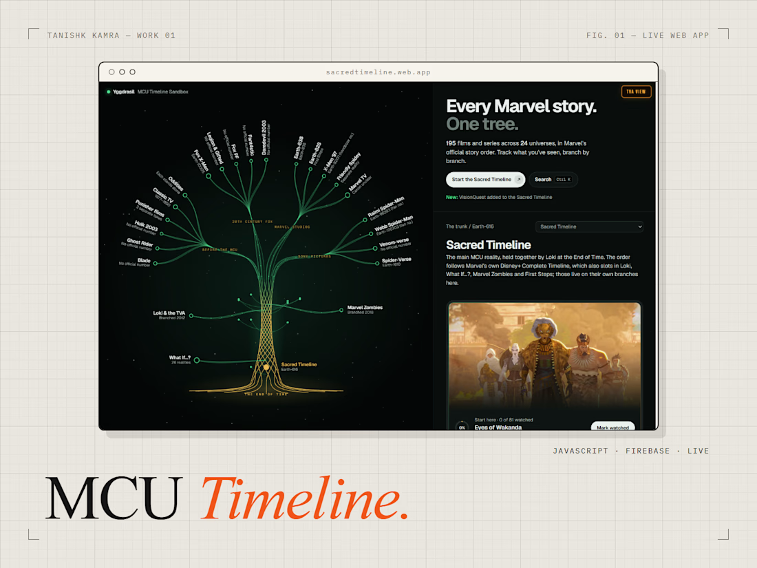

Showing a newcomer where to start in seconds is the right goal for a tree this big. How did you decide what to show first and what to hide until someone searches?