The network for creativity
Join 1.25M professional creatives like you
Connect with clients, get discovered, and run your business 100% commission-free
Creatives on Contra have earned over $150M and we are just getting started
Back to feedPost
Some branding work and social content I created for West & Willow. A passion project where I gave myself the time and space to create something truly close to my heart.
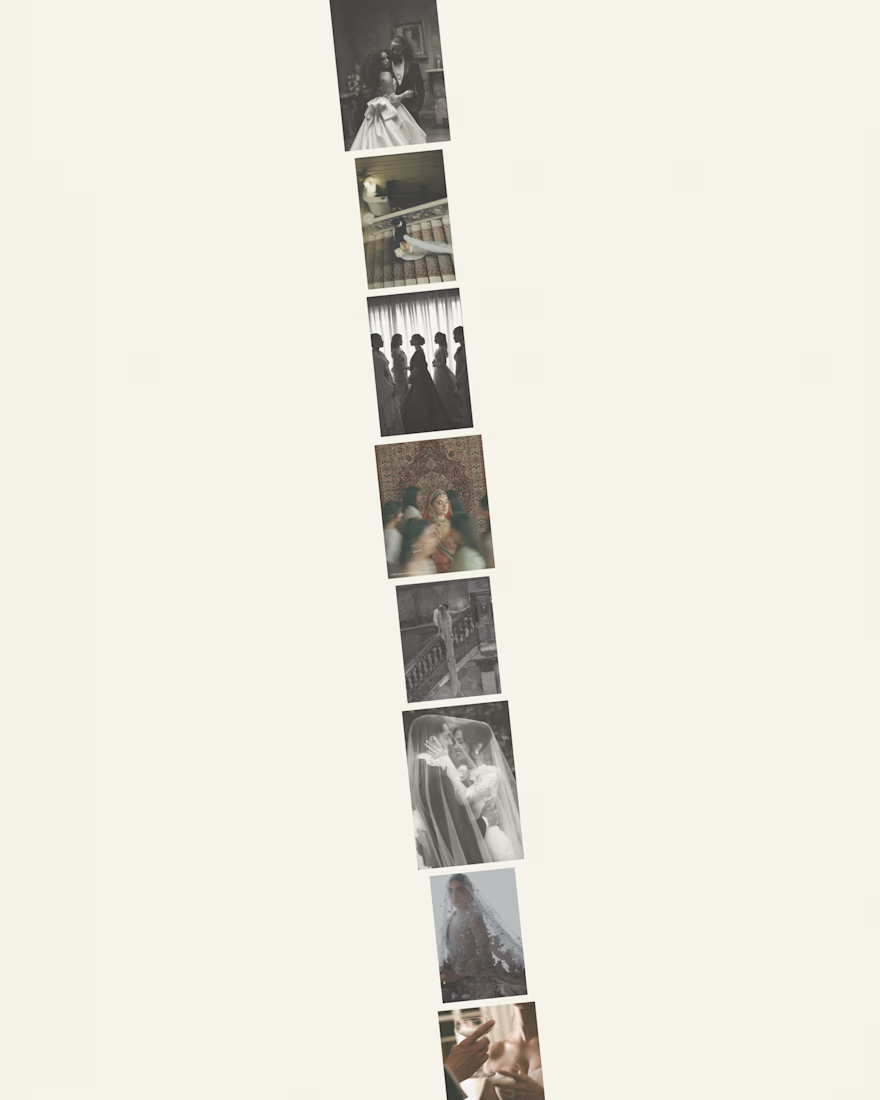
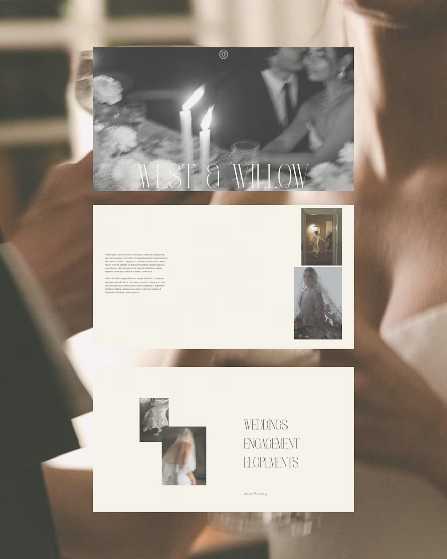
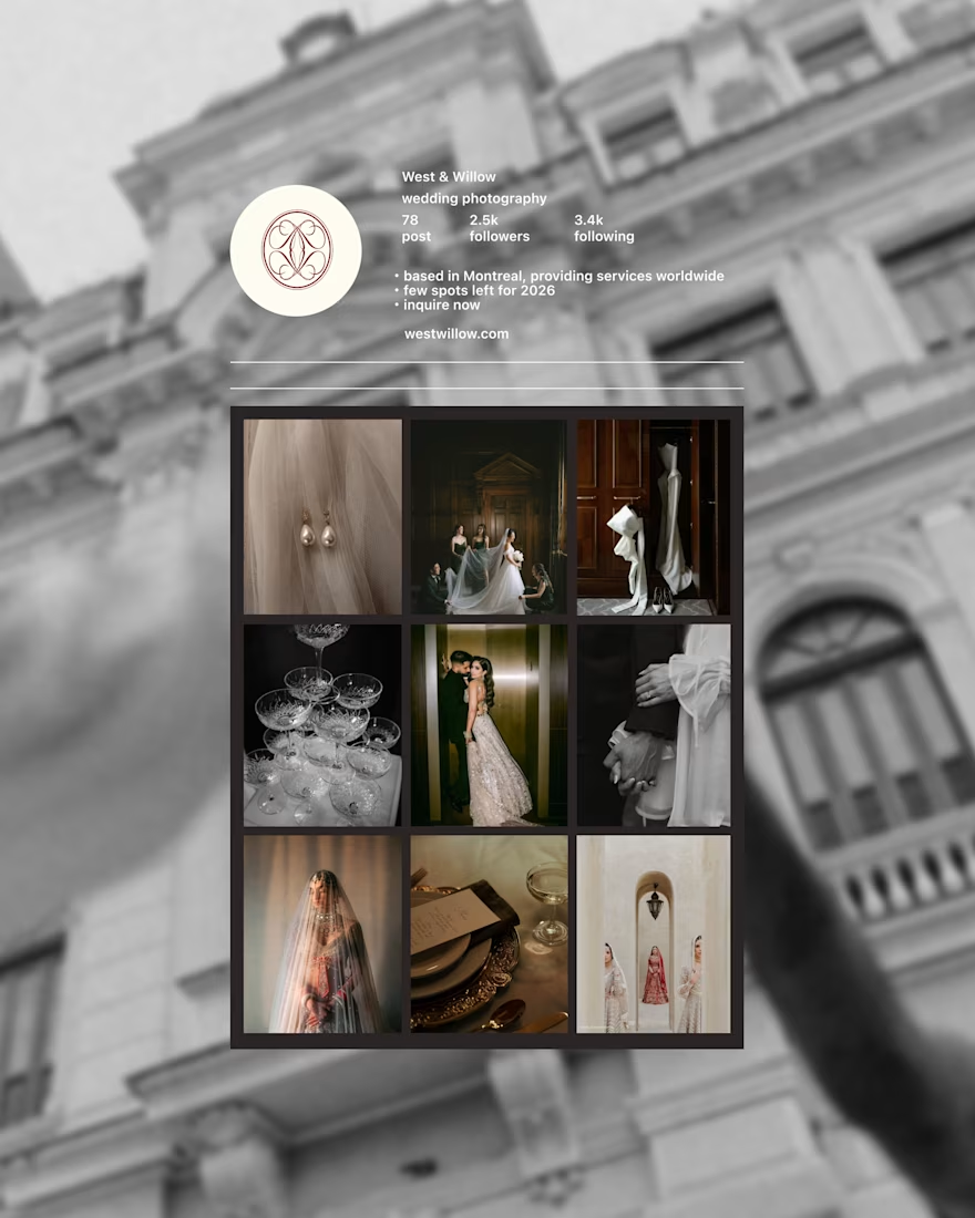


Thank you so much, I'm glad you like it:)

wonderful design!
Thank you so much!


Absolutely stunning
thankyou so much!!!

Stunning Work!
Thank You!!

The visual direction is so soft but confident. Feels very “trust the process” energy ✨
Thank you so much!! Still learning and working on finding my style

Woaah Amazing! @Iqra Imran Syed
Thank you!!
The network for creativity
Join 1.25M professional creatives like you
Connect with clients, get discovered, and run your business 100% commission-free
Creatives on Contra have earned over $150M and we are just getting started







Related posts


Four logo concepts, one direction: calmness, warmth, mental health and professionalism.
Which one feels most aligned with the brief to you?

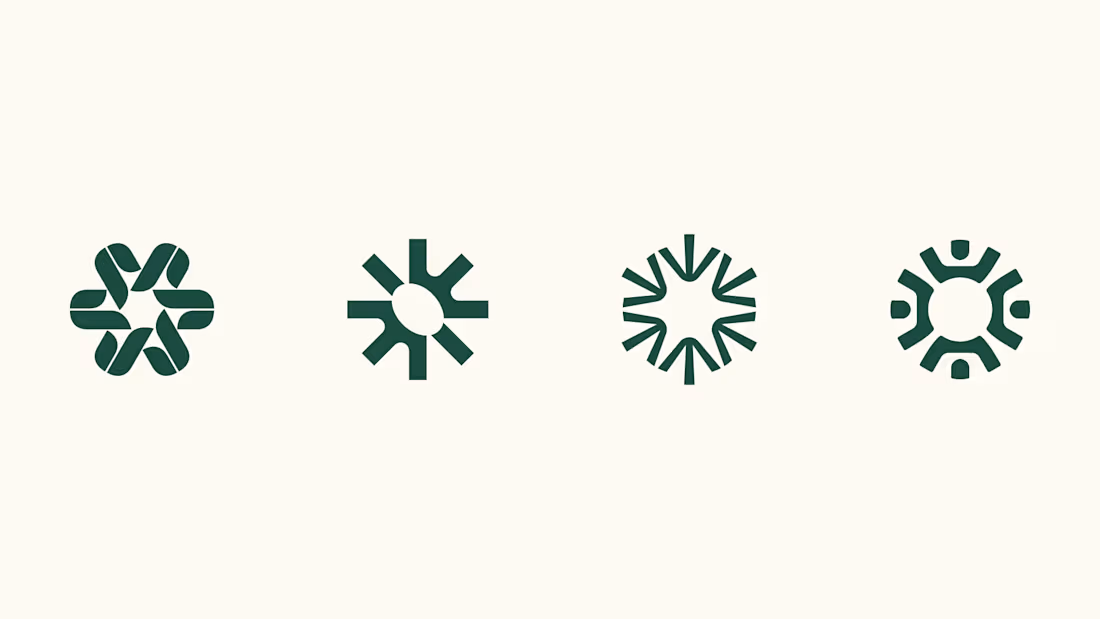

I think 3 or 4 work best. I really like the first one, but it moves away from the "calmness" concept
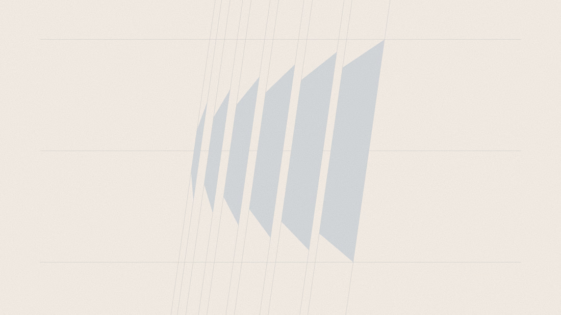
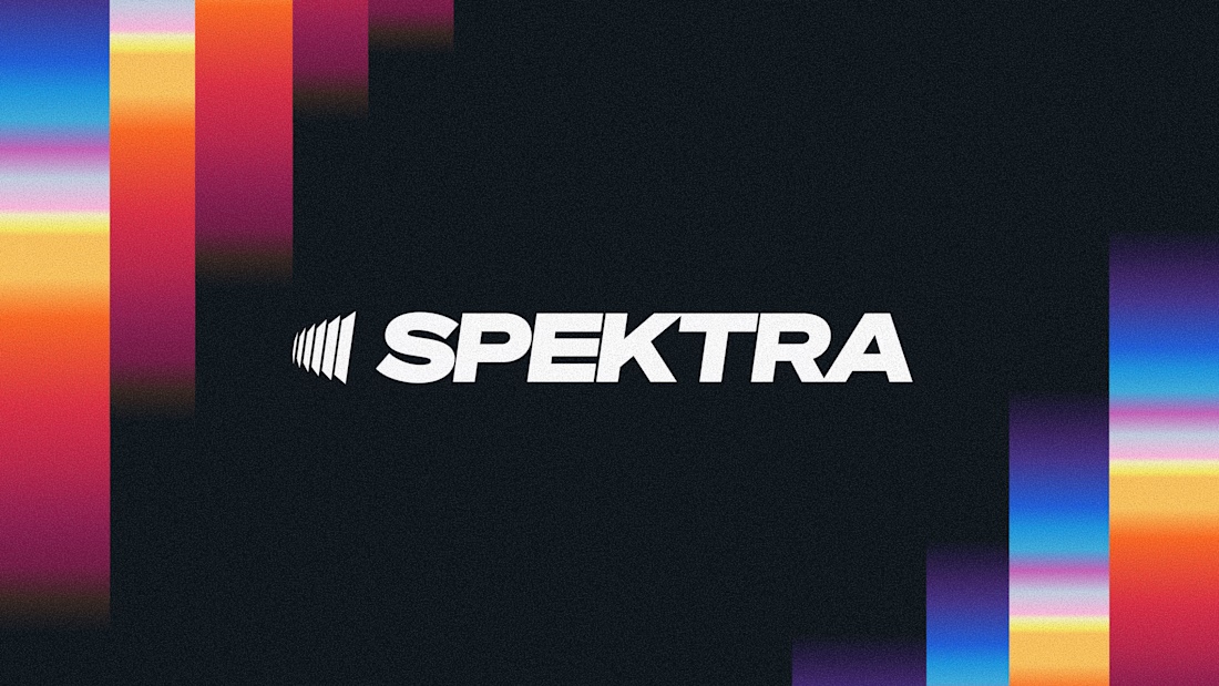
A closer look at the Spektra logo I designed.
The mark fans out from a narrow point, while the wordmark leans forward. together, they give it a sense of movement without needing much detail.
There’s a lot of color in the wider identity, so the logo holds its own in plain white. Simple geometry with enough weight to stand up to everything around it.



This is fire, Daniel
The logo conveys the story

Working on a website redesign for one of the biggest crypto data providers.
Lots still under wraps, but these cards are my fav so far.
More soon ... 👀

The restraint in these dark cards is doing a lot of work—the tiny pixel details feel intentional, not decorative. The progression across the set makes the crypto product direction feel especially cohesive.