The network for creativity
Join 1.25M professional creatives like you
Connect with clients, get discovered, and run your business 100% commission-free
Creatives on Contra have earned over $150M and we are just getting started
Back to feedPost

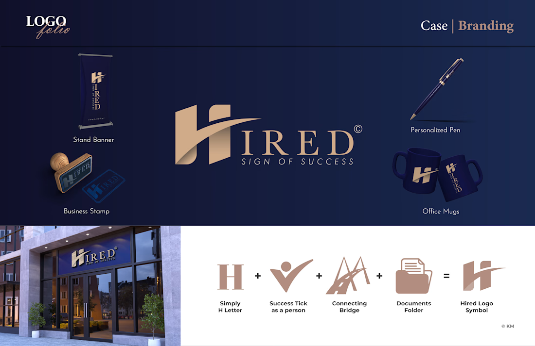
Hired | Hiring Company, based in Albania
Slogan: “Sign of Success”
✅Service: Branding✨
📌Client Requests: A modern logo, that clearly communicates their service and brand name.
💬Thought Process: The logo focuses on visually representing the company’s core service: handling essential documents for a smooth hiring process and strong employer-employee relationships.
The design features a success tick shaped like a person, integrated into the letter “H”, forming a bridge between its two lines. This also suggests a document folder on one side, symbolising connection and organization.
It’s a bold modern logo, digitally telling their story.
-Brand Color: Navy blue for trust and professionalism, gold for success.
-Font: Serif, combining formality with elegance.
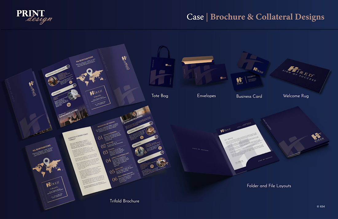
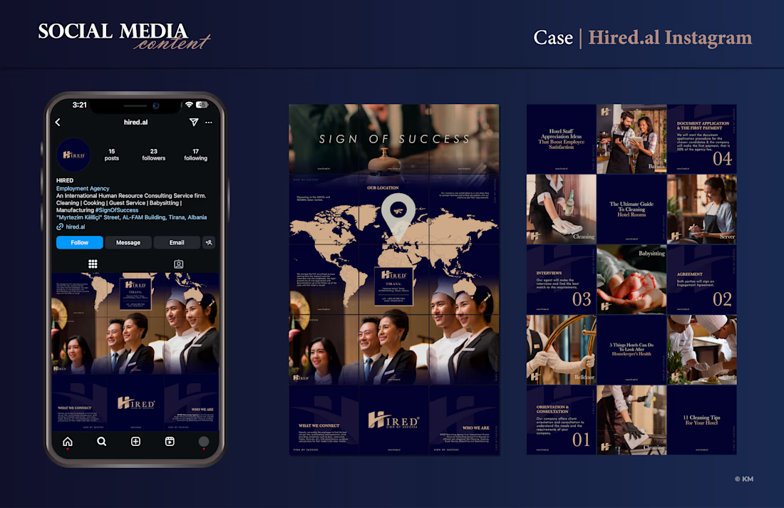
❇️Other Services: Office collateral & social media content design.
Adobe PhotoshopBrand DesignbrandingsocialmediadesignAdobe IllustratorPrint DesignSocial Content DesignAdobe InDesign


The network for creativity
Join 1.25M professional creatives like you
Connect with clients, get discovered, and run your business 100% commission-free
Creatives on Contra have earned over $150M and we are just getting started








