The network for creativity
Join 1.25M professional creatives like you
Connect with clients, get discovered, and run your business 100% commission-free
Creatives on Contra have earned over $150M and we are just getting started
Back to feedPost

When you pay attention to small details, users understand exactly what they need to.
You’d be surprised how much a single button label or one short sentence can impact conversions.
I’ve seen results change without redesigning the layout, just by clarifying a CTA, removing hesitation in a headline, or rewriting one line under pricing.
That’s the difference between decorating a page and understanding user intent.
Conversions often move in the details.
The network for creativity
Join 1.25M professional creatives like you
Connect with clients, get discovered, and run your business 100% commission-free
Creatives on Contra have earned over $150M and we are just getting started





Related posts

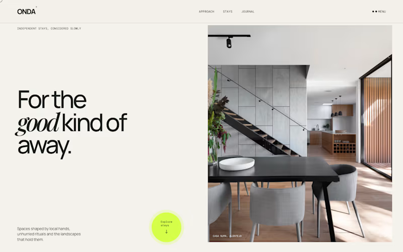
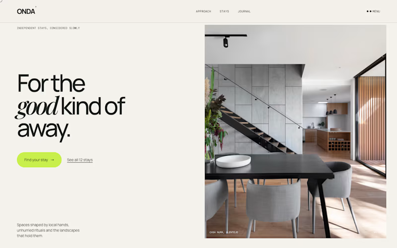
Same homepage, two approaches.
One keeps it calm with a single round button at the bottom. The other puts the action right under the headline, with a second option.
Which one would get your click?
1 voted
13%
7 voted
87%
8 votes
Closed

Action up front gets my click. The round button in the corner reads more like a badge than a button, so a first-time visitor could scroll right past it. Would love to see which one wins on real traffic.

Just dropped my second UX & Conversion Copywriting concept on Contra! 📊
Pricing pages are where most SaaS and FinTech sign-ups stall. When tiers are packed with accounting jargon or hidden-fee anxiety, solo founders bounce instead of starting a trial.
For this self-initiated VeloceLedger concept, I focused on turning hesitation into clarity:
• Identity-Driven Tiers: Replaced vague labels like "Basic" with "Best for..." taglines so freelancers self-identify their plan in seconds.
• Zero-Risk Trial Microcopy: Explicitly reassured users they’ll auto-downgrade to the free tier when the 14-day trial ends ("zero surprise charges").
• Interactive Plan Helper: Built a 1-question prompt to eliminate choice paralysis right on the page.
Check out the full case study on my profile, what’s the #1 thing that makes you hesitate on a SaaS pricing page? 👇

Before you call a layout finished, give it an unusually long name, a two-line heading, and a paragraph that needs more room.
It’s easy to make a screen look balanced when every example fits perfectly.
A little awkward content is a useful design partner. It shows you where the layout needs flexibility before someone has to squeeze their real work into it.