The network for creativity
Join 1.25M professional creatives like you
Connect with clients, get discovered, and run your business 100% commission-free
Creatives on Contra have earned over $150M and we are just getting started
Back to feedPost

Snatched by Krunch — Shapewear & Activewear Storefront
Client project · Shopify · Apparel / DTC · Conversion-focused
The brief
SBK sells shapewear, activewear and sets across sizes S–3XL to a UK and US customer base. Apparel has a conversion problem no other category has: fit uncertainty. A customer who isn’t sure a compression piece will fit her doesn’t buy, and one who buys the wrong size returns it — which costs more than the sale was worth. Every structural decision on this storefront was made to remove that doubt before checkout.
Two constraints shaped the build. The audience is overwhelmingly mobile, so every section was designed phone-first and only then adapted up. And Instagram is the brand’s primary acquisition channel, which meant the store had to feel continuous with the feed a customer had just come from — not like a different company.
What we built
A hero that sells the range, not one product. A rotating editorial hero — “Let’s get snatched.”, “All week long.” — in a high-contrast serif over lifestyle video and photography, with split CTAs sending shapewear and activewear shoppers down separate paths from the first screen. Two very different purchase intents, separated immediately instead of funnelled into one collection.
Sizing stated everywhere, not buried. A wave marquee carries “Sizes S–3XL · Love the Krunch · Look snatched” across the fold, and every product card exposes its size run inline, with unavailable sizes visibly greyed rather than hidden. A shopper learns whether her size exists before she’s invested a single click — the biggest silent drop-off point in extended-size apparel.
Product cards built for speed. Quick-add on hover, size and colour swatches on the card, wishlist hearts, NEW badges, price in the customer’s currency via a switcher in the header. Browsing from a reel doesn’t require a product-page detour.
A homepage that carries the whole store. Traffic from social lands on one page and rarely goes deeper, so we built the homepage to do the work of a full catalogue — category routing, two merchandised product rails, social proof, brand story and trust, all reachable without a second click.
Merchandising that mirrors how she shops. “Best Sellers — what she keeps reordering” leads with proven repeat purchases; “New In — sets that carry the whole week” follows for the returning customer. Repeat-purchase framing is a trust signal in its own right in this category.
UGC as social proof, not decoration. “In The Wild — @snatchedbykrunch_” runs a carousel of real customer reels and review screenshots with playback controls. In shapewear, seeing the product on a range of real bodies does more conversion work than any studio shot, because it answers the fit question visually — and it keeps the Instagram-to-store transition seamless.
“How We Show Up — Behind the fit”. Four editorial panels covering fabric and compression, sizing graded S–3XL with real measurements printed on every product page, dispatch timelines, and the exchange promise — “Wrong size? Exchange it. We would rather you keep the piece than keep the sale.” That line is the whole strategy in one sentence, and it sits above the fold in the announcement bar too: 14-day exchanges, find your fit guaranteed.
Capture and reassurance at the right moments. An entry offer, a persistent 10%-off tab, and a 15% footer capture for the visitor who leaves without buying — plus a closing trust row covering shipping thresholds, exchanges, secure checkout and a direct fit-help line for anyone still unsure.
Art direction
A high-contrast display serif against clean sans body copy — editorial enough to carry a lookbook, restrained enough to disappear behind the product. The palette stays to deep burgundy, soft blush and warm neutrals pulled from the collection itself, so the site never competes with the garments. Photography carries the page; UI stays quiet.
Build
Shopify, custom sections throughout — rotating hero, wave marquee, category split tiles, quick-add product carousels with variant swatches, UGC reel carousel, editorial content blocks, lookbook grid, trust row, footer. Multi-currency, wishlist, and merchant-editable content so the team swaps drops, campaigns and imagery without a developer.


The network for creativity
Join 1.25M professional creatives like you
Connect with clients, get discovered, and run your business 100% commission-free
Creatives on Contra have earned over $150M and we are just getting started



Related posts


The little green dot moving through the grid is so satisfying

skin in the game.
pick a card.
live with it.
the wild card tattoo club case study is coming soon: the brand, the voice, a looping soundtrack and a website where you draw a card.
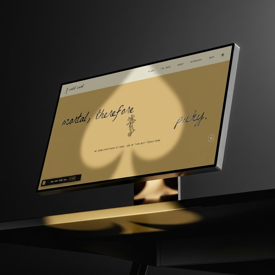
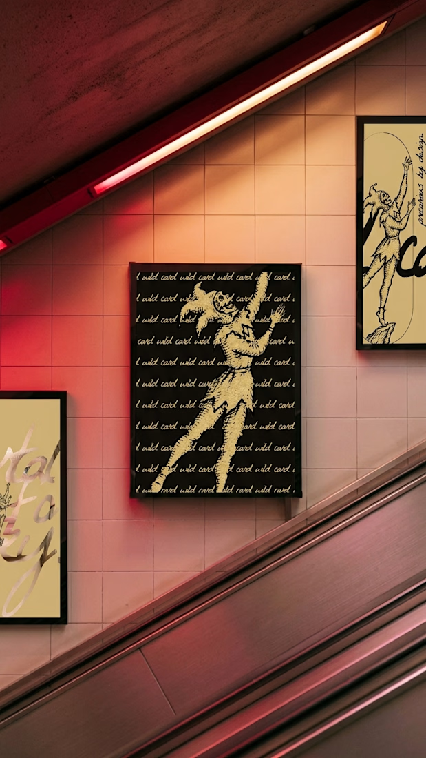
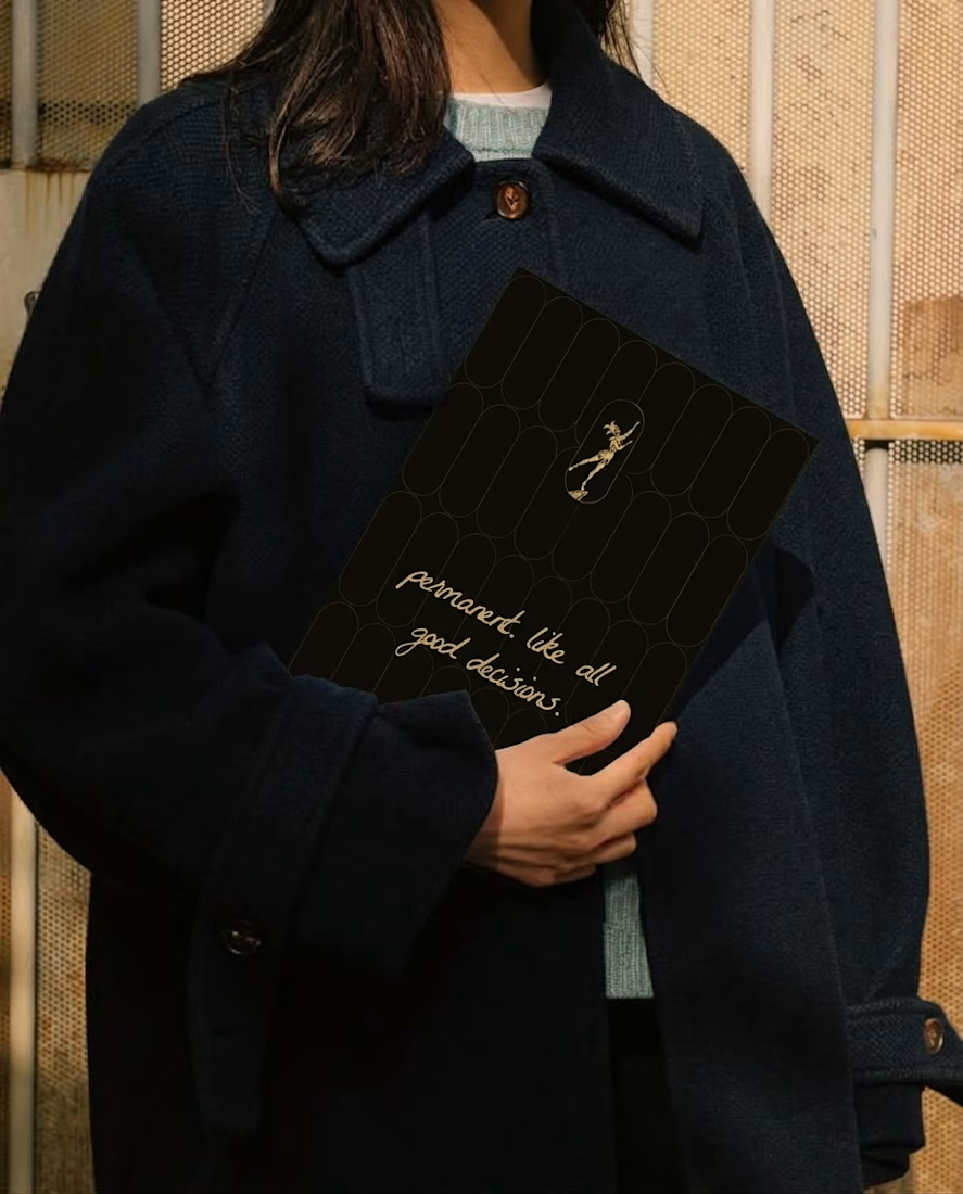
The gold illustrations on those black cards are gorgeous, Révolté

Updated the Dreamy effect for Framer, now it’s faster, smoother and more flexible
Grab it here
Really like what I get. If you are web designer, or brand designer would love to hear your feedback


Nice update, Denis. Making it faster and smoother is what matters most when an effect like this ends up on real client sites.