The network for creativity
Join 1.25M professional creatives like you
Connect with clients, get discovered, and run your business 100% commission-free
Creatives on Contra have earned over $150M and we are just getting started
Back to feedPost
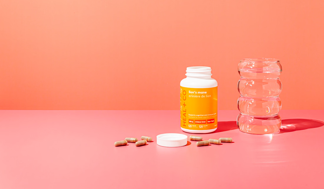
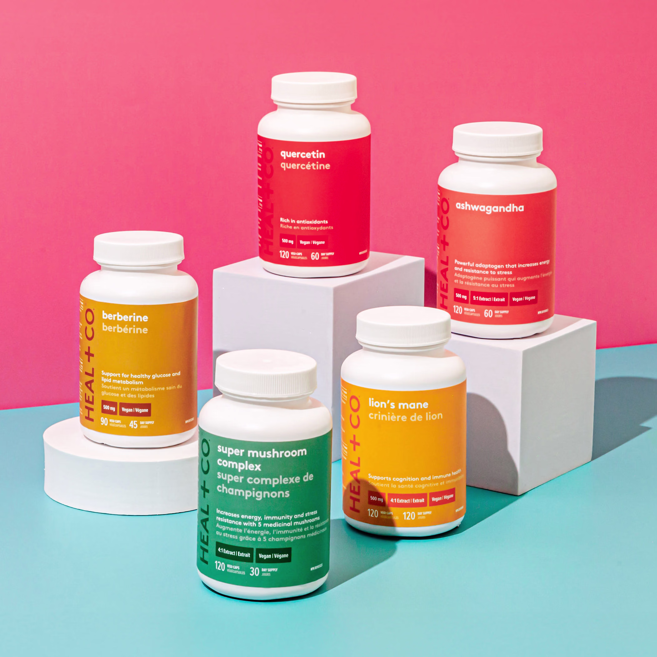
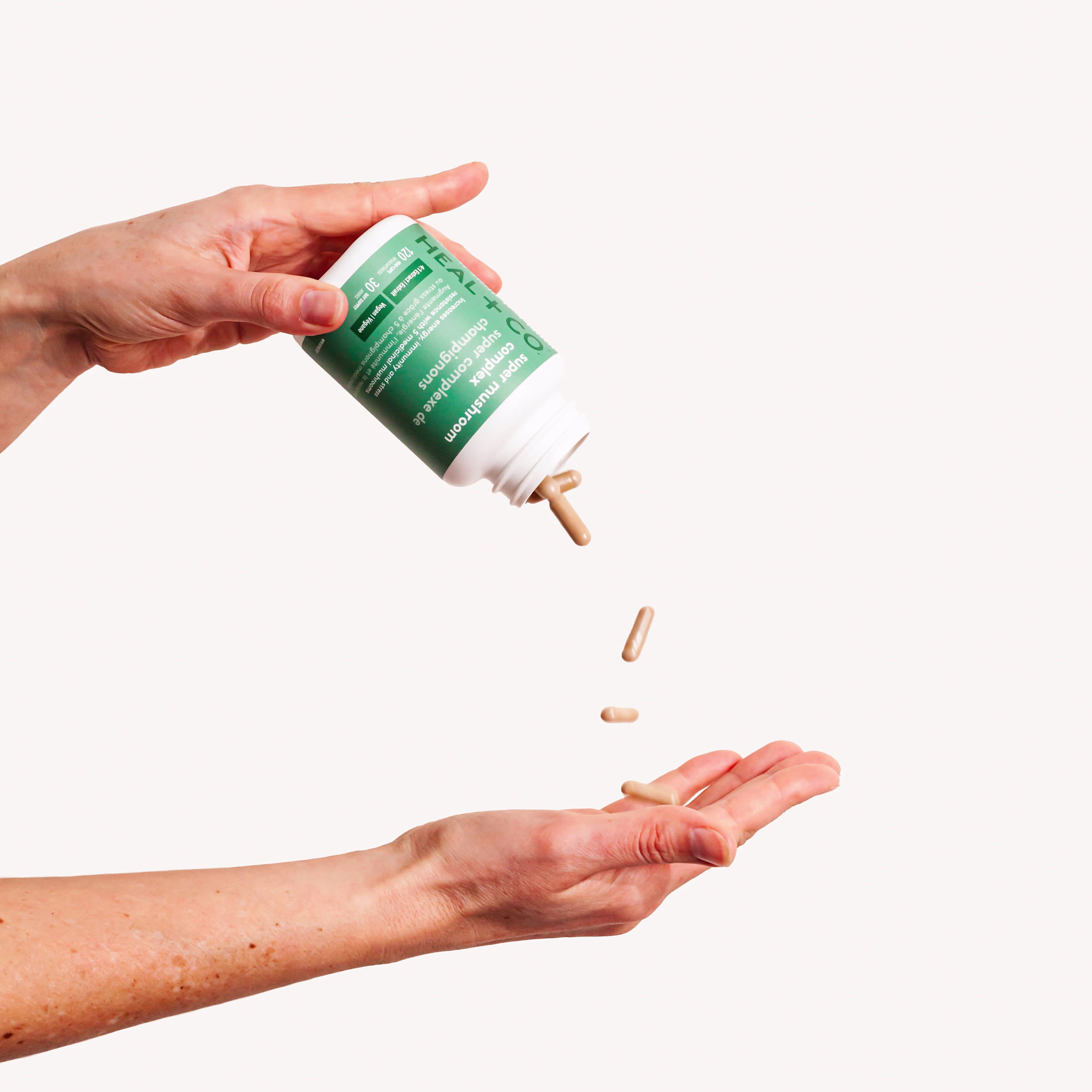
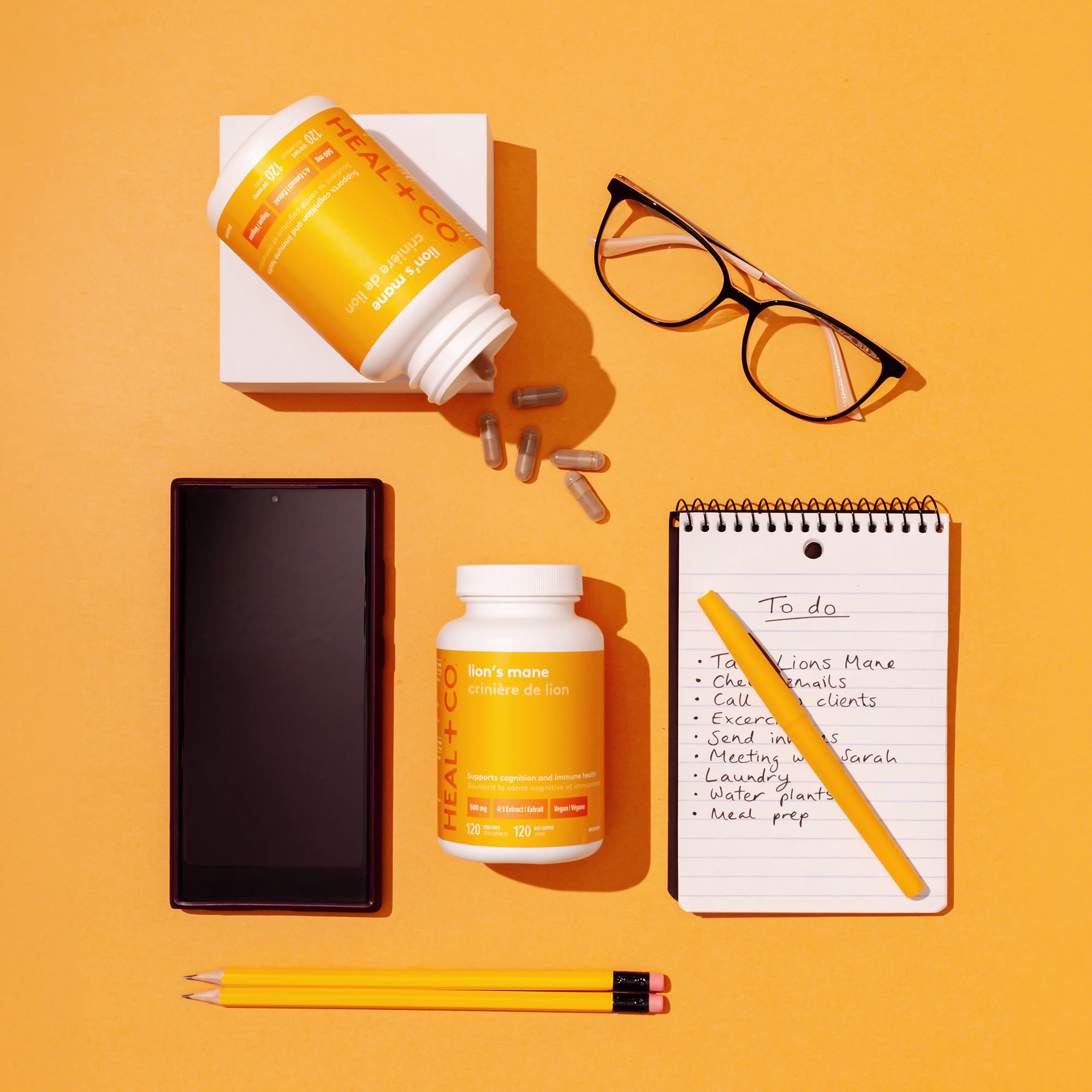
Potency. Purity. Efficacy. Transparency. Facts not fluff. With bold, refreshingly straightforward claims like these, Heal + Co. needed to look as simple and powerful as the healing power of nature it delivers.
To stake their claim as the serious supplement, we stripped away all the marketing BS - what they beautifully call "packaged promises." We used pure color, restrained design and lots of confident empty space. We said exactly what we needed to say and nothing more, making people feel confident about what's inside.
This Canadian success story has been a longtime Sobi client, and the brand reflects their no-compromises approach to natural wellness.
Deliverables: Brand identity, packaging design, brand messaging. wearesobi.com
The network for creativity
Join 1.25M professional creatives like you
Connect with clients, get discovered, and run your business 100% commission-free
Creatives on Contra have earned over $150M and we are just getting started
Challenges
View allTrending
Claude
Claude has entered the design space. How are you using Claude Design?
Contra University
Learn from expert creatives how to earn more using next-gen AI tools.
fifaworldcup2026
The World Cup is here and the whole world's watching. How are you designing for the world stage?
creativeaiflow
Creative AI workflows are evolving. What tools do you use, and what are their strengths and weaknesses?
freelancerlife
Freelancer life is wins, pivots, and everything in between. What’s yours right now?