The network for creativity
Join 1.25M professional creatives like you
Connect with clients, get discovered, and run your business 100% commission-free
Creatives on Contra have earned over $150M and we are just getting started
Back to feedPost

The #1 job of your website headline is to get people to read your second sentence.
For example, I’m not the copywriter behind Bokksu, but if I were, this is how I’d change their hero headline from the lifeless “Discover Japan through snacks” to:
1.Attention grabber ⇝ “Look at it this way”
2.Use indirect competitor as price anchor⇝ “It’s more expensive than a Netflix subscription”
3.Your promise⇝ “But it’s cheaper than a trip to Japan.”


The network for creativity
Join 1.25M professional creatives like you
Connect with clients, get discovered, and run your business 100% commission-free
Creatives on Contra have earned over $150M and we are just getting started



Related posts

1 line (headline + body text) or 2 lines? Wider or narrower?
It's easier for me to read 2 lines.
What about you?

5 voted
19%

22 voted
81%

27 votes
Closed

second one

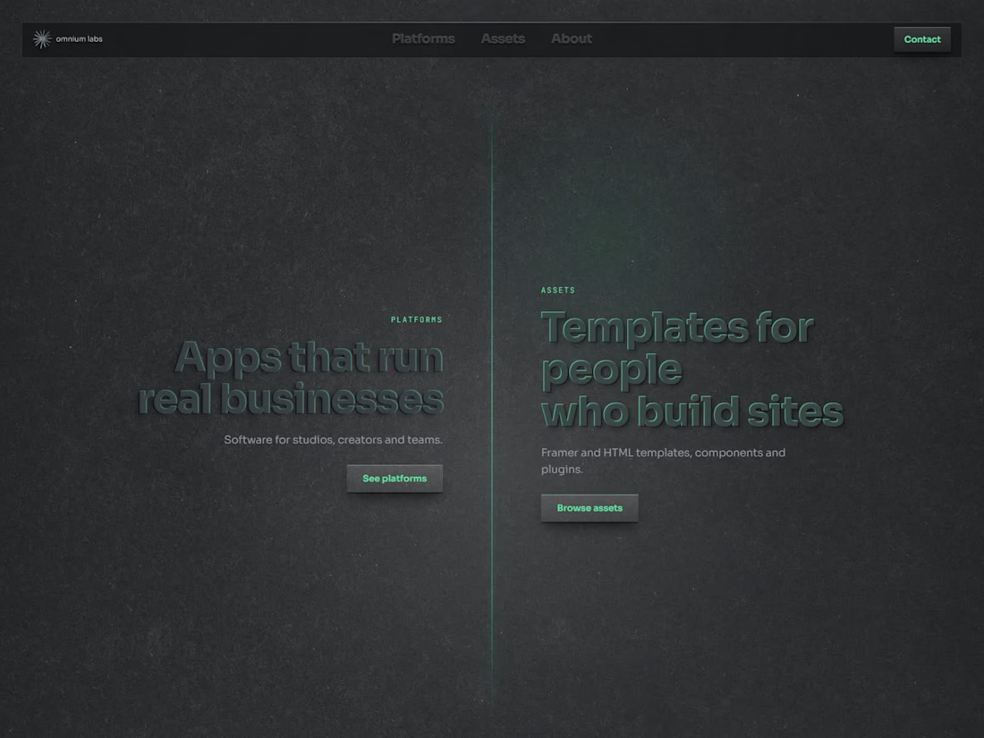
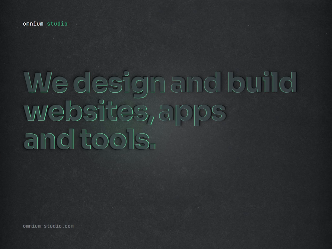
Dark sites don't need white text everywhere.
On omnium.tools the headlines are almost the same colour as the background. They're pressed out of the page, and a soft green light moving across them makes them readable. It's quieter than white on black and feels more physical.
Would you ship low-contrast headlines on a real client site, or is that only for your own portfolio?


Your business runs on copy-paste. Mine doesn't.