The network for creativity
Join 1.25M professional creatives like you
Connect with clients, get discovered, and run your business 100% commission-free
Creatives on Contra have earned over $150M and we are just getting started
Back to feedPost

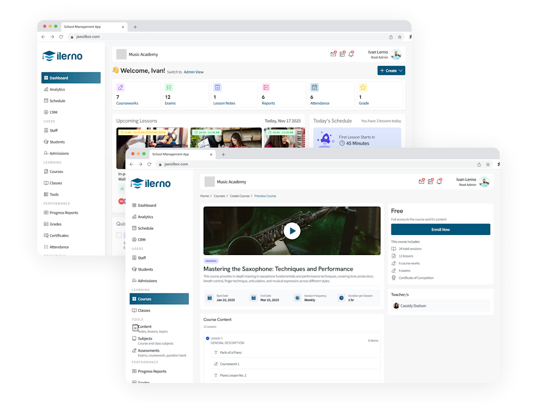
Audited an outdated LMS screen by screen, interviewed admins, then redesigned from scratch for both admin and student users. Delivered a documented design system and streamlined navigation throughout.

The network for creativity
Join 1.25M professional creatives like you
Connect with clients, get discovered, and run your business 100% commission-free
Creatives on Contra have earned over $150M and we are just getting started

Challenges
View all


Related posts

Day 10/30 of my hero section challenge.
Today: Ofelia, a spa in Bali.
→ The wordmark sits at eye level, spanning the full width, cutting across the middle of the space. Here the type claims the room, and because the interior is symmetrical and calm, it can take the weight.
→ A high-contrast serif against soft plaster. The architecture is all curves and matte texture, so the type brings the only sharp edges in the frame. Contrast without adding a single element.
10 down, 20 to go. A third of the way.
Template by Hariom, adapted and customized by me. Interior imagery generated with AI.


Contrast without adding a single element is such a clean way to put it. With 20 more of these to go, are you locking the typographic approach per venue type, or is Ofelia's centered serif going to be the constant across the whole 30?

Seasonal identity for Beat Film Festival. The challenge: create a concept where cinema helps audiences process a turbulent cultural and historical moment — staying relevant and resonant rather than offering escape from it.
The identity metaphor for BFF is a shared journey —
audience and festival alike searching for solid ground.
"Get on Board" is an invitation to hop into the same boat, riding together the waves of emotion sparked by film and shaped by the turbulence around us. Beat becomes the lighthouse in that storm — a sense of safety, belonging, and a moment worth sharing.


The gradient makes the whole identity special, what do you think?


Launched this yesterday 🏈
Experience it for yourself: http://jjettas.com/


HIS VISOR IS A VIDEO WTFFFFFFFFF!
Someone call AWWWARDS