The network for creativity
Join 1.25M professional creatives like you
Connect with clients, get discovered, and run your business 100% commission-free
Creatives on Contra have earned over $150M and we are just getting started
Back to feedPost
200–300 visitors/month. Almost zero conversions. High bounce rate.
That was my old portfolio, and those numbers forced me to rebuild everything.
My previous site (vishalmishra.vercel.app) was built to impress designers. Heavy animations, modern aesthetic, a very "creative agency" feel. The problem? My actual clients are small businesses, startups, and offline businesses, and they don't browse portfolios the way designers do.
They want answers fast:
— What does this person do?
— Have they done work like mine?
— How do I get in touch?
My old site made them work for it. Most left before finding out.
So I fixed it.
The new portfolio (mishravishal.in) is a single-page experience - About, Projects, Services, Sequence, FAQ, and Contact are all visible without clicking away. And instead of just an email link buried at the bottom, visitors can now:
— Fill a quick "Start a Project" form
— Message me directly on WhatsApp
— Or just send an email, whatever feels easiest
The goal: give a first-time visitor enough context to decide before they bounce.
Is this the right call? I genuinely don't know yet; maybe the bold, animated portfolio was the better brand statement. That's a real question I'm sitting with.
If you've worked with a similar audience or gone through a portfolio redesign, I'd really value your perspective. What would you have done differently?
The network for creativity
Join 1.25M professional creatives like you
Connect with clients, get discovered, and run your business 100% commission-free
Creatives on Contra have earned over $150M and we are just getting started
Related posts
Startfrom is live.
a small library of @framer templates made to feel like real websites, not placeholder layouts
as framer template market gets noisier, we’re taking the opposite route: fewer templates, higher standards, more polish
live now: startfrom.co
Nice work👏
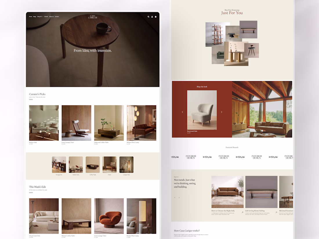
Most furniture websites sell products. This one sells a point of view.
This e-commerce web design was built for a luxury furniture brand with a clear philosophy: not for everyone, just for you. From India, with intention. Every section of the page was designed to feel like a curated editorial rather than a product catalogue, because the people who buy furniture like this aren't browsing. They're choosing.
Curator's Picks. This Week's Edit. Just For You. Shop the Look. The content architecture guides, without pushing each section, to a natural next step rather than a conversion tactic.
Harbor Sofa. Luna Lounge Chair. Oakwood Coffee Table. Cove Lounge Chair. Every product given room to breathe against warm cream backgrounds and rich walnut photography that makes you feel the weight of the wood before you read the price.
The closing line says everything about the brand's confidence: "We thank our predecessors in the design industry. We'll take it from here."
A design that earns that kind of statement.
Does this feel like a furniture brand worth bookmarking? 👇
Tools: Figma · Jitter
#EcommerceDesign #WebDesign #FurnitureDesign #UIDesign #LandingPage #ContraFreelance #LuxuryDesign #ProductDesign
Cohesive minimal design, Great work!
Amazing.
Challenges
View allTrending
Claude
Claude has entered the design space. How are you using Claude Design?
Contra University
Learn from expert creatives how to earn more using next-gen AI tools.
fifaworldcup2026
The World Cup is here and the whole world's watching. How are you designing for the world stage?
creativeaiflow
Creative AI workflows are evolving. What tools do you use, and what are their strengths and weaknesses?
freelancerlife
Freelancer life is wins, pivots, and everything in between. What’s yours right now?