The network for creativity
Join 1.25M professional creatives like you
Connect with clients, get discovered, and run your business 100% commission-free
Creatives on Contra have earned over $150M and we are just getting started
Back to feedPost

Hey everyone — this is Grid Studio, our web design & development agency.
We wanted the site to feel the way we approach every project — intentional, bold, and a little different. Dark canvas, orange accents, animated details that make it feel alive.
The idea was simple: if someone lands on the page, they should feel something before they read anything. Every curve, every interaction, every CTA is there for a reason.
Would love to hear what you think. 🫶🏼
Check it out 👇🏻


The network for creativity
Join 1.25M professional creatives like you
Connect with clients, get discovered, and run your business 100% commission-free
Creatives on Contra have earned over $150M and we are just getting started








Related posts


Great direction for an automotive site.

Ever wondered what a space-race poster would sell if it sold hammers?
The Zvezda Works case study answers that, and it’s nearly here.
Watch this space.

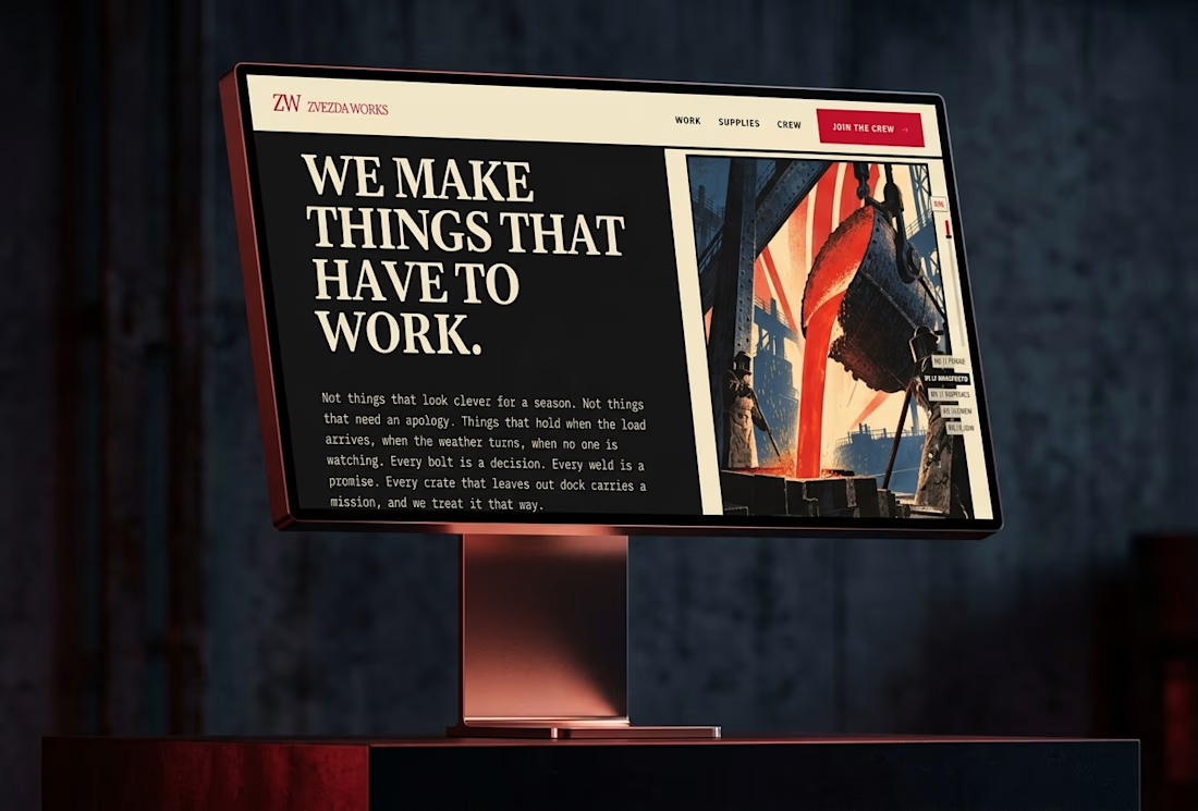
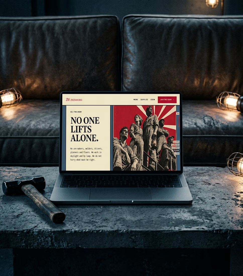

A little creative experiment I'm working on ✳️
Playing with bold typography, playful motion, and unexpected interactions for a UGC creator portfolio.
Still a work in progress, but having way too much fun with this one.


The big stacked WORK / RESULTS / RATES menu next to the loose purple stickers keeps the portfolio playful while the navigation stays easy to scan. Do the stickers react on hover, or are they tied to scroll?


